I love using Redash to create and automate SQL queries that generate reports. Its dashboard feature lets me automate many of the reports I used to create manually in Numbers and Google Sheets. Redash saves me dozens of hours a year, and it lets me get real-time access to the data I need most. Instead of spending time generating reports, I can spend time analyzing and acting on findings.
Ugly Charts Aren’t Useful Charts
As much as I love Redash, I do have one big problem with it. The default color schemes of the dashboard’s data visualations are total eye-sores:
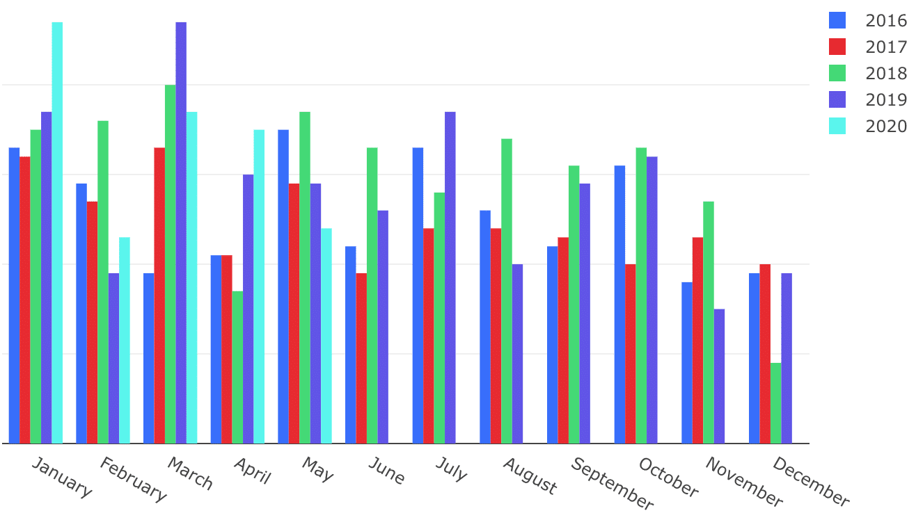
Call me sensitive, but I refuse to spend a second longer than I need to looking at this clashing mess. It turns me off from my favorite thing about Redash — delving into the automated charts.
Do it Yourself?
Redash does allow for some color customization of visualizations, but the default colors are listed in an unintuitive order and with confusing titles.
To access the customization menu, open a data visualization, and click “Edit Visualization.” When you click the “Colors” tab, you’ll have the option to choose a color from a list for each series in your visualization. Here is the color selection default dropdown:
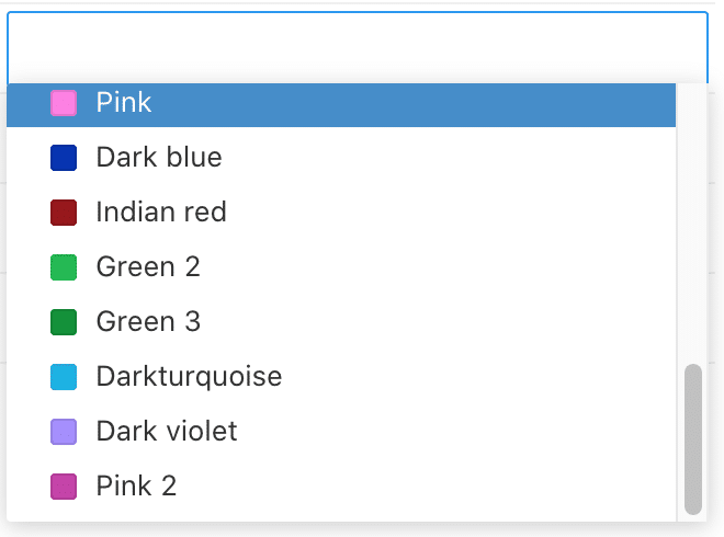
Apart from this being out of any discernible order, the naming conventions are completely puzzling. For example, when trying to create a “blues” palette, I realized that the “light blue” color rendered more periwinkle, and don’t get me started on the differences between “Green,” “Light Green,” “Green 2,” and “Green 3”!
To make things even trickier, some of the colors are nearly indistinguishable when used side-by-side. This makes it difficult to select colors by eyeballing them by hue in the dropdown; you need to use the color name to be sure. And if your data visualization pulls from complex datasets, the seconds-long load time can make the process of customizing colors a long, frustrating endeavor.
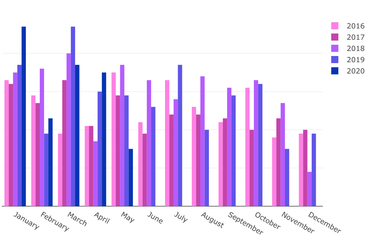
With some experimentation (and a lot more time than I anticipated), here’s the same chart as above but using colors chosen with aesthetics in mind:
Beautiful Palettes for Redash Customization
Ideally, I’d love to use a HEX code to select brand colors in these reports. Some folks submitted that request recently, so maybe Redash will release this feature soon. In the interim, I created these palettes to hopefully save you some eyestrain and time when you’re creating more beautiful reports.
Deeps
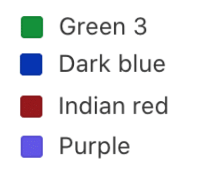
Pastels
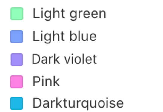
Primary and Secondary
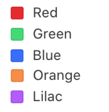
Reds-Oranges
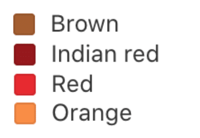
Greens
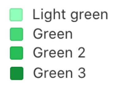
Blues
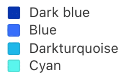
Purples
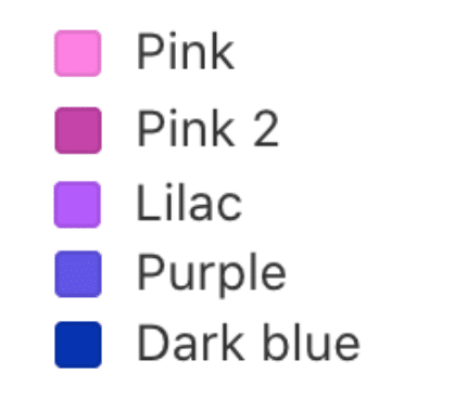
Rainbow-ish
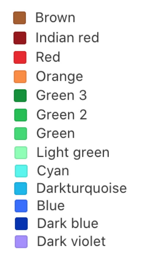
I hope these color palettes help you get the best of both worlds out of Redash — great automated reports and a soothing visual experience.

Latest version (v9) supports picking hex values for a color. :-)
Well that was fast!! 🤣
Thank you for the feature! Looking forward to getting my hands on v9.
Elaine
What is not clear to me from the above is how to make use of the palettes you have created.
Hey Warwick.
In the version of Redash I’m using, you can edit the colors of each data series in a visualization.
(To access the customization menu, open a data visualization, and click “Edit Visualization.” When you click the “Colors” tab, you’ll have the option to choose a color from a list for each series in your visualization.)
My intention was to give people a color name and aesthetically pleasing grouping to reference as a handy way to add color to visualizations. Does that answer your question?
Elaine