I had a great suggestion for my next topic on UIStackViews from my previous blog post. Dan asked, “Could you show us how you would put four fields on the same row evenly?”
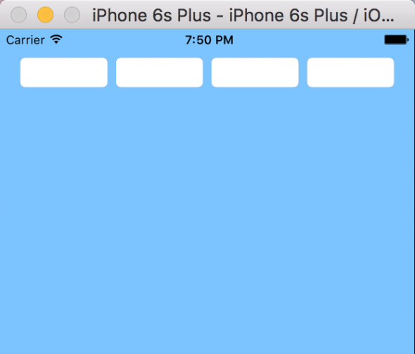
UITextFields present an interesting problem for UIStackViews because they do not have an intrinsic content size. They shrink to fit the text that is inside them or get really tiny if they have no text. You have to tell the stack view how to stretch the controls inside it, and in this case, also stretch them evenly across the row. The example we are going to build will look like this:
Laying Out the Controls
You have a couple of ways to get started. As with any container view in iOS, you can place the controls on your storyboard scene first and then encapsulate them in a container, or place the container on the scene first and drag controls into the container.
I will start with the former method, dragging four UITextFields onto my storyboard scene and encapsulating them in a stack view.
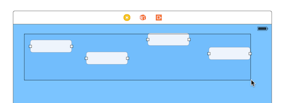
Hit the Stack button to encapsulate your selected controls in a stack view.

Because the UITextFields do not have an intrinsic content size, the fields shrink and are grouped in a tight bundle of four within the new stack view.
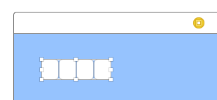
Now constrain the UIStackView in the parent view using Auto Layout. I added constraints on the leading, trailing, and top of the stack view to the parent view.
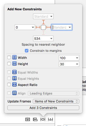
Finally, you should have four text fields in a stack view constrained to the parent view. Now we will take a look at how to space them out equally.

Configuring the UIStackView
Now that we have our controls in the stack view, we need to tell it how to distribute the controls. As you can see, it defaults to fill the stack view, but it doesn’t automatically do it equally.
Set the distribution on the stack view to Fill Equally.
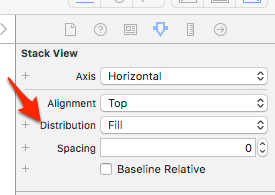
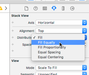
The result of filling equally is almost what we want. We have the text fields filling out the stack view equally, but they are a little too close to each other.

In the “old” days before UIStackViews, when you wanted spacing in between your controls, you had to add Auto Layout constraints between them. Now with stack views, we can configure the amount of space between each control.
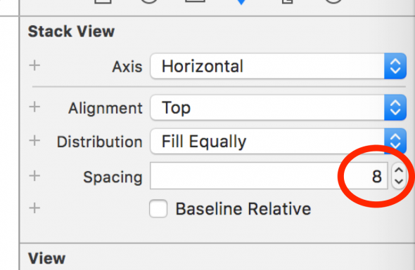
Now we have the exact look that we want.

Fixing Auto Layout Warnings
It may happen that you get Auto Layout warnings when you try my example. I believe the root cause is iOS’s inability to do sub-pixel rendering. What I mean by that is you can’t say a control is 4.5 pixels wide–it has to be a whole number. I usually encounter this when I have a number of controls that I want to space equally across a view. Depending on how wide my view is and how many controls I am spacing out, the result may not divide into equal whole number pixels. Xcode will report this as an Auto Layout warning that is difficult to get rid of.
Here are the warnings that I get on Xcode 7.3.
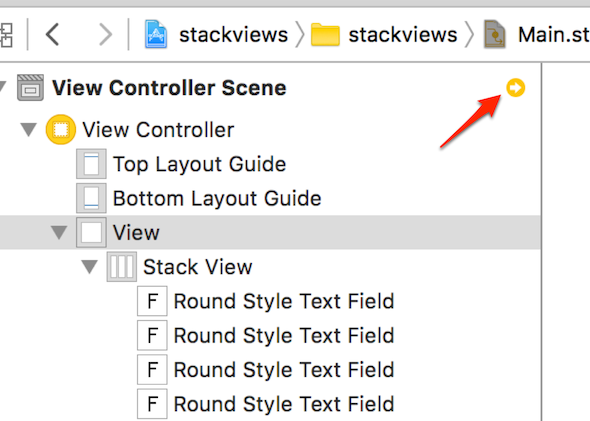
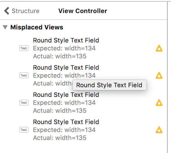
When I right-click on the yellow triangle, updating the frames does not fix the problem. It seems like there is nothing that will make Xcode happy. To make the warning go away, you can click on just one of your text fields in the stack view and set the Content Hugging Priority to be one less than the rest of the controls in the stack view. In my case the default is 250, so I set one of the text fields to be 249. Problem fixed!
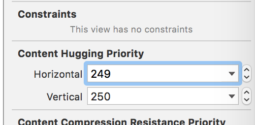
The reason this works is you are giving permission for one of your controls to be a little smaller than the rest, which results in a whole number when the math doesn’t work out in your favor.
Do you have another layout problem you would like to see solved with UIStackViews?


I recently have been going through the Stanford iOS 9 development class and they covered stack views. I followed their course several years ago (when objective-c was still the preferred language), and I don’t believe they were covered. Had I known they existed before I could have saved myself countless hours and headaches.
I loved the Stanford videos when I first started doing iOS development.
Very well. I was searching for this solution for the last two days..
I was very much tired of searching here and there. At last this article proved simple and straight
Nice article (and the previous). I’d love to see some examples of how to do layouts with varying button sizes like in this calculator UI where the 0 button spans the width of 2 columns of buttons but they’re all still sized relative to each other.
https://www.macobserver.com/imgs/tmo_articles/20131101-05-Calculator.jpg