Material UI (MUI) is a handy open-source React component library that provides pre-built components that you can easily drop into your React applications. While this speeds up the development process, styling them exactly how you want can sometimes be tricky. In a recent project, my software development team and I built a dashboard that used MUI’s Line Chart component. There are plenty of ways to customize it, but getting it to look a specific way isn’t always clear through MUI’s documentation. In this guide, I’ll walk you through several different ways you can style your MUI line chart component.
Formatting Axis Data
By default, the data shown on the axis ticks and in the tooltips is just the raw data that you set the data or dataKey property to. If you want to change how this data is displayed, you can use the valueFormatter property. You can specify if you want to make this change in either the tick or the tooltip by using context.location.
Some use cases of this is if you need to shorten the data shown on the axis ticks or if you need to show the units in the tooltip. You also might only want to shorten the axis data in the ticks but not shorten them in the tooltip.
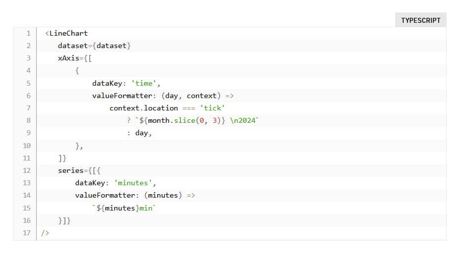
Here’s a snippet of code of how you can format the axis data:
 <LineChart
    dataset={dataset}
    xAxis={[
        {
            dataKey: 'time',
            valueFormatter: (day, context) =>
                context.location === 'tick'
                    ? `${month.slice(0, 3)} \n2024`
                    : day,
        },
    ]}
    series={[{
        dataKey: 'minutes',
        valueFormatter: (minutes) =>
            `${minutes}min`
    }]}
/>
Adding Placeholder Text for No Data
Sometimes, your line chart might not display any data, such as when the data is still loading or when the user hasn’t selected a specific dataset to visualize. The default view is for the chart to display “No data to display”, which might not be useful for the user. You can change this default message by adding a noDataOverlay to the LineChart’s slotProps prop.
slotProps={{
    noDataOverlay: {
        message: "Loading data...please wait :)",
    }
}}
Targeting Specific Line Series
If you need need to style a specific line, such as making a certain series represented by a different color or a dashed line, you can add a label to that series then select it using CSS. I used this when adding a line for the average between series.
<BarChart
    {...props}
    series={[
        {
            data: averageDataSet,
            label: 'average',
        },
        {
            data: series2,
            label: 'series1',
        },
        {
            data: series2,
            label: 'series2',
        },
    ]}
    sx={{
         ".MuiLineElement-series-Average": {
            strokeDasharray: "5 5",
            stroke: "black",
        }
    }}
/>
Changing the Axis Color
To change the LineChart’s default axis color you can add these these selectors to the sx prop:
sx={{
          ".MuiChartsAxis-root .MuiChartsAxis-line": {
            stroke: initiateColors.grey25,
          },
          ".MuiChartsAxis-tickLabel": {
            fill: initiateColors.grey75,
          }
}}
While these don’t cover all the possible ways to style a MUI LineChart component, I hope it can help you style some common use cases. Digging through the MUI Chart API references and Common Features, as well as going through the CSS selectors in the browser tools, can help with additional items you might need to style.

