Article summary
Visual Design: Visual treatment of text, graphic page elements and navigational components.
Visual Design Reinforces Decision-Making
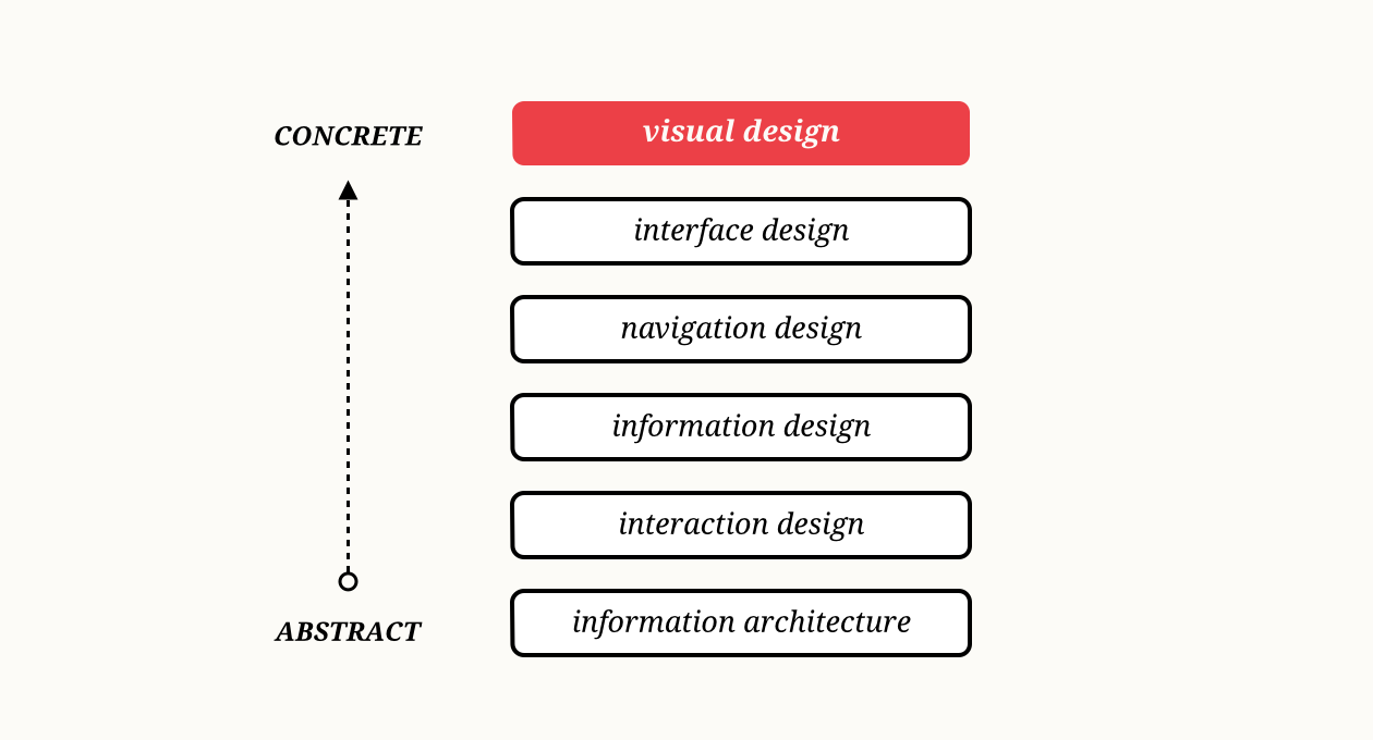
Often, I hear the term “visual design” referred to as a layer that can be dealt with later on in the design process. To de-couple visual design like this is a mistake I see made often, especially when designers are dealing with constraints above and beyond their control. As Jesse James Garrett illustrates it, visual design should support all decisions made previous in the design process. If another designer is working on the aesthetics of your app, be sure to communicate intent and hierarchy of information architecture, information and navigation design decisions.
This is where a style guide becomes pertinent to translate meaning. I find annotating artboards to be extremely useful to transfer intent, leaving a thinking trail behind for other designers and developers accessing your project files. It allows you to document thinking without having to communicate it directly at the time someone else picks up your project.
Communicating Brand Identity
As you begin to design an interface, work toward building a pattern library to reinforce a company’s visual brand identity. Store each decision in a style or brand guide, documenting why specific decisions were reached. Style guides typically consist of artwork, graphic elements, color, and typography. I find it useful to keep this document up to date, as it communicates and stores logic around how and when to incorporate visual design patterns into your company’s product. This can also serve as a central document to be shared with all members of the product team, especially as developers implement the design.
Reinforcing Location & Navigation
Use graphic elements and color to support information architecture and interaction design decisions. While visual design is the surface layer, it should support everything that sits below it. Users should understand where they are in the site, how to get around, and how to perform tasks easily. Use color and typography hierarchy to help maintain spatial awareness, guiding the user intuitively from one place to another. Don’t stray from incorporating your primary brand color throughout your app. Use secondary and tertiary colors to disseminate between features of your app and support clickable items.
Supporting Workflows & Hierarchy
Within each page or screen, you should prioritize primary workflows. Visual design should be applied to support these workflows to help the user easily complete a specific task. As you build your style guide, attribute graphic elements and color to reinforce primary and secondary call to action. It should be clear to the user how to intuitively proceed each step of the way. The less you require your user to think, the better. It’s important to apply constraints by not introducing a new graphical element, color or type treatment unless a new pattern needs to be established. Always leverage existing styles if they support a similar purpose or action.
Share Your Work
After spending time thinking about this, I’m interested to hear other techniques and examples of incorporating visual design into projects. Feel free to share your work or others’ inspiring work in the comments below.
Image Source: ©2000 Jesse James Garrett, The Elements of User Experience

