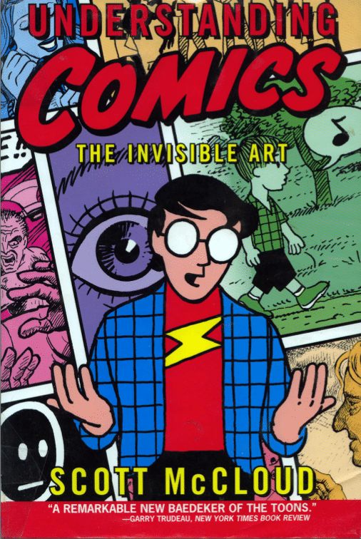
A little over a year ago, I was made aware of Scott McCloud’s book “Understanding Comics”:http://www.amazon.com/Understanding-Comics-The-Invisible-Art/dp/006097625X/ as a source of inspiration and direction for building impactful storyboards during software creation. I acquired a copy of the book shortly after and have read it several times since. It’s good.
If you’ve read the comic that “illustrates Google Chrome’s superiority”:http://www.google.com/googlebooks/chrome/index.html, you’ve seen a sample of Scott’s work and proof that his writing is applicable to effectively telling stories about how an application will improve the future for its users.
Two relatively simple things have stuck with me most:
- There is a range in visual abstraction — from realistic to iconic — and where images fall on that spectrum has a huge effect on the resulting communication.
- In image sequences, distance on the page is roughly equivalent to the passage of time.
h2. Abstraction: Detailed vs. Iconic Images
Realistic, detailed images invite the reader to inspect an object. We tend to dwell on details and think of the image as a thing to be possessed. If shown a detailed image of a guitar, for example, I’ll note the shape of the inlays on the neck, the contours of the headstock, and the grain of the wood on the top and sides. I’ll wish I could touch it and play it to feel the action of the strings and feel how the body reverberates.
On the other hand, simplified images allow the writer to pursue a number of different, but very powerful, responses. An iconic character invites you to assume their identity, or to envision someone else you know in their place. A simplified guitar becomes an extension of the musician using it. Removing some details from a face allows the author to emphasize the details that remain and hopefully better communicate their intended meaning.
By combining iconic and detailed images, we can help a reader see and understand what we mean to communicate. Placing an iconic device in a detailed office environment, for example, might help business stakeholders envision how a loosely-defined product could be used in a specific context. On the other hand, a detailed product placed in a simplified office environment could allow potential customers to imagine that the office on display is their own; the product is meant for them!
h2. Distance & Time
When you’re reading images across a page of framed images, like in a comic book, the frames around the images split up time into discreet chunks. And, generally, the time it takes you to take in a frame or sequence of frames translates to time passing in the story. Other cues can override that sense of time, like text calling out explicit times, but distance is an important way to control the perceived length of time passing in your story.
There are a handful of practical methods Scott illustrates for lengthening the passage of time:
1. Duplicating frames in sequence
2. Increasing the space between the frames in a sequence
3. Increasing the size of a frame
4. Removing the border from a frame
If you want to learn more, I highly recommending reading the book. Scott does an incredible job illustrating how to communicate using sequences of images and words.


I completely agree! Scott’s book is amazing. His other books are also eye-opening. Give them a read if you haven’t already.