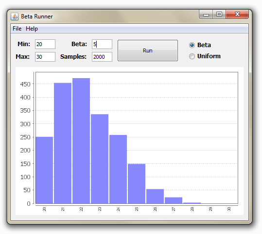
This week one of our customers asked us to create a small, single-purpose tool to help support one of our JRuby desktop applications. The requirement was simple: make it easy to input minimum, maximum, and beta values into a beta distribution function for a few thousand samples and visualize the results.
After a few hours of work we produced this:
Creating this was simple and straightforward thanks to a number of factors.
- We brought in JFreeChart, a powerful, yet easy-to-use charting library for Java.
- We used the beta distribution functionality from the Bayesian Logic (BLOG) Inference Engine project.
- We had prior experience with these two libraries from our JRuby projects.
- The NetBeans visual Swing editor made it trivial to get some simple widgets on the screen.
- As always, JarJar Links allows us to distribute this application as a single jar file.
Factor #1, JFreeChart, is far and away the most significant. Our experiences with JFreeChart are all positive: getting data into a nice looking chart has always been straightforward. The API is relatively easy to work with in that it strikes a good balance between configurability and getting a chart on the screen with minimal hassle.
The next time you’re looking to visualize data in your JRuby or Java application, don’t overlook JFreeChart.