Article summary
When I am exploring a new logo design, I typically start by sketching (to think through some high-level creative directions), then quickly jump into producing digital concepts. The problem is, I’ve often felt limited in my ability to truly explore by playing freely with any font or graphic I please. I’m usually restricted to my personal library — or whatever I can find online as a free resource. For graphics, I’ll sometimes take the plunge and purchase stock art from iStock or subscribe to sites like Pixeden for free templates, textures or UI schemas.
Fortunately, I’ve discovered a new way to convert screenshots into vector graphics — allowing me to create digital logo concepts by playing with fonts and other artifacts before I buy them. This technique has allowed me to produce a vector graphic from any screenshot I grab from a font or stock site. This offers me a way to flexibly work through a larger range of ideas quickly — while maintaining a standard of clean, presentation-worthy logos (even if they are just ideas!). This method especially comes in handy when I need to manipulate font paths to incorporate into a secondary mark or brand element. It’s important to note and track any artifacts you have found along the way, especially ones that require purchasing if they get chosen as part your final design.
Why bother? Font selection in logo design is pivotal to portraying many characteristics about a brand (f.g. credibility, youthfulness, modernity). And those characteristics should ultimately be relevant to the product’s target users. As a software designer, I feel it’s important to be able to produce a range of design assets, carrying the essence of the brand from logo to UI visuals and interactions.
I’ll use a font sample to show how this process works:
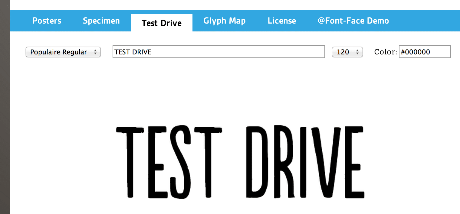
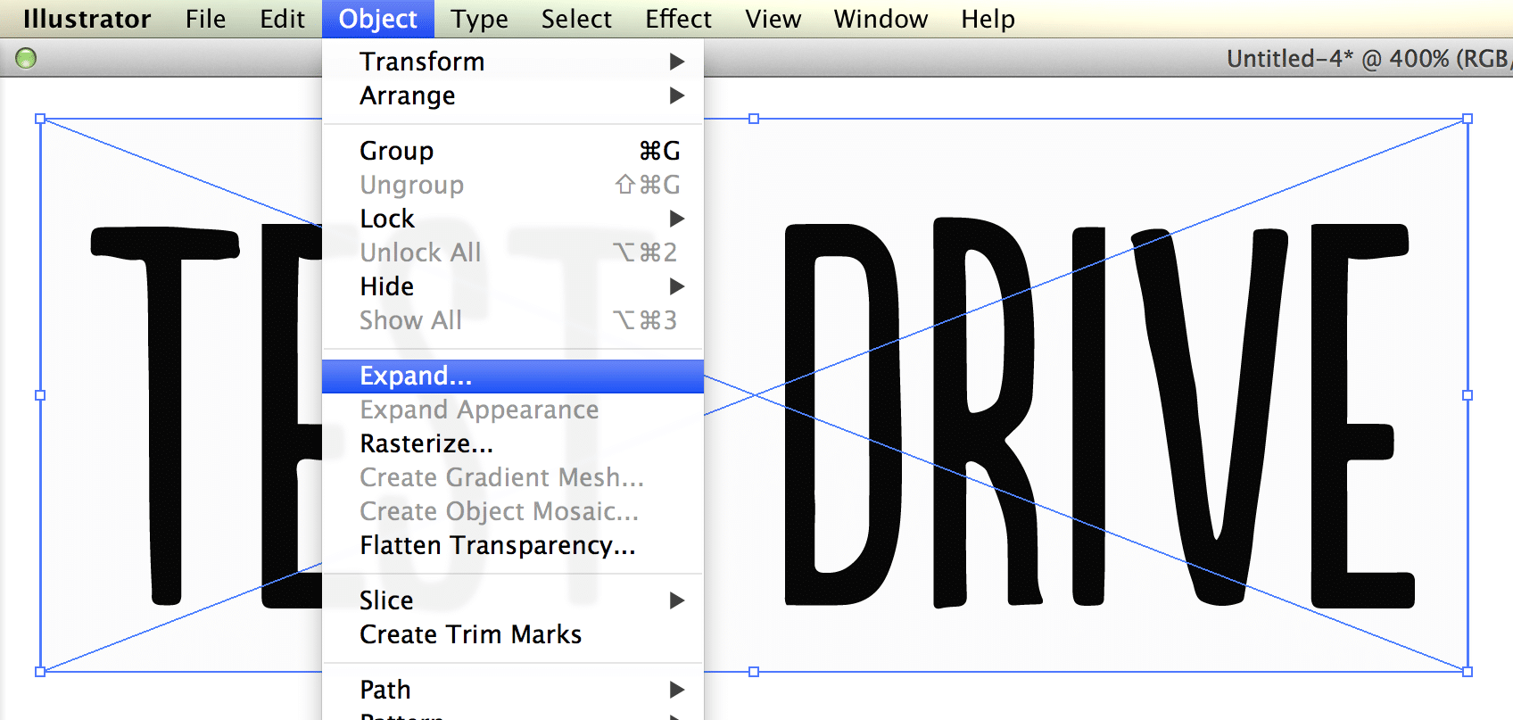
1. Locate an awesome font, and a take your ‘test drive’ screenshot.
Sites like Font Spring provide several design samples to showcase a nice range of use within a given font family. I find this helpful to envision how a font might portray those brand characteristics in a finished design. Most font shops allow you to ‘test drive’ the font prior to purchasing a license. This gets you the ideal screenshot in order to convert this font sample to vector art.
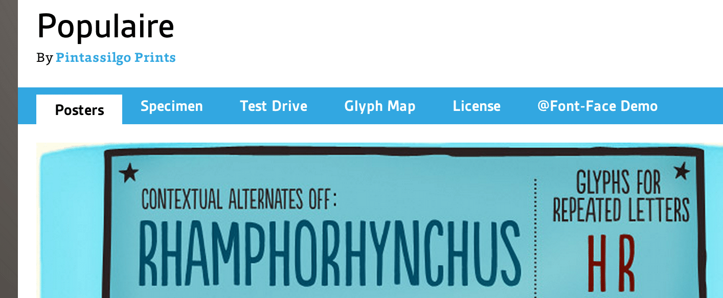
For identity inspiration, take a look at Behance, Dribbble, or Logopond. A few font resources I frequent include My Fonts, Font Spring, Font Squirrel and DaFont.
2. Label screenshot files and bookmark your source links.
When discovering new typefaces and other inspirational artifacts, it’s incredibly important to stay organized. As a creative enthusiast, I get quickly caught up in ideas around what I can do with my new finds. But it’s the worst to find yourself using an outlined character and have no idea which font it came from: “Was it something I had installed or found?” Save yourself the trouble — whatever system works for you, just keep it organized!
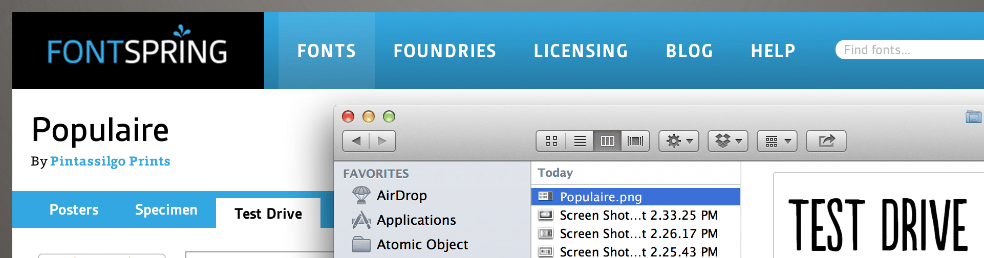
As soon as I take a screenshot, I rename my files with the font names, or sometimes I label the artifact within my Illustrator document. I also tend to capture brand-specific artifacts in some general access folder and project-specific artifacts in their respective project folder.
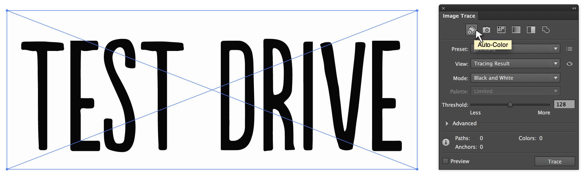
3. Import your screenshot into Illustrator and convert with Image Trace.
After importing your screenshot, launch the Image Trace palette window. Play with the advanced options to fine tune your path, corner, or noise saturation. I usually select the Auto Color option. This gets you most of the way there while still withholding the unique characteristics of the font. Since you’ll still need to purchase the final artwork or license later, you don’t need to sweat the details. Just refine it enough to sell the idea.
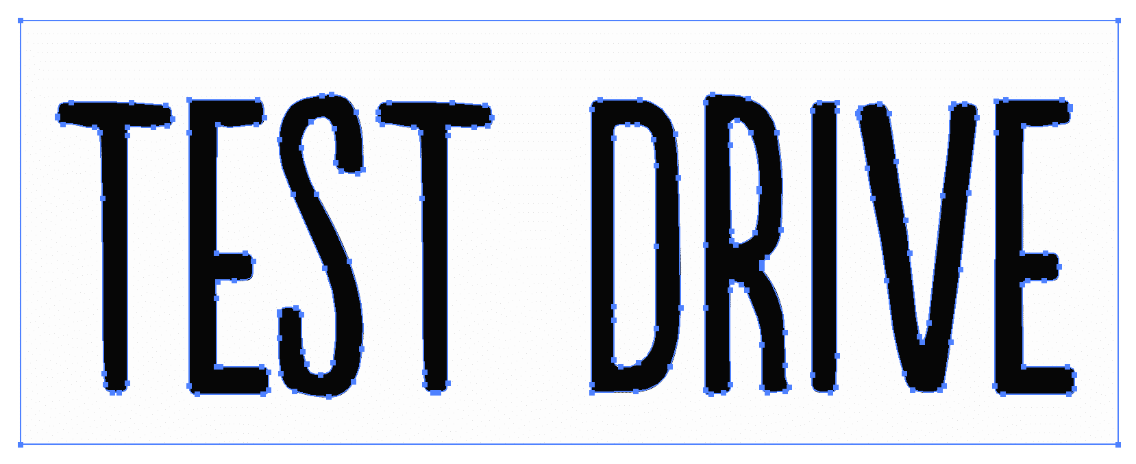
4. Expand and clean up any unnecessary paths.
Once converted, go to Object > Expand to obtain full vector manipulation. At this point, I ungroup all possible layers and delete any unneeded paths. Depending on the clarity of your original screenshot, there may be hidden layers that can be trashed. Using the direct selection tool, you can isolate these individual paths and keep what you want.
5. Don’t forget to make your purchases!
Once you’ve landed on a design direction, be sure to buy the fonts and images you used. As a designer, providing merit to other creatives is something I feel strongly about. I love the social exchange that occurs when you draw inspiration (credibly) from another design or share something you’ve recently learned from your own project. But avoiding purchasing stock art and applying the appropriate licenses or accreditation is not permissible for anyone (non-designers included). So always pay for what you end up using — no exceptions!