In Part 1 and Part 2, I showed you how we structured and styled a decimal picker for mobile devices. In this final part, we’ll set up a basic Ember.js app to showcase the control and then wire up its components.
We’ll begin by starting a fresh Ember project. (If you’ve never used Ember, checkout the excellent Quick Start Guide) by running the following in your shell of choice.
ember new sample
cd sample
npm install ember-cli-version-checker
ember install ember-gestures
ember install ember-cli-sass
ember generate template application
ember generate component decimal-picker
ember generate component fader-control
touch app/styles/app.scss
ember server
Point a web browser at https://localhost:4200, and you should see a blank white page. Let’s fill in the pieces that we built in the last two posts (with a few modifications). Since we’re working with Ember, we can split them up into resuable components. Each component will need its own template (we’re using Handlebars, but you could use most any templating language) and a script.
We’ll start with the faders.
<div class=digit>
  <div class=fader>
    {{input type="range" min=min max=max value=value class=(concat "range-value-" value)}}
    <div class="min-value">{{min}}</div>
    <div class="max-value">{{max}}</div>
  </div>
  <div class=display>
    <span class=value>{{value}}</span>
    {{#if showDecimal}}
        <span class=decimal>.</span>
    {{/if}}
  </div>
</div>
This template is just our <div class=digit> from before, but with a few modifications. We replaced the <input> element from Part 1 with an Ember input helper and replaced each manual value we’d typed in with a data binding ({{min}}, {{max}}, {{value}}, etc.). We also wired up the input’s class so that it updates dynamically any time the control’s value changes. This will engage the .range-value-#{$i} classes we set up last time. Onward to the script!
When we designed the control, we wanted users to be able to input numbers quickly and without conciously thinking about the control. This meant the faders had to be both draggable and tappable. On Android, we were in luck. Android’s stock browser (like most desktop browsers) provides tap and drag behavior by default. But of course, we weren’t targeting just Android.
Enter mobile Safari. For some reason, mobile Safari provides the drag behavior, but only if you start your tap exactly on the thumb. If you tap anywhere else on the track, the control blinks to let you know that it registered your tap, but doesn’t move the thumb at all. This was less than ideal for a thumb-friendly UI, so we rolled up our sleeves and built a custom event handler to provide the behavior we were looking for across all browsers.
We used the Ember Gestures plugin to get easy access to touchStart and touchMove events. Any time the user taps or drags within the fader’s bounding box, we calculate the nearest available notch and snap the thumb to that spot. Thanks to Ember’s two-way data bindings, setting the fader’s value also updates the display and switches to the appropriate track background.
import Ember from 'ember';
import RecognizerMixin from 'ember-gestures/mixins/recognizers';

export default Ember.Component.extend(RecognizerMixin, {
  touchStart(e) {
    this.handleTouchEvents(e);
  },

  touchMove(e) {
    this.handleTouchEvents(e);
  },

  handleTouchEvents: function(e) {
    if (e.target.nodeName === "INPUT") {
      var boundingRect = e.target.getBoundingClientRect();
      var touchPointVertical = e.originalEvent.changedTouches[0].pageY;
      if (touchPointVertical <= boundingRect.bottom && touchPointVertical >= boundingRect.top) {
        var inputHeight = Math.ceil(boundingRect.bottom - boundingRect.top);
        var notches = e.target.max - e.target.min;
        var notchSize = Math.ceil(inputHeight / notches);
        var distanceFromTopOfInput = touchPointVertical - Math.ceil(boundingRect.top);
        var notchesFromTop = distanceFromTopOfInput / notchSize;
        var notchesFromBottom = Math.round(notches - notchesFromTop);
        if (notchesFromBottom > e.target.max) {
          notchesFromBottom = e.target.max;
        }
        if (notchesFromBottom < e.target.min) {
          notchesFromBottom = e.target.min;
        }
        this.set('value', notchesFromBottom);
        e.preventDefault();
      }
    }
  }
});
Now that we have our fader component set up, it’s time to put a few of them together into the broader decimal picker. We’ll do that with a decimal-picker component. Since we only needed three digits for this particular control, we spelled out the names of the units, tenths, and hundredths values, but you could easily make this component generic enough to support any number of decimal places.
<div class="decimal-picker">
  {{fader-control value=units
                  min=min.units
                  max=max.units
                  showDecimal=true}}
  {{fader-control value=tenths
                  min=min.tenths
                  max=max.tenths}}
  {{fader-control value=hundredths
                  min=min.hundredths
                  max=max.hundredths}}
</div>
<div class="buttons">
  <button class="done" {{action 'done'}}>DONE</button>
  <button class="clear" {{action 'clear'}}>CLEAR</button>
</div>
Here we include three fader-control components with appropriate data bindings and wire up our buttons to trigger actions that we’ll define in our component’s script.
import Ember from 'ember';
import RecognizerMixin from 'ember-gestures/mixins/recognizers';

export default Ember.Component.extend(RecognizerMixin, {
  // Since these properties are passed in when we use our component, we don't
  // technically need them here. I like to include them so that when I'm looking
  // at a component's script by itself, I know which properties I can use
  // without having to dig around in the template.
  units: 0,
  tenths: 0,
  hundredths: 0,
  faders: 3,

  minimum: 0.00,
  min: Ember.computed('minimum', function() {
    return this.decimalToDigits(this.get('minimum'));
  }),

  maximum: 2.99,
  max: Ember.computed('maximum', function() {
    return this.decimalToDigits(this.get('maximum'));
  }),

  combinedValue: Ember.computed('units', 'tenths', 'hundredths', 'faders', function() {
    let units = parseInt(this.get('units'));
    let tenths = parseInt(this.get('tenths')) / 10;
    let hundredths = parseInt(this.get('hundredths')) / 100;
    let denominator = 100;
    let val = units + tenths + hundredths;
    return Math.round(val * denominator) / denominator;
  }),

  init: function() {
    this._super();
    this.setProperties(this.decimalToDigits(this.get('initialValue')));
  },

  touchMove(e) {
    // Since we're handling touch events ourselves in the fader control, we don't want
    // to process touchMove events at this level.
    e.preventDefault();
  },

  decimalToDigits: function(decimal) {
    let decimalValue = Number(decimal).toFixed(this.get('faders') - 1);  // A string like "2.99"
    return {
      units: decimalValue[0],
      tenths: decimalValue[2],
      hundredths: decimalValue[3]
    };
  },

  actions: {
    done: function() {
      alert(this.get('combinedValue'));
    },

    clear: function() {
      this.setProperties(this.decimalToDigits(this.get('initialValue')));
    },
  }
});
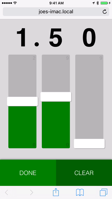
Finally, we’ll use our component in application.hbs…
{{decimal-picker faders=3
                 initialValue=1.50
                 minimum=0.00
                 maximum=2.99}}
…and copy our finished stylesheet from last time into app.scss.
* {
  box-sizing: border-box;  // always
}

html, body {
  background-color: #ccc;
  font-size: 8px;
}

input[type="range"] {
  background: transparent;
  box-shadow: none;
  border-style: none;
  margin: 0;
  padding: 0;

  &,
  &::-webkit-slider-runnable-track,
  &::-webkit-slider-thumb {
    -webkit-appearance: none;
  }
}

$fader-width: 50vh;
$fader-height: 25vw;
$gutter: 5vw;
$thumb-width: $fader-width * 0.1;

input[type="range"] {
  width: $fader-width;
  &::-webkit-slider-thumb {
    position: relative;
    border-style: none;
    width: $thumb-width;
    z-index: 2;
    height: $fader-height * 1.1;
    margin-top: $fader-height * -0.05;
    border-radius: 4px;
    background: white;
    box-shadow: -1px 1px 2.5px #888;
  }

  &::-webkit-slider-runnable-track {
    position: relative;
    border-style: none;
    width: $fader-width;
    height: $fader-height;
    border-radius: 4px;
  }
}

@mixin fader-backgrounds($width, $min, $max) {
  $unit-width: $width / ($max - $min);
  @for $i from $min through $max {
    &.range-value-#{$i}::-webkit-slider-runnable-track {
      background-size: ($i - $min) * $unit-width 100%;
    }
  }
}

input[type="range"]::-webkit-slider-runnable-track {
  $fill: linear-gradient(green, green) no-repeat;
  $background: #aaa;
  background: $fill, $background;
}

input[type="range"][min="0"][max="9"] {
  @include fader-backgrounds($width: $fader-width, $min: 0, $max: 9);
}

input[type="range"][min="0"][max="2"] {
  @include fader-backgrounds($width: $fader-width, $min: 0, $max: 2);
}

$button-height: 88px;
$bottom-margin: 38px;

.decimal-picker {
  $container-height: 100vw;
  $faders: 3;
  bottom: ($container-height / -2);
  left: ($container-height / 2);
  height: $container-height;
  padding-top: $gutter/2;
  position: absolute;
  margin: 0;
  margin-top: 4rem;
  margin-bottom: $button-height + $bottom-margin;
  transform: rotate(270deg);
  transform-origin: 0 50%;
  width: 75vh;
  -webkit-touch-callout:none;
  -webkit-user-select:none;
  user-select:none;
  -webkit-tap-highlight-color:rgba(0,0,0,0);
}

.decimal {
  position: absolute;
  right: -1.5rem;
  font-family: serif;
}

.fader {
  position: relative;
  height: $fader-height;
  width: $fader-width;
  float: left;
}

.digit {
  float: left;
  margin-top: $gutter;
}

.display {
  height: $fader-height;
  width: $fader-height;
  margin-left: $gutter/2;
  line-height: $fader-height;
  font-size: $fader-height - 2vw;
  transform: rotate(90deg);
  text-align: center;
  float: left;
  font-weight: bold;
  font-family: sans-serif;
}

.max-value, .min-value {
  position: absolute;
  transform: rotate(90deg);
  -webkit-transform: rotate(90deg);
  font-family: sans-serif;
  font-size: 2em;
  bottom: -0.125em;
  z-index: 1;
}

.max-value {
  right: 0.4em;
  color: darken(#ccc, 20%);
}

.min-value {
  left: 0.5em;
  color: darken(green, 5%);
}

.buttons {
  position: absolute;
  bottom: 0;
  left: 0;
  width: 100%;
  box-shadow: 0px -2.5px 5px #888;
}

button {
  height: $button-height;
  width: 50%;
  float: left;
  border: 0;
  font-size: 2.5em;
  color: white;
  font-weight: 100;
}

.done {
  background: green;
}

.clear {
  background: darken(green, 5%);
}
And that’s it! We now have a fast, accessible, user-friendly control that we can include in our mobile app. You can find the source code for this project on Github.