
Ember Power Select is an easy-to-use, flexible and powerful component that I recently used to tackle some challenging front-end feature designs. My current project is a web portal where users can view and filter reports based on a large combination of different criteria. A recent project feature allows users to create filter combinations, save them, delete them, and name (and rename) them….all within a single dropdown.
At the time, we were using ember-select2, which was deprecated as of August 2016. It turned out that ember-select2 wasn’t powerful enough for the dropdown that we needed, so we upgraded to its successor, Power Select.
Getting Started with Ember Power Select
First, you’ll need to install Ember Power Select. Do this by running this command within your project directory:
$ ember install ember-power-select
Basic Power Select Dropdowns
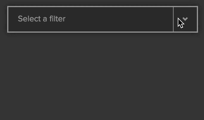
In the most basic case, Power Select is quite a bit like ember-select2, with a few name changes. The example shown below allows someone to pick from a list of filters.
{{#power-select
options=filterOptions
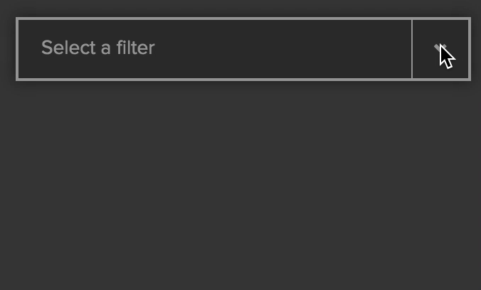
placeholder=“Select a filter"
selected=selectedFilter
searchEnabled=false
onchange=(action (mut selectedFilter))
as |filter| }}
// the content here will be rendered as a row for each option provided
{{filter.name}}
{{/power-select}}
// Controller .js file
import Ember from 'ember';
export default Ember.Controller.extend({
filterOptions: [
{ name: "Default filter" },
{ name: "High-Severity Filter" },
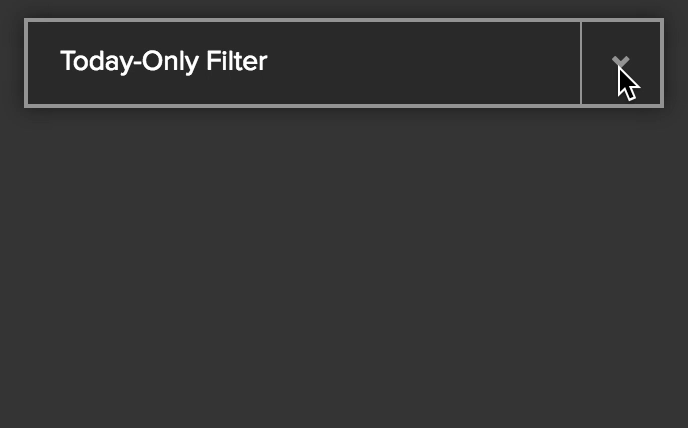
{ name: "Today-Only Filter" }
]
});
Let’s go through the options on the Power Select component.
optionsis the list of options to choose from. This will be provided as the block param|filter|.placeholderis the placeholder text that will be shown before a user chooses an option.searchEnabledallows you to turn on or off the search box within the expanded dropdown view (this is enabled by default).onChangeassigns the action that will happen when a new option is chosen. Here, we are using(action (mut selectedFilter))which will mutate selectedFilter with each change. There are more action options that can be enabled, but onChange is required. See the bottom of this page for the additional options.selectedstores the value of whatever option is chosen. In this example, if I select “Default Filter” as the selected filter, that object will be bound to|filter|.
Important: if you render the selected item here (rather than in a separate component, as shown later in this post), then the keys within the options must match the keys within the selected item. In this example, {{filter.name}} will render each filterOption as {{filterOption.name}} in the expanded dropdown view, and the selectedFilter as {{selectedFilter.name}} in the closed dropdown view.
Why wouldn’t these objects be the same, you ask? Because Ember Power Select lets you fully customize what actions (and assignments) happen on a selection.
Instead of using the mut syntax shown above, you can declare a custom action to be used onChange. The block param |filter| is automatically provided as a parameter to whatever function you declare.
  {{#power-select
    options=filterOptions
    placeholder="Select a filter"
    selected=selectedFilter
    searchEnabled=false
    onchange=(action "setFilterSelection")
    as |filter| }}
    {{filter.name}}
  {{/power-select}}
// Controller .js file
import Ember from 'ember';
export default Ember.Controller.extend({

  filterOptions: [
    { name: "Default filter" },
    { name: "High-Severity Filter" },
    { name: "Today-Only Filter" }
  ],

  actions: {
    setFilterSelection(filter) {
      // this has the same functionality as the previous block
      this.set(‘selectedFilter’, filter);

      /* If I used this line instead, my HBS file would not render correctly
         because I would be attempting to access the name value off of a string */
      // this.set('selectedFilter', filter.name)

      //...do other interesting things here
    }
  }
});
Adding Items and Actions within Expanded Dropdown Rows
Let’s add some icons within our dropdown. First, I’ll add an icon for each row into the filterOptions array in my .js file. Then I’ll add an <img> tag within the Power Select block.
  {{#power-select
    options=filterOptions
    placeholder="Select a filter"
    selected=selectedFilter
    searchEnabled=false
    onchange=(action (mut selectedFilter))
    as |filter| }}
      {{filter.name}}
      <img src="{{filter.icon}}" style="margin: auto 1rem;"/>
  {{/power-select}}
// Controller .js file
import Ember from 'ember';
export default Ember.Controller.extend({

  filterOptions: [
     { name: "Default filter", icon: "report-icon.png" },
     { name: "High-Severity Filter", icon: "alert-icon.png" },
     { name: "Today-Only Filter", icon: "clock-icon.png" }
  ]
});
We can also add a button to the Handlebars file, and then connect that to a ‘deleteFilter’ action in the .js file that will remove options from the dropdown in real time.
{{#power-select
  options=filterOptions
  placeholder="Select a filter"
  selected=selectedFilter
  searchEnabled=false
  onchange=(action (mut selectedFilter))
  as |filter|
}}
  <div style="display:flex;">
    {{filter.name}}
    // the extra attributes on this dev prevent power-select from grabbing a
    // click of the button as a selection of the item within which it is rendered
    <div data-option-index="-1" aria-disabled=true>
      <{{action 'deleteFilter' filter}}">Delete</button>
    </div>
  </div>
{{/power-select}}
// Controller .js file
import Ember from 'ember';
export default Ember.Controller.extend({
  filterOptions: [
    { name: "Default filter" },
    { name: "High-Severity Filter" },
    { name: "Today-Only Filter" }
  ],

  actions: {
    deleteFilter(filter) {
      var removeItem = this.get('filterOptions').findBy('name', filter.name);
      this.get('filterOptions').removeObject(removeItem);
    }
  }
});
Rendering Custom Components within the Dropdown Frame Itself
The dropdown row’s delete buttons let us remove filters, but what if we want to rename filters? Because of various constraints, the dropdown area has to double as an entry field that would let you edit the name in place.
What we’re doing with the closed dropdown view here is very different from the open dropdown rows. As such, we’ll want to use a special component view for the selected option, rather than using the block template we’ve been using so far. I’ll call the selected option component “dropdown-edit,” and pass that into the Power Select block as the selectedItemComponent option. The new syntax looks like this:
{{#power-select
selected=chosenFilter
options=filterExample
onchange=(action "changeFilter")
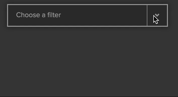
placeholder="Choose a filter"
selectedItemComponent="dropdown-edit"
searchEnabled=false
onkeydown=(action "preventSpaceBar")
as |filter| }}
// Now ONLY dropdown row items will be displayed using this code
<div style="display: flex; justify-content: space-between;">
{{filter.name}}
// the extra attributes on this dev prevent power-select from grabbing a click of the button as a selection of the item within which it is rendered
<div data-option-index="-1" aria-disabled=true>
<button {{action 'deleteFilter' filter}}>Delete</button>
</div>
</div>
{{/power-select}}
// Controller .js file
import Ember from 'ember';
export default Ember.Controller.extend({
  filterOptions: [
    { name: "Default filter" },
    { name: "High-Severity Filter" },
    { name: "Today-Only Filter" }
  ],
  actions: {
    deleteFilter(filter) {
      var removeItem = this.get('filterOptions').findBy('name', filter.name);
      this.get('filterOptions').removeObject(removeItem);
    },

    changeFilter(filter) {
      this.set('chosenFilter', filter);
    },
    preventSpaceBar(select, e) {
      if (e.keyCode === 32) {
        return false;
      }
    }
  }
});
Notes
- Returning false from the
onkeydownoption’s action (preventSpaceBar, in our case) forces the dropdown menu to stay open. Removing this would cause thedeleteFilteraction to still happen, but the dropdown would be closed immediately, forcing the user to open it to see if the filter was, in fact, deleted. - The
data-option-index="-1" aria-disabled=truelines on the button div are an unfortunate but required bit of code to keep Power Select from recognizing the button click as a selection of the overall dropdown row that the button is in.
My dropdown-edit component renders one of two views: either just the filter name (and an edit icon), as in the previous cases, or an input box. There’s a bit of CSS to make the styling look nice, which I won’t include here. The main goal of the CSS here is to adjust the spacing to make the input box seamlessly overlap the dropdown box.
Note: To set the styling on all Power Select components, you can use the pre-defined variables provided here.
{{#if editMode}}
  {{input value=context.attrs.select.selected.name}}
  <div>
    <img src="pen-icon-gray" {{action 'toggleEditMode'}} />
  </div>
{{else}}
  <div>
    {{context.attrs.select.selected.name}}
  </div>
  <div>
    <img src="pen-icon-gray" {{action 'toggleEditMode'}} />
  </div>
{{/if}}
// dropdown-edit component .js file
import Ember from 'ember';
const ENTER = 13;

export default Ember.Component.extend({
  editMode: false,

  actions: {
    toggleEditMode() {
      this.toggleProperty('editMode');
    }
  }
});
Et voilà!
Hey! I just found this and it’s a nice creative example of a pretty customised power-select. I just wanted to highlight a slightly more idiomatic approach to allow the buttons in the options to be clickable without selecting that option.
Instead of adding “data-option-index=”-1″ aria-disabled=true” to trick ember-power-select, the simplest approach is to prevent the event’s propagation so it never bubbles and ember-power-select doesn’t receives it.
“`
deleteFilter(filter, e) {
e.stopPropagation();
var removeItem = this.get(‘filterOptions’).findBy(‘name’, filter.name);
this.get(‘filterOptions’).removeObject(removeItem);
}
“`