
Chart.js is a JavaScript tool which allows you to generate charts for a webpage. It is an approachable way to create beautiful charts with little effort. Due to the good examples and solid documentation, it won’t take long to get your data on the page.
It also seems to be widely adopted. You can find a lot of posts about it online, which will be helpful if you run into challenges along the way. This example will get you up and running with a simple line chart.
Getting Started with Chart.js
HTML5 Boilerplate is a good place to start a project like this since it sets up a basic HTML site. Feel free to strip out all of the unneeded code. Include the JS via a CDN for Chart.js at the bottom of the body in the HTML file.
<script src="https://cdnjs.cloudflare.com/ajax/libs/Chart.js/2.7.3/Chart.bundle.js"></script>Validate that the JavaScript file was loaded. (You can do this by confirming that the JavaScript file is available via the resources tab in the browser’s developer tools when you load the page.) Now you should have all the tools set up to build your first chart.
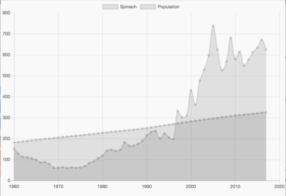
For this example, I gathered some free data from the government about the supply of fresh spinach in the US. Turning that into a chart requires four steps:
- Prepare the data.
- Set the chart options.
- Set chart location.
- Generate the chart.
1. Prepare the Data
This step takes a bit of forethought. In this example, the spinach data is in an Excel file. For the chart to work, you need to format the data from the Excel cells into an array of objects, each with an X,Y coordinate that can be plotted on the chart. This can be done programmatically, but for the simplicity of the demo, you can use a text editor to accomplish it more quickly.
To compare the use of spinach to the US population over time, you will chart two lines. This will require generating two datasets, one for the year vs. population data and another for the year vs. spinach data. Each data point in the set is an X,Y coordinate, and together, they form an array of objects. For this chart, X is the year, and Y is the value. As each line will be charted against the year, both data sets will have the same X coordinate.
One way to create the array of objects is to copy and paste the data from Excel. To do this, place two of the desired columns next to each other, selecting the cells and copy/pasting them into a text editor.
Let’s begin with the year and population data, using the multi-cursor feature to add the object data structure. To do this, find the space/tab that separates the two values. Then find all instances of that space, use option + enter to place a cursor at that location, and then use the arrow keys to turn the document into objects that will be used as inputs for the dataset object.

At this point, the data should be formatted and ready to add to the JavaScript file. Next, you can create and assign each of the arrays of X,Y coordinates to a variable to make the code simpler to manage.
var populationData = [
  {
    x: 1960,
    y: 180.671
  },{
    x: 1961,
    y: 183.691
  },
  ...
];

var spinachData = [
  {
    x: 1960,
    y: 152.3
  },{
    x: 1961,
    y: 128.0
  },
  ...
];
2. Set the Chart Options
Now you can prepare the options for the chart. Think of this as creating a recipe. You’ll be gathering ingredients such as which style to display the data, what labels to give each data set, which data to use, etc. The options are numerous.
For this chart, you’re going to create a line graph with two lines: Spinach & Population. Make sure the scale of the X axis is set to “linear” to properly display the data. Now the recipe should be ready to go.
var options = {
  type: 'line',
  data: {
    datasets: [{
      label: 'Spinach',
      data: spinachData,
    },{
      label: 'Population',
      data: populationData,
    }],
  },
  options: {
    scales: {
      xAxes: [{
        type: 'linear',
      }],
    }
  }
}
3. Set Chart Location
At this point, you can create a div DOM element with a unique ID. The ID name will be used to find the element in the DOM, and the JavaScript will replace that element with the chart after it is created.
<canvas id="project-chart" height="400" width="600"></canvas>Using JavaScript, find the element in the DOM with id="project-chart", and store it in a variable ctx.
var ctx = document.getElementById('project-chart').getContext('2d');
To generate the chart, add the code below. This will take the chart options above, generate the chart, and place it in the DOM. When you load the webpage, the chart should appear.
var myChart = new Chart(ctx, options);
4. Generate the Chart
Finally, you need to create an array of objects that you can feed into charts to display the data. For this example, you can create two data sets that will be displayed on the same chart. These will show the population over time, along with the total supply of spinach by the year.
Looking Forward
This example is just the beginning of what you can do with Chart.js. Try customizing the appearance of the chart by adding color, shapes, or custom legends. Create interactivity in the chart when hovering or clicking on points. Modify the scale of the axis, the placement of the legend, or create a custom legend. There’s a lot to explore…