Article summary
Dropdown lists are common user interface components. Chances are, you interact with them frequently—whether you’re entering your address in a form or selecting the color of a sweater when online shopping. Let’s chat about the good and not-so-good aspects of dropdown lists, and when you should avoid them altogether.
The Good
- They conserve space.
- They’re flexible.
- They allow us to collect input in a standardized way.
The Not-So-Good
- They hide available options behind an additional click.
- They can create issues with scrolling if the lists are too large.
- They can get cut off on mobile devices, making interacting with them frustrating and sometimes impossible.
When to Avoid Them
Now that we know some of the pros and cons of utilizing dropdown lists, let’s talk about the scenarios where you should avoid dropdown lists and how to choose a better alternative.
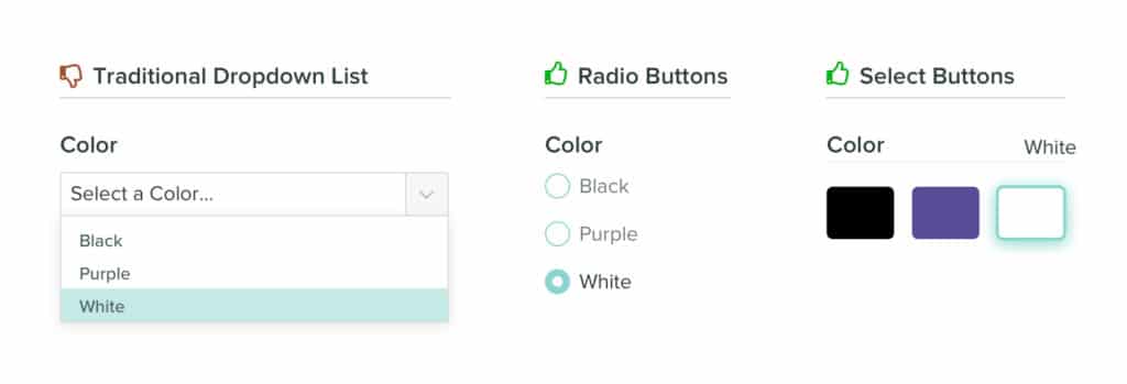
Do not use a dropdown if your list of options contains less than five items.
A list that contains one to five items does not need to be hidden behind a dropdown list. In this situation, opt for radio or select buttons instead. This allows all possible options to be front-and-center for the user. It reduces a click, while making it easy to see which choice has been selected out of all the available options.
(If you’d like some tips on how to best implement radio buttons, I wrote about that, too.)
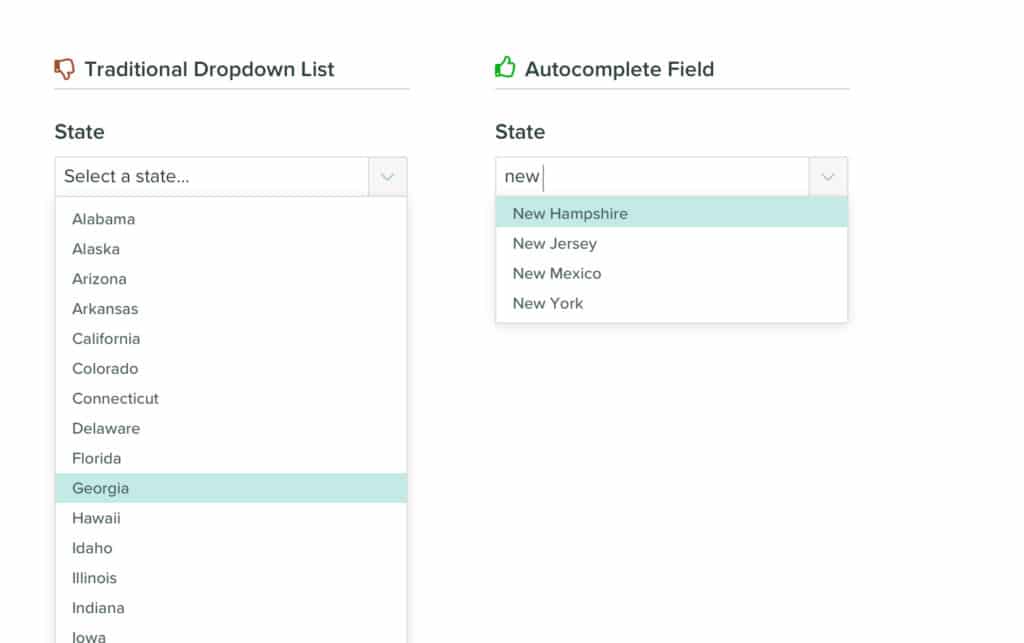
Do not use a dropdown if your list of options contains more than 10 items.
A choice of more than 10 options can cause issues when implemented into a standard dropdown list. Users will be required to keep scrolling to see all possible options. Long lists like these can also pose issues on mobile devices, cutting off a portion of the available options.
A better alternative here would be to implement an autocomplete field. This allows the height of the dropdown box to remain compact, reducing the potential for scrolling issues. It also provides users with a quick way to locate their selection. This method works great for situations where the user already knows their response (like entering their state or age).

Do not use a dropdown if the action is intended to turn a feature on or off.
This one might sound obvious, but I’ve encountered it many times. If your intention is to provide users with a way to turn a feature on or off, a dropdown is not the best option. Instead, opt for a toggle or switch. They make the current state clear, and changing the state requires less effort than clicking a dropdown and selecting the desired outcome.

What About Exceptions?
Design is squishy. There’s almost always an exception to the “rule.” You may find yourself in a situation where you have limited screen real estate, 11 options in a list of items, and a case that’s not ideal for an autocomplete field. In that particular scenario, a dropdown list might be the best possible option.
Take the above “rules” with a grain of salt. Use them as a guiding light, but do your research and listen to your users to determine the best UX patterns for the job.