I love Sketch — it’s my go-to for wireframes, high-fidelity mockups, and even prototyping. I’ve become as proficient as I can, including mastering nested symbols and utilizing JSON data connections to populate real data into static designs.
But I recently started helping a client’s design team build out their design system. The problem? They exclusively use Figma. I had never touched it, but I needed to learn fast. Sketch’s workspace has become an industry standard; it’s often imitated by competitors. And even though Figma looks a little like Sketch, it’s different in many ways.
Symbols vs. Components
Making a symbol in Sketch sends it to the dedicated Symbol Layer, the one place to manipulate the symbol. But in Figma, components are created inline. Want to make a copy of a component? Figma creates an instance of it, which you then have to detach and then create as a new component. This was confusing the first couple of times around, but now it’s not a big deal.
Unfamiliar Taxonomy & Iconography
Figma introduced some new labels and iconography within its UI. Notably, they did away with Art Boards and are instead calling them Frames. I’m assuming the change has to do with differences in behavior, including the ability to nest frames, which is a nice feature.
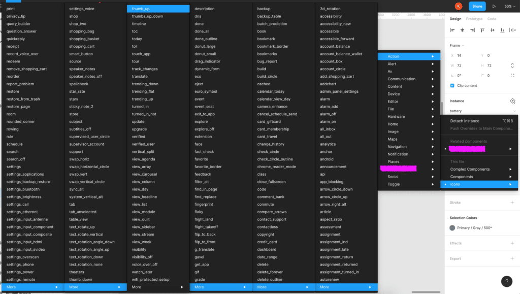
One of the major gripes that I’ve had with Figma is the imagery they use for icons. For example:
- I’m used to seeing “Groups” depicted as a folder, but Figma elected to use a rectangle marquee.
- Both “Components” and “Instances” use purple diamond shapes, and they’re very similar to each other.
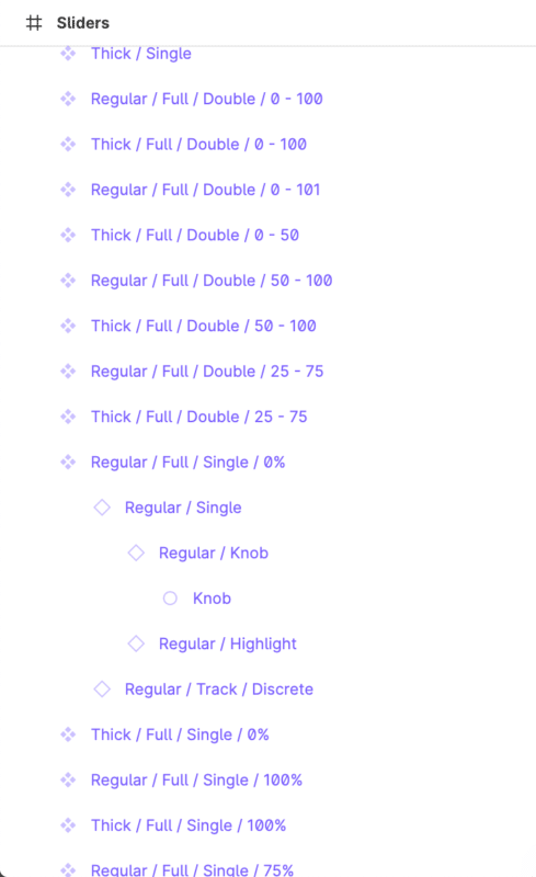
Layer UI Cognitive Overload
While the Figma UI is clean and sharp, I definitely find it challenging to use. The expand carets in the layers panel only appear when you mouse over them. And the delineation between Art Boards (or Frames) is hard to tell at a glance. Without mousing over the panel, it’s much harder to quickly decipher what’s going on:
The power of using symbols and components, especially complex/configurable ones, is utilizing the overrides — such as changing out the icon for a button. But finding the exact icon you want is incredibly burdensome in Figma’s UI, and there’s no ability to search.
Auto Layout Is Powerful
Okay, on to Auto Layout, my favorite feature (and the most annoying to master). It’s been a cornerstone of most of the components I’ve been creating. Figuring out its nuances was frustrating until I discovered nested Auto Layouts!
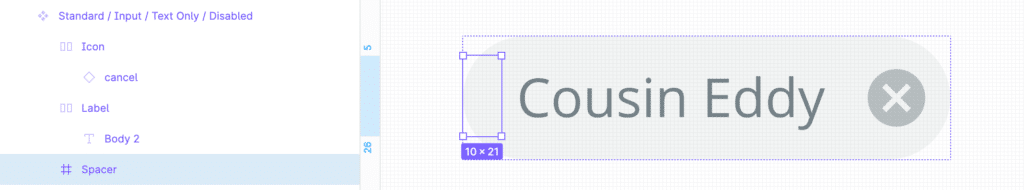
The major problem with Auto Layout is the universal spacing between all of the elements. This works well for creating a simple button, but not complex components. Eight pixels all around doesn’t necessarily work when you’re stacking an image on top of a headline on top of a subhead on top of a date/time. That’s when I figured out using an invisible spacer element inside of a group gives me pixel-perfect spacing!
The ability to hide a layer in an instance of a component is also really cool. Even cooler is that doing this when using an Auto Layout will slide the rest of the elements into a new position.
I Want to Use it More
I’m using a myriad of tools right now, including both Sketch and Figma. And while I thought Sketch was my forever, I am really liking what Figma can offer, especially in terms of design systems.
I plan to release more blog posts on Figma in the future, highlighting some of the tips, tricks, and hacks I’ve discovered along the way. In the meantime, if there is a super interesting tidbit about Figma that you think I should be aware of, let me know in the comments below, or send me an email. I’d love to chat!