
React Grid System is a handy tool that provides a responsive grid layout for React applications inspired by Bootstrap. The library allows for user configuration, including letting you set breakpoints, total columns, and even the maximum screen size.
Grid Configuration
By default, React Grid System sets up the grid with the following configuration:
{
  gridColumns: 12,
  gutterWidth: 30,
  containerWidths: [540, 740, 960, 1140, 1540],
  breakpoints: [576, 768, 992, 1200, 1600],
  maxScreenClass: "xxl",
  defaultScreenClass: "xxl",
}
These properties can be updated by providing new values to the setConfiguration function at app start up.
setConfiguration({ gridColumns: 24 });
Containers, Rows, and Columns
To utilize the grid, we’ll need to first create a container. This is just a wrapper around the grid to which we can add rows and columns. Rows are how components are placed along the vertical axis. Similarly, columns define how content fills in along the horizontal axis. Both rows and columns can be nested within each other. This means you can have multiple smaller grids within the larger container grid.
Below is an example of how to implement a simple grid.
<Container>
  <Row>
    <Col>Column 1</Col>
  </Row>
</Container>
Of course, this grid only contains a single column, so it will just fill up the entire width of the container. If we were to add another column, the two columns will share the space equally.
<Container>
  <Row>
    <Col>Column 1</Col>
    <Col>Column 2</Col>
 </Row>
</Container>
But what if we want columns of different widths? We can define that as a property of the column.
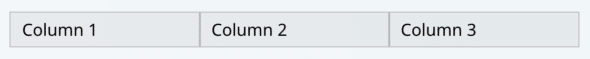
<Container>
 <Row>
    <Col sm={4}>
      Column 1
    </Col>
    <Col sm={1}>
      Column 2
    </Col>
    <Col sm={7}>
      Column 3
    </Col>
  </Row>
</Container>
Note the property name of “sm”. This is because it defines the number of columns to take up for small screen sizes. Available sizes include “xs”, “sm”, “md”, “lg”, “xl”, and “xxl”. However, if only one of these is defined, that will be the number of columns the Col will take up at any screen size. I’ll discuss defining behavior for different screen sizes in the next section.
Controlling Behavior at Different Screen Sizes
Using React Grid System is especially helpful with making web apps that are both desktop- and mobile-friendly. To accomplish this, React Grid System lets you set how many columns are taken up by various elements on different screen sizes.
From the example above, we can define the number of columns for smaller screens vs. larger screens.
<Container>
 <Row>
    <Col sm={4} md={4}>
      Column 1
    </Col>
    <Col sm={4} md={1}>
      Column 2
    </Col>
    <Col sm={4} md={7}>
      Column 3
    </Col>
  </Row>
</Container>
The “md” property will define the number of columns to take up for screens of size medium or larger.
The “sm” property defines the same for small and extra small screens.
Styles for Different Screen Sizes
Adjusting the width of components based on screen sizes is possible with React Grid System, but so is completely changing styling. To do this, we can utilize the useScreenClass hook. This hook provides us with the current screen size (“xs”, “sm”, “md”, etc.).
const screenClass = useScreenClass();
return (
  <div
    style={{
      backgroundColor: ["sm", "xs"].includes(screenClass)
        ? "yellow"
        : "teal",
    }}
  >
    Hello World
  </div>
);
This code updates the background to yellow if the screen class is small or extra small. On all other screen sizes, it will appear as teal.
Rather than relying on listing out each screen class for styles. It can be useful to create a helper method to classify screen types for you.
export type ScreenType = "desktop" | "tablet" | “mobile";
const tabletScreenSizes = ["md"];
const mobileScreenSizes = ["xs", “sm"];

export function getScreenType(screenClass: string): ScreenType {
  if (mobileScreenSizes.includes(screenClass)) {
    return "mobile";
  } else if (tabletScreenSizes.includes(screenClass)) {
    return "tablet";
  }

  return "desktop";
}
This provides us with definitions for screen types that we can use throughout the codebase.
Using React Grid System for Responsive Web Apps
Utilizing tools like React Grid System helps us to effectively create and style responsive web apps.