
Article summary
Collapses are a useful UI design pattern that allows content to be hidden or revealed based on user interaction. They play a crucial role in improving the user experience by organizing and managing large amounts of content within an application or website.
A simple, fixed-height collapse is relatively easy to implement in React — just create a container with overflow: hidden, add some CSS transitions, and programmatically update the height of the container based on an isExpanded state. It becomes tricky, however, when the contents of the container have a dynamic height that the container must scale to.
While there are libraries out there that solve this problem, in many cases, you can reduce the size of JavaScript sent to the client by building your own homegrown solution. In this post, you’ll learn how to build your own lightweight collapse component that responds to the height of its contents.
The Problem
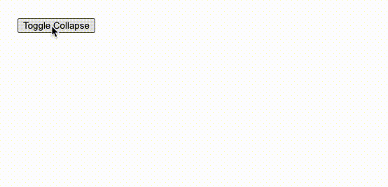
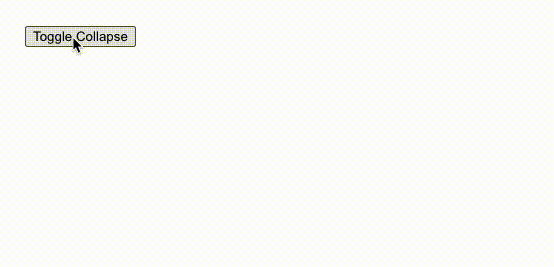
Let’s illustrate the problem with an example. The following code renders a simple collapse that, when expanded, has its height set to 100px:
export const App: FC = () => {
  const [isExpanded, setIsExpanded] = useState(false);
  const toggleIsExpanded = useCallback(() => {
    setIsExpanded((isExpanded) => !isExpanded);
  }, []);

  return (
    <>
      <button onClick={toggleIsExpanded}>Toggle Collapse</button>
      <div
        className="collapse"
        style={{ height: isExpanded ? "100px" : "0px" }}
      >
        Lorem ipsum dolor sit amet...
      </div>
    </>
  );
};
.collapse {
  transition-property: height;
  transition-duration: 200ms;
  overflow: hidden;
  background-color: #cccccc;
}
In the browser, this ends up looking something like this:
That’s okay, but not great. If our content is longer, it gets cut off:
Okay, no problem — let’s just set the height to auto instead of 100px:

The height is correct, but we lost our transition! It turns out that CSS doesn’t support transitioning on auto values. So what can we do?
Potential Solutions
A quick Google search reveals some potential solutions:
Animating on max-height Instead
One option involves setting height: auto on the content while transitioning its max-height between 0 and some arbitrarily large value (but not auto, for the same reason as above!). This option works fine when the max height is known but, like our original example, fails when the content height is dynamic.
Using the transform Property to Animate Height
It’s also possible to set the transition-property to transform and update the height using scaleY. While easy to implement, this option has major drawbacks:
- The content warps as it transitions into view.
- Content following the collapse doesn’t move with the height of the collapse.
Our JavaScript-Based Solution
It seems the only other option is to programmatically retrieve the height of the contents, transitioning between that value and 0 depending on the isExpanded state. While this option requires more JavaScript, it’s arguably the most elegant. Plus, we’re in React, so we can just pull the logic into its own component.
export const Collapse: FC<PropsWithChildren<{ isExpanded: boolean }>> = ({
isExpanded,
children,
}) => {
const ref = useRef<HTMLDivElement>(null);
const [contentHeight, setContentHeight] = useState(0);
useEffect(() => {
if (ref.current) {
setContentHeight(ref.current.clientHeight);
}
}, [children]);
return (
<div
className="collapse"
style={{
height: isExpanded ? contentHeight : 0,
}}
>
<div ref={ref}>
{children}
</div>
</div>
);
};
Let’s walk through how this solution works:
- Using React’s
useRefhook, we create arefand connect it to adivsurrounding the content. - We set up a state variable
contentHeightto maintain the height of the content when expanded. - In a
useEffect, we check to see if the element is mounted, and if so, update thecontentHeightto be theclientHeightof the element. The key here is the dependency array:[children]. This causes the height to recompute anytime the contents change, rather than just once at the initial mount. - Finally, we dynamically set the
heightof the surroundingdivto ourcontentHeightstate or 0, based on whether theisExpandedprop is true.
Testing it out now, we get a fully functioning collapse that even responds to changes to the content height:

Limitations
It’s important to note that this homegrown solution may have limitations in more complex scenarios, particularly when dealing with nested collapses or content with its own CSS transitions. In such cases, incorporating external libraries like react-collapsed can provide more robust functionality. Ultimately, the goal is to create a seamless user experience by effectively organizing and hiding content until it’s needed, enhancing the overall usability of the application.