
Recently, I was trying to create a modifier to change SwiftUI’s Toggle colors to match the project’s design system. To match the requirements, I wanted to change the Toggle’s color when it was switched on, off, and the thumb color, which is the white circle that slides back and forth to indicate the Toggle’s status. I decided to do some research to find out the best way of going about these changes to customize the SwiftUI Toggle.
Why We Need a Custom ToggleStyle
In UIKit, the UISwitch has instance properties onTintColor and thumbTintColor. Unfortunately, SwiftUI only lets you control the equivalent of onTintColor by using .tint(). If we want more control over how the Toggle looks, we’ll have to make a custom ToggleStyle, a protocol that lets you modify the appearance and behavior of the toggle beyond the built-in ToggleStyles, switch and button.
Implementing a New ToggleStyle for Color Changing
Even if all we want to change are the colors, we need to reimplement the styling of the toggle. This way we have direct control over all of the elements. To create a toggle that looks like the default but with custom colors, we can use this code, inspired by this post:
struct CustomToggleStyle: ToggleStyle {

    var onColor: Color
    var offColor: Color
    var thumbColor: Color

    func makeBody(configuration: Self.Configuration) -> some View {
        HStack {
            configuration.label
                .font(.body)
            Spacer()
            RoundedRectangle(cornerRadius: 16, style: .circular)
                .fill(configuration.isOn ? onColor : offColor)
                .frame(width: 50, height: 30)
                .overlay(
                    Circle()
                        .fill(thumbColor)
                        .padding(2)
                        .offset(x: configuration.isOn ? 10 : -10)
                )
                .onTapGesture {
                    withAnimation(.smooth(duration: 0.2)) {
                        configuration.isOn.toggle()
                    }
                }
        }
    }
}

struct ToggleView: View {
    @State var isOn: Bool = false
    var body: some View {
        VStack {
            Toggle("Example Toggle", isOn: $isOn)
                .toggleStyle(CustomToggleStyle(onColor: .yellow, offColor: .indigo, thumbColor: .green))
            Toggle("Default Toggle with Tint", isOn: $isOn)
                .tint(.yellow)
        }
        .padding()
    }
}

#Preview {
    ToggleView()
}
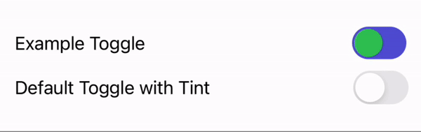
The result is a new colorful toggle!
Changing More Than Just Color
The beauty of the custom ToggleStyle is that now we can change anything we want. Here are some examples of what you could change, substituting your own values to meet your needs:
- Define the colors in the ToggleStyle so that your Toggles are consistent across your app.
- Change the height and width to make the Toggle smaller by changing the values in the frame:
.frame(width: 46, height: 26). - Add a shadow to the thumb:
.shadow(radius: 1, x: 0, y: 1). - Make the thumb smaller by adding padding:
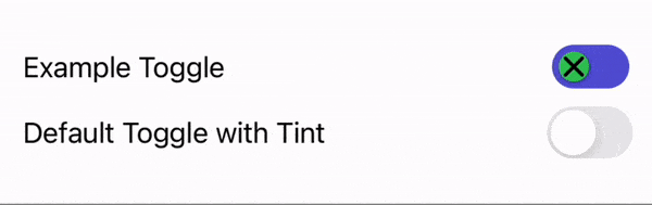
.padding(4). - Add icons to the thumb before the offset:
.overlay(configuration.isOn ? Image(.iconCheckCircle) : Image(.iconX)). - Change the animation and duration:
withAnimation(.easeInOut(duration: 0.1)).
All these changes together look like this:
struct CustomizedToggleStyle: ToggleStyle {

    let onColor = Color.yellow
    let offColor = Color.indigo
    let thumbColor = Color.green

    func makeBody(configuration: Self.Configuration) -> some View {
        HStack {
            configuration.label
                .font(.body)
            Spacer()
            RoundedRectangle(cornerRadius: 16, style: .circular)
                .fill(configuration.isOn ? onColor : offColor)
                .frame(width: 46, height: 26)
                .overlay(
                    Circle()
                        .fill(thumbColor)
                        .shadow(radius: 1, x: 0, y: 1)
                        .padding(4)
                        .overlay(configuration.isOn ? Image(.iconCheckCircle) : Image(.iconX))
                        .offset(x: configuration.isOn ? 10 : -10)
                )
                .onTapGesture {
                    withAnimation(.easeInOut(duration: 0.1)) {
                        configuration.isOn.toggle()
                    }
                }
        }
    }
}

struct CustomizedToggleView: View {
    @State var isOn: Bool = false
    var body: some View {
        VStack {
            Toggle("Example Toggle", isOn: $isOn)
                .toggleStyle(CustomizedToggleStyle())
            Toggle("Default Toggle with Tint", isOn: $isOn)
                .tint(.yellow)
        }
        .padding()
    }
}

#Preview {
    CustomizedToggleView()
}
Custom ToggleStyle – Yes or No?
In the end, we decided not to use the custom ToggleStyle in our project. For our needs, we decided it was more important to have the baked-in accessibility that the default SwiftUI Toggle offered, as well as to keep our codebase and styling implementations consistent. Whether you should use a custom ToggleStyle depends on what you value. If complete control of the way the Toggle looks is the priority, then customization is the way to go. Other times, changing the tint color in the on state is enough to customize your SwiftUI Toggle.