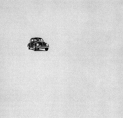
In my view, the two most important concepts in interface design are typography and negative space. These are the two factors that can make or break a design before any color is applied or any interactions happen.
Almost 10 years ago, in their now-canonical article, Information Architects Inc. famously declared that web design is 95% typography. Type is what you put on the page; it’s the primary medium by which your user is interacting with your software and the information it represents. The follow-up article states:
“95% stands for a method: Focus on typography, ask yourself, which text is functional, which text is passive, systematize them, order them hierarchically, simplify, create an interface, the rest will add up automatically.”
Negative space, then, is a complement to (or you could even say a component of) good typography. Employing negative space not only influences users’ satisfaction with a design, it also improves their comprehension. Copious amounts of negative space lend connotations of luxury and sophistication. (This stems from print design, where paper is a limited resource, and it can be compelling to try and cram all of the information in.) The rhythms of your macro- and micro-whitespace can help frame understanding, lead the reader down the page, and emphasize important elements in an interface.
If you fail at typography and whitespace, you fail, period. When evaluating a design (my own work, my peers’ work, job candidates at AO) they’re the first thing I look for, and the first thing I notice when something’s wrong.
At the same time, typography and negative space are also difficult to get right. When a design isn’t working, the instinct can often be to add more—more lines, more color, more design—when in reality, the answer is so often, do less. (Here I’m reminded of Dieter Rams’ 10th design principle: “Good design is as little as possible.”) Through experience, I’ve learned to fight the urge to continually add to a design and start asking myself, “How little can I get away with here and still make this work?”
To outsiders and those who are just starting out in the discipline of design, so much of it can seem based in instinct, talent, and dark magic (likely because of its relationship with the visual arts). In reality, while designers can (and many do) practice based on instinct and taste alone, designs that work can generally be traced back to foundational principles rooted in math and science (whether the designer is aware of it or not). The rules of proportion, line, color, and movement are all real, and when designers follow them, it’s difficult to go wrong.
Typography and negative space are prime examples of this, and some concentrated study of the underlying principles here can go a long way to improve a designer’s skill level and confidence. One resource I recommend is Kimberly Elam’s Grid Systems: Principles of Organizing Type, and my other favorite is Ellen Lupton’s Thinking with Type. Both are accessible (but not basic) guides to foundational principles, good for both those just getting started, or those of us who like to return to the fundamentals periodically in our practice—which, really, shouldn’t that be all of us?


