I’m pairing with a Developer, Jordan Nelson, in a side by side think-aloud-style pairing session to redesign an app. You can read more about the why behind this experimental design process and come back here to read how we got started with an audit of the existing app.
Gaining a better understanding is the start of the design process. If you google “design process,” you’ll find plenty of images that diagram a cyclical framework that starts with things like define, ask, or empathize. Whatever the term, this phase has some clear goals.
Goals
- Talk to people that use or need this service or product.
- Build empathy for their why — why this service or product is so valuable to them.
- Break down the problem to its core, the simplest explanation.
Since we’re designing a personal finance app for Jordan, together, we audited the features of the current app. We pulled up the app, identified a smaller enough feature to talk about (like income vs expenses data), and asked the following:
- What’s working well? What is helpful about checking this info?
- How often do you look at this data?
- Is it actionable? If so, what do you do with this info?
These questions spurred a conversation. If there were aspects of the app that were clearly not working, it was easy to point those out. The real benefit in this audit is determining context, value, and priority.
Tools
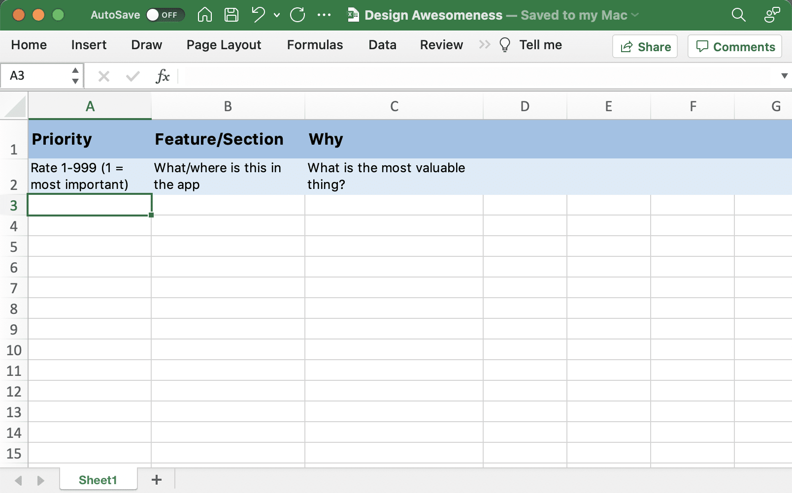
We used Excel to do the audit because using this tool required no training and it was easy to add to if we adjusted the framework, which we did. We started with this:
Once we did a pass through this, we started to see some groupings of information. We affinity mapped those groupings with a trailhead, a place to start within the group and see what information is available.
“The information architecture exercise helped me to find meaningful trailheads from a lot of disjoint ideas that I had floating around. Finding these trailheads has helped to prioritize and find a way forward on a couple focused areas.” – Jordan Nelson
At this point, we’re not talking about solutions. Lots of questions will arise in this discussion like, “Would this bar chart be better as a pie chart?” or “What if we turned this list of items into visual cards with photos?” or “Is a trailhead a page or part of the home page?” This is a great sign that the creative muscles are working, but you should defer those decisions until later and stay focused on the context, value, and priority.
Outcomes
Within a couple of hours, this audit provided the following:
- Information architecture from prioritized groupings of content
- A list of features to keep and remove and why the keeps were so valuable
- A story about the purpose of this app
From here, we had enough information and context to start doing some rapid sketching, and that’s what we’ll talk about in part three.

