Article summary
In the first two parts of this series, we focused on simplifying the design thinking process and grounding it in activities that help your team work collaboratively and with intention. Now it’s time to understand who we’re designing for.
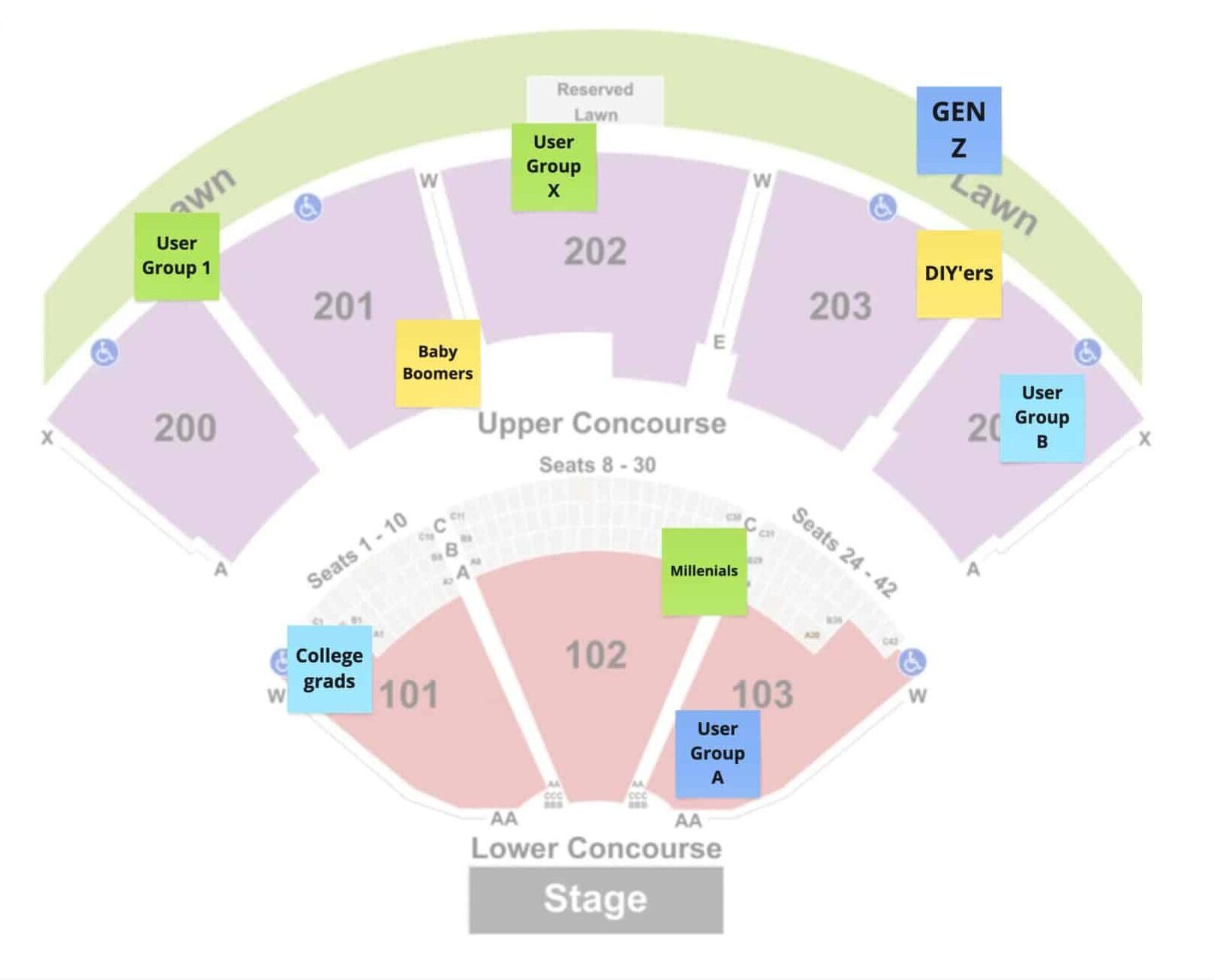
Activity: The Show – Part 1: Small Venue
Imagine your product is putting on a show, and your users are the stadium audience. Some are in the front row, vibing along to every word. Others are way up in the 300 level, curious but not quite bought in. This exercise helps you visualize who’s coming to your show—and how connected they are to your product or brand.

Step 1: Plot Your Audience (5–7 minutes)
Hand out a simple seating chart (or draw one together on a whiteboard). Ask each participant to:
- List all the user groups who currently interact with your product or brand
- Plot each group on the stadium map based on their loyalty and engagement
- Front Row / VIP – Deeply loyal, frequent users, strong advocates
- Middle Sections (100–200 level) – Reliable users with moderate engagement
- Nosebleeds (300 level) – Low engagement or at-risk users; untapped potential
Encourage participants to use whatever labels make sense. These could be by role, persona, customer type, market segment, etc.
Step 2: Share & Discuss (10–15 minutes)
Have each participant present their stadium map and walk through:
- Which user groups they identified
- Why they placed each group where they did
- Any surprises, disagreements, or gaps they noticed
As a team, look for patterns. Are some groups overrepresented? Are there high-potential users sitting in the back row? Are your most loyal users actually being served well?
Why This Matters
This simple metaphor creates a shared mental model for your team. It shifts user segmentation from abstract to tangible, and encourages conversation about loyalty, retention, and areas of opportunity. By seeing who’s closest to the stage—and who might need a better seat—you’ll be better equipped to prioritize features, craft messaging, and design with empathy.
The ultimate goal? Leave this activity with a unified understanding of who your users are, how they relate to your product, and where you can focus to deepen relationships or grow your audience.
Activity: The Show – Part 2: The Arena Tour
After the small venue comes the arena tour—and with your product or feature now live, it’s time to check back in with your audience.
This follow-up activity challenges your team to think about impact. After your release, where did your users go? Who’s still showing up early and staying late? Who may have wandered out before the lights even dimmed?
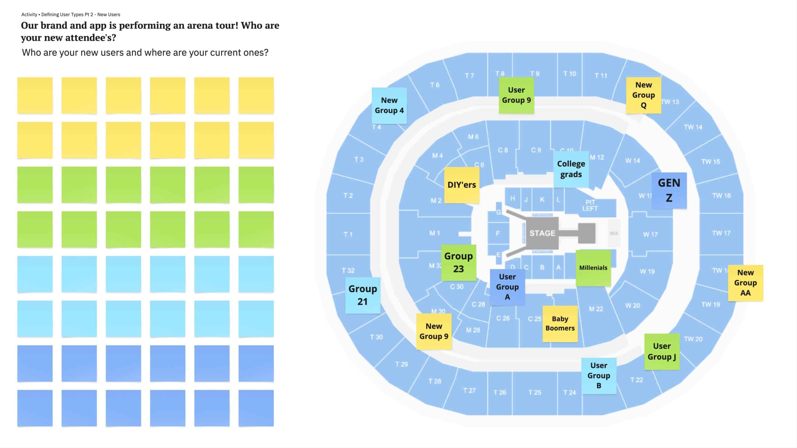
Step 1: Re-Map Your Users in the Arena (5–7 minutes)
Using an updated arena seating chart, revisit the users you plotted in the original small venue map. Ask your team:
- Have any users moved closer to the stage since the product launched?
- Did any loyalists drop off or shift farther from the action?
- Are there new users in the arena that weren’t there before?
- Are there fans now sitting in the front row who were skeptics in the back?
Give your participants 5–7 minutes to relocate their user groups in this new arena seating layout. They can place sticky notes from the first map or start fresh with what they’ve observed post-launch.
Step 2: Share Observations & Reflect
Once everyone’s re-mapped their users, ask them to talk through their decisions:
- What movement surprised them?
- Are there any groups that didn’t respond as expected?
- What kinds of features, messaging, or improvements helped shift users’ positions?
Once you’ve formed these clusters, label each one with a descriptive name. Be specific, but relatable—names like “Weekend Warriors”, “Brand Evangelists ”, or “Value Seekers” are more memorable than generic personas.
Why This Matters
Affinity mapping helps your team see the forest through the trees. By clustering your user groups into meaningful categories, you move from anecdotal assumptions to shared understanding. These fan clubs can guide everything from roadmap prioritization to marketing messaging.
And best of all, this activity makes your audience feel real, giving your team something human and relatable to design for.
The Encore
Understanding your users isn’t a one-time task — it’s an ongoing conversation. These activities aren’t just about filling stadium seats or sorting sticky notes; they’re about creating shared understanding across your team. By visualizing loyalty, mapping engagement, and clustering user types, you’ve laid the groundwork for more intentional design decisions moving forward. Whether you’re launching something new or refining what already exists, these simple tools can help you stay grounded in what matters most: the people you’re building for.