“Mobile first” seems to have turned into a buzzword lately. How dare anyone design a web experience any other way? It’s certainly a good framework to follow—one that can be applied to most designs these days. But on a recent project, the client wasn’t so concerned about the site’s mobile presence. The desktop was priority, so we had to do things the “old” way and design from the desktop down to mobile.
1. Remember, Everything Is Going to Grow
Diving into designing wireframes, I quickly realized it’s easy to forget how differently you need to design for a phone. Going mobile first, you start out designing big and tight. Working up into desktop, everything gets the chance to breathe. You can have multiple columns! There’s so much room for activities. With desktop first, you will have to decide on what gets to stay and what has to go. Ideally, you can preserve most of the features while also preserving an exceptional user experience.
2. “Make the Logo Bigger”
Most designers have heard “Make the logo bigger!” from a client at some point in their career. I don’t literally mean the logo should be bigger. On your first run of a mobile design, you will probably have to make most elements larger.
If you’re designing wireframes for the phone in close proximity to the desktop wireframe, the phone’s design is going to look ridiculously large. It’s supposed to.
I initially wanted to drag everything from the desktop artboard onto the phone artboard and shorten the elements horizontally. It looked fine and seemed to work. This was especially true after looking at it for so long on a large, zoomed-in screen. But after testing the wireframe out on the phone, I immediately went back into Illustrator and scaled everything to about 3x the desktop size.
A good rule of thumb is to base the size of other elements can be found in Apple’s Human Interface Guidelines. The HIG doesn’t recommend making any icons or buttons smaller than 44×44 pixels large, which is comfortably clickable on a touch device.
3. Create a Device Frame
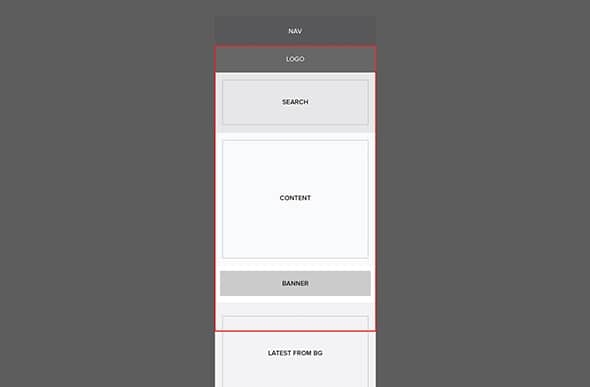
As your page grows longer and longer, it’s helpful to keep a frame around the actual size/resolution of the phone’s screen. In Illustrator, I typically just keep a red, 3pt-stroked box around the viewport. Without it, it’s easy to lose sight of what the user will actually see when they land on the page. It will also help with keeping in mind where the fold will be, even though it can be drastically different across different devices. It’s also important to remember that browser chrome will eat up some of this real estate as well.
4. Test Often!
Of course, sacrifices will have to be made when scaling down to mobile. I found that without frequent testing on an actual device, I kept falling into the trap of attempting to preserve certain elements. I would convince myself that a set of buttons didn’t need to be so large. “We’ll just squeeze them all in right here.” Then upon bringing it up on my phone, I realized that I would hold a grudge against anyone who expected me to use those tiny buttons.
Frequent testing saved a lot of time in designing the wireframes. Before spending a lot of time perfecting alignments, font sizes, etc., I found it valuable to set up a couple different sizes of buttons that could potentially work on the page. I would then save a PDF to my Dropbox folder and view that PDF through the Dropbox app on my phone. This was a very quick and easy method. I already had the Dropbox desktop and phone apps, and I would only have to wait about 15 seconds for the phone to download the newly saved file. There are plenty of other methods that are even better, such as Skala Preview, but my quick and dirty method sufficed.
Visual design for mobile devices is certainly different than desktop, and even more so than designing for print. It had been a while since I had designed for desktop first, but once I got into this workflow, it went smoothly and quickly. If you have any other tips, please share!