Figma is a widely-used tool for creating and prototyping user interfaces. (See my previous post about the strengths and weaknesses of Figma.) Figma’s Auto Layout and Symbols are a very powerful combination of features for software designers, enabling them to add significant value to their products. These features also can get complicated quickly.
To keep a handle on the complexity, I’ve focused on using these features in two key areas: the implementation of user interface elements and page-level layouts. Having this as my mindset helps me stay grounded in where value is when using these features as we build out our design tooling.
Interface elements can be basic, like buttons, or multiple elements put together to create a larger component. These elements and components often use auto layout to support the responsive design manipulation needed. The page-level layouts keep these elements and components in the right place on the page and organized nicely.
Elements & Components
Getting Started with Symbols
It can be helpful to start using symbols when wire-framing within Figma. This brings a level of standardization to the file and the artboards within. It typically begins with a set of elements such as buttons, inputs, and simple components like a navigation bar that get turned into Symbols within Figma. Symbols are extremely powerful in that they allow a designer to reuse a styled element throughout their designs. If a project warrants customization, the symbols can be overwritten or quickly reset. Examples of this are changing the label text of a button or the background of a card.
You should consider using Symbols whenever you’re using an element or component multiple times within a design. This will force consistency and avoid having to “find and replace” elements down the line. Changing the master symbols will change all the instances of the master symbol. It makes batch copywriting or styling updates a breeze. These components, for the time being, are created to the left of the artboards for the layout of the software. When things get a bit more complex, the symbols will move to their own page.
Getting Started with Auto Layout
Designers use auto layout when designing elements, components, and symbols to ensure they can respond to resizing. This sets the designer up for an easier time when they start utilizing the elements on the page. Elements need the ability to expand to span additional columns in the grid or adapt to responsive layouts. Your project might require separate mobile and desktop symbols depending on how more complex components might react when changing from mobile to desktop layouts. After the symbols are made, an instance of the master symbol is created, and a manual test checks to see if it meets the expected behavior.
Each of these elements might get accompanying variants that help indicate the state of the element used in the user interface. You can easily swap out these variants for another using Figma’s interface. This makes the designer’s job a bit more streamlined.
Page-Level Layouts
Page-level layouts can help a designer quickly layout sections of components on a page. It can be useful to have multiple layouts. One column or a main column and sidebar are common layout types. Spending time implementing this keeps the designs consistent from screen to screen. It also better communicates a standard practice to the implementation team. Additionally, when using Figma as a clickable prototype, it keeps the content from jumping around the page when it’s not aligned properly.
Example
To illustrate the page-level layout, let’s walk through an example. Here we add the navigation, title, and body of the page. This is where we apply auto layout to the page to create a header and body container that maintains consistent constraints from page to page. It will do this by setting the correct horizontal boundaries and the correct spacing between elements vertically such as the page title and the page content.
To create the responsive page design, add the navigation, page header, and each content section to the page.
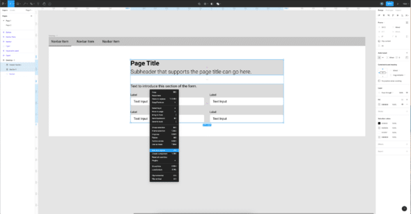
Select those sections individually so we can apply auto layout to all the sections. We named this new grouping Page Content. Auto Layout is then applied to the Page Content group. This will give a consistent spacing between each section in the content of the page. For this example, it is set at 40px. At this point we have the content spaced the way we want it.
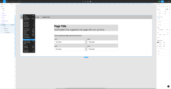
Next, select the artboard frame and add Auto Layout.
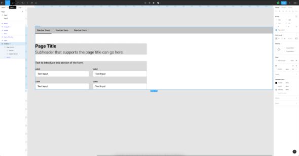
This may change the layout in not-so-pleasing ways. So, let’s fix that. First, select the frame and set the auto layout spacing between the navbar and the content container, in this case, to 0.
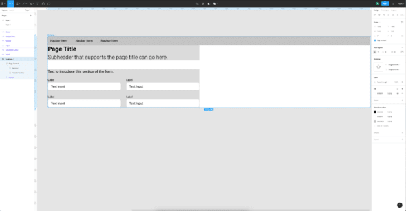
At this point, there should be no spacing between the navbar and the title section. We will add the spacing back in a moment.
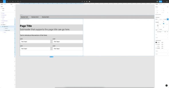
Select the Page Content container to add top and bottom padding to the content container in this case, 60px. Select top-center alignment for the content layout. This will add top and bottom spacing to the Page Content container and place it center top of the bounding box it’s in.
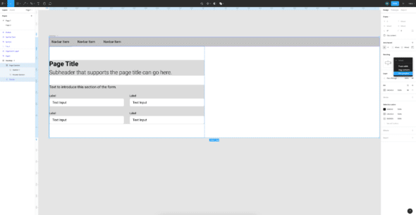
Then ensure both the Navbar and Page Content containers are set to “fill container.” This will expand the containers to the available horizontal space.
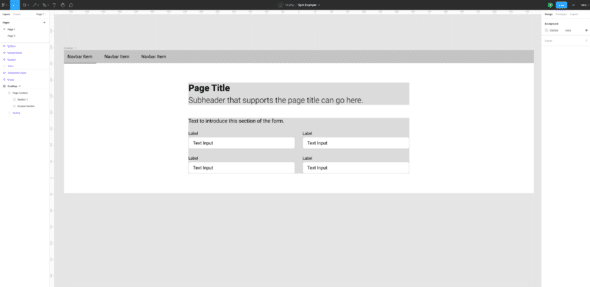
The Page Content should now be centered on the page.
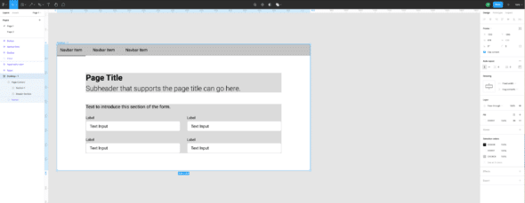
Usage of Figma’s Auto Layout and Symbols
We’re all set. You can now easily resize pages, and content will be aligned consistently on the page. You can add or remove sections within the page, and the content will adjust automatically.

