Article summary
Shadcn is a set of reusable UI component patterns for use with React applications. However, instead of importing the elements like a traditional component library (@somewhere/ui), you add a local copy of the component source files into your project. This allows you to customize, extend, and shape the components to fit your particular needs.
Shadcn has a wide variety of elements available, from larger building blocks like sidebars, accordions, and navigational menus, to smaller components like a badge or an avatar. To create a searchable dropdown, we need to first take a look at the Command component.
Using “Command”
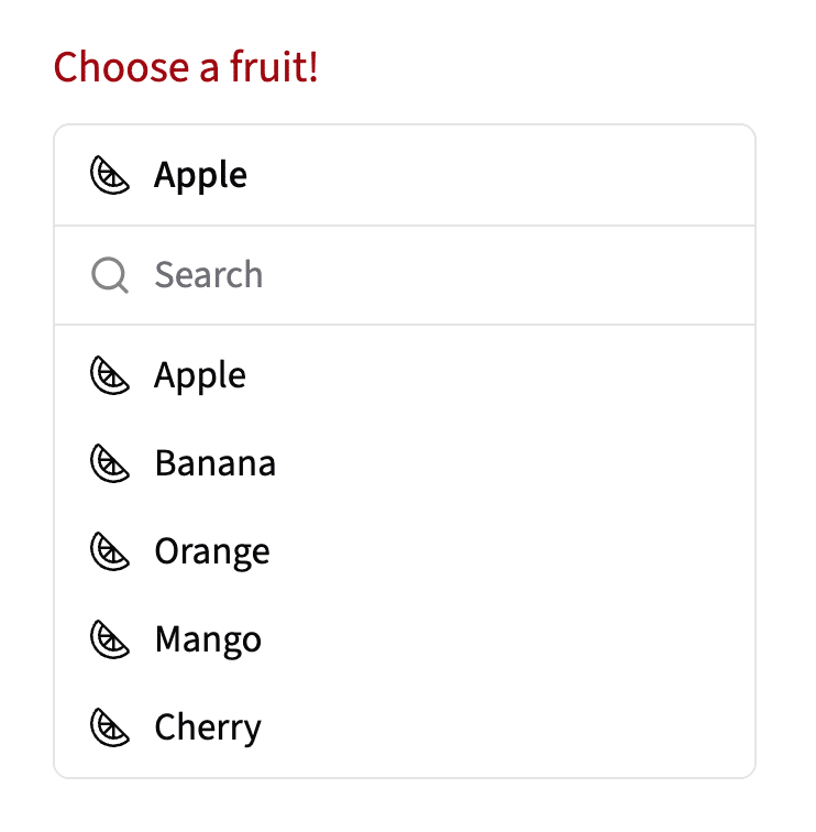
The Command component from Shadcn helps the user create searchable menus with type-ahead capabilities. Command components contain the CommandInput (where the user can search) and CommandList, which contains the CommandItems (options in the menu). For our example, we’ll take a look at a list of different fruits that the user can choose from.
const fruits = ['Apple', 'Banana', 'Orange', 'Mango', 'Cherry'];

export const FruitPicker = () => {
 const [selectedFruit, setSelectedFruit] = useState(fruits[0]);

 return (
   <div className="bg-popover text-popover-foreground rounded-md border">
     <div className="flex items-center gap-2">
       <Citrus strokeWidth={1.5} />
       <span>{selectedFruit}</span>
     </div>
     <Command>
       <CommandInput placeholder="Search" />
       <CommandList>
         {fruits.map((fruit) => (
           <CommandItem
             key={fruit}
             value={fruit}
             onSelect={() => setSelectedFruit(fruit)}
           >
             <Citrus strokeWidth={1.5} />
             <span>{fruit}</span>
           </CommandItem>
         ))}
       </CommandList>
     </Command>
   </div>
 );
}
Utilizing the Command element out-of-the-box, our fruit picker may look like this:
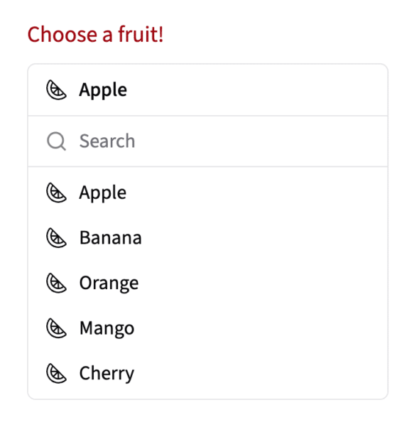
While it looks nice, it takes up a lot of vertical space on the page, especially if the list of fruits is long. Let’s take a look at an alternative implementation by combining the Command component with a Popover component.
Elements Stronger Together
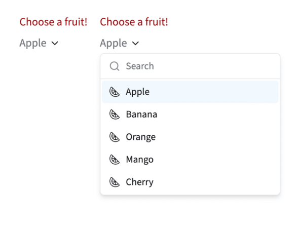
Shadcn components are already great tools to easily build a dynamic website, but combining their abilities makes them even stronger. Shadcn’s Popover is a trigger that can display rich content contained within a portal on screen, rather than an isolated overlay like a Dialog.
By combining Command and Popover, you can create a dynamic element that can suit many needs. For example, a questionnaire that may include dynamically populated options, or stylish and compact form fields.
Let’s add a Popover with custom button styling.
const fruits = ['Apple', 'Banana', 'Orange', 'Mango', 'Cherry'];

export const FruitPicker = () => {
const [menuOpen, setMenuOpen] = useState(false);
const [selectedFruit, setSelectedFruit] = useState(fruits[0]);

 return (
   <Popover open={menuOpen} onOpenChange={setMenuOpen}>
     <PopoverTrigger asChild>
       <Button
         variant="link"
         size="link-reg"
         className="inline-flex gap-1"
       >
         <span>{selectedFruit}</span>
         <ChevronDown />
       </Button>
     </PopoverTrigger>
     <PopoverContent side="bottom" align="start">
     <Command>
       <CommandInput placeholder="Search" />
       <CommandList>
         {fruits.map((fruit) => (
           <CommandItem
             key={fruit}
             value={fruit}
             onSelect={() => setSelectedFruit(fruit)}
           >
             <Citrus />
             <span>{fruit}</span>
           </CommandItem>
         ))}
       </CommandList>
     </Command>
    </PopoverContent>
   </Popover>
 );
}
By nesting the Command element inside of PopoverContent, it combines the type-ahead benefits of a Command while saving space on the page.
Tips and Tricks
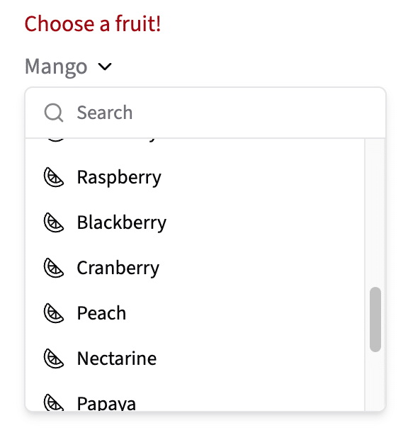
Too Many Options?
While this looks great for short lists, long lists of options can quickly overtake the page. If we add even more fruits to our list, it can run out of room and overflow off the bottom of the page.
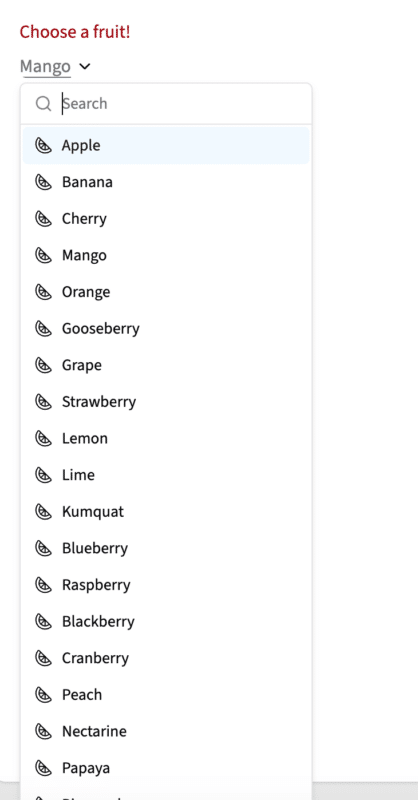
Solving this issue is easy by adding a scrollbar! Set your overflow-y to auto on your CommandList element.
Alphabetize options?
The Command component preserves the order of the array that is supplying the data. While this can be helpful in some cases, sometimes you’d prefer the list to be in alphabetical order, like selecting a state/region of a country like the United States. Currently, the options in the fruits list are not in alphabetical order.
If you’d like to alphabetize the elements of the array in the display, you can use .sort and .localeCompare to alphabetize the elements without mutating the original array.
{[...longFruits].sort((a, b) => a.localeCompare(b)).map((fruit) => (
  <CommandItem key={fruit} value={fruit}>
    {fruit}
  </CommandItem>
))}
.sort() compares pairs of items. For each pair, a.localeCompare(b) returns:
- a negative number if
ashould come beforeb 0if they are equal- a positive number if
ashould come afterb
After the copied array is sorted, .map() turns each fruit string into a CommandItem.
What’s next?
Searchable dropdowns are just the beginning! By nesting components and modifying the base elements to your needs, the possibilities truly are endless. To learn more about React and Shadcn, take a look into this page!