Article summary
React Native is a popular framework that can save organizations time and money when developing a mobile application. It also leverages developers experienced in web applications to build a mobile application quickly without much upfront work. However, there are still some kinks to work out when developing iOS and Android. Both platforms have their own style guides and require knowledge of them to create a cohesive application.
Here are three common components you might create in your application that will look different even when using React Native.
1. Picker
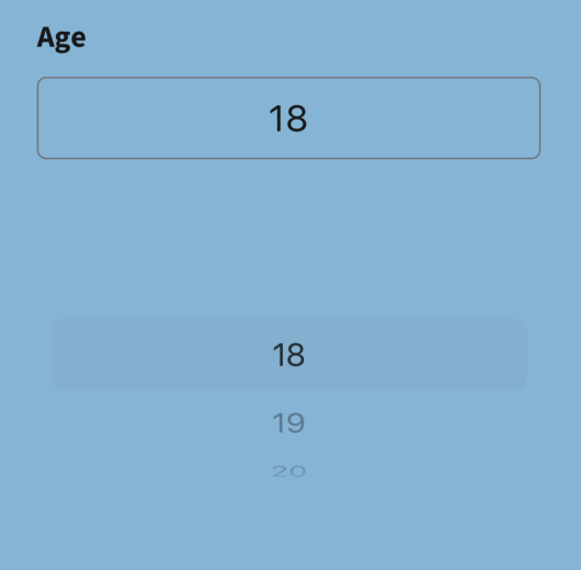
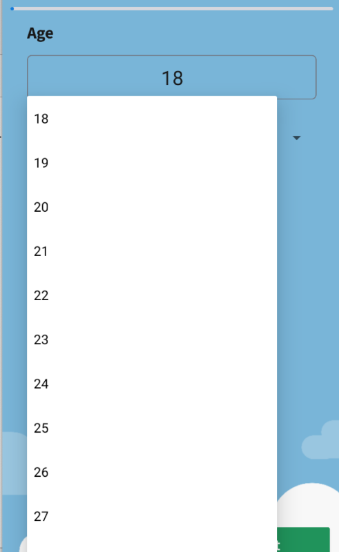
The picker component is a common component used for birthdays, age selection, and more. However, this component looks drastically different in iOS and Android. Although the iOS picker looks like a scroll wheel, the Android picker is more like a dropdown.
import React, { useState } from "react";
import { View, Text, Picker } from "react-native";

const MyPicker = () => {
  const [selectedValue, setSelectedValue] = useState("option1");

  return (
    <View>
      <Text>Please select an option:</Text>
      <Picker
        selectedValue={selectedValue}
        mode="dropdown"
        onValueChange={(itemValue, itemIndex) => setSelectedValue(itemValue)}
      >
        <Picker.Item label="Option 1" value="option1" />
        <Picker.Item label="Option 2" value="option2" />
        <Picker.Item label="Option 3" value="option3" />
      </Picker>
    </View>
  );
};

export default MyPicker;

You can change the picker mode to say “dialog” so that it shows as a popover rather than a dropdown. Note that this mode option only applies to Android.

2. Elevation
Android buttons have a default elevation, which casts a shadow on the background. This can be great for standalone buttons, but when we used a component library to create a Flatlist of buttons, it caused a space between each button that didn’t match iOS. Although 100% parity isn’t always possible when developing in React Native, sometimes parity can be achieved by tweaking Android-specific attributes on components.
Since Buttons in React Native do not have a style prop, you cannot remove the elevation. A simple trick is to use Touchable Opacity, Pressable, or Button from a third-party library like Native Base to modify or completely remove the elevation.
import React from "react";
import { Button, Text } from "native-base";

const MyButton = () => {
  return (
    <Button
          style={{
              elevation: 0,
            }}
    >
      <Text>Click me!</Text>
    </Button>
  );
};

export default MyButton;
3. Modal
The modal is another component that shows significant differences between Android and iOS. The modal in an Android can’t be customized to have different popover styles. To get the same effect in Android, if you don’t like the full-screen look, you can use a library that uses its dialog component. Or you can customize the React Native modal only on Android to achieve the same look. The modal allows the developer to set the presentation style specific to iOS devices. Again, these differ from Android.
Checking the Style Guides
Checking out the style guides for both Android and iOS mobile phone types is important for creating common components in React Native. Sometimes the differences aren’t clear-cut unless you’ve developed in each OS natively. To get more consistency across the app when there isn’t parity, it might be good to use a component library like Native Base that works well on Android and iOS. Using this on top of React Native can help you harness the power of theming as well.

