There’s a perceived divide between “traditional” designers (who work in print and branding) and software designers. But the reality is, most of us received the same foundational education and follow the same design principles. The tools and outcomes are often different, but the ingredients have a lot in common.
So how do traditional design principles apply to software design? Let’s take a look at contrast, repetition, alignment, and proximity.
Contrast in Software Design

In traditional design, contrast can be applied in a variety of ways. It can refer to the difference between text color and background, the sizes of visual elements, varying textures, or even the contrast of actual content.
The same can apply to software design, although I’d argue that contrast in typography is the most important for software usability. It is extremely important that your typography is large enough, and contrasts with the background enough, to be legible.
And don’t forget about color blindness! What seems reasonable to you might not be for the ~8% of the population who sees differently than you. If you’re unsure if your text contrast is sufficient, use a tool like Stark to check for you.
Of course, legibility is just one of the areas where contrast can help. It can also be used to create good hierarchy within typography. A good example of this is using different text styles for headings than for body copy.
Repetition in Software Design
In traditional design, repetition is used to create unity within a composition or brand identity. For example, a brand may always display its logo knocked out of a red background. That repetition helps establish a strong sense of identity, making it distinct from other brands.
In illustration, repetition is often used to create texture or a sense of movement.
In software, one of the biggest forms of repetition is through UI and UX patterns. If you’re an Apple device user, you probably know what will happen if you say, “Hey Siri!” You’re probably also comfortable swiping down from the top of your phone to see your notifications. Patterns like these are things you should be paying attention to as a software designer.
When designing a mobile app, if you know the majority of your users will be using iPhones, this swiping pattern may be something you choose to utilize. Using existing patterns in your designs will help users navigate and feel comfortable with your product.
Alignment in Software Design

In traditional design, alignment is used to find the “right” place for each item in a composition. For example, in logo design, a grid system is used to align typography to the logomark. Using these grids creates a sense of symmetry and consistent spacing. It’s the science that makes something visually look “right.”
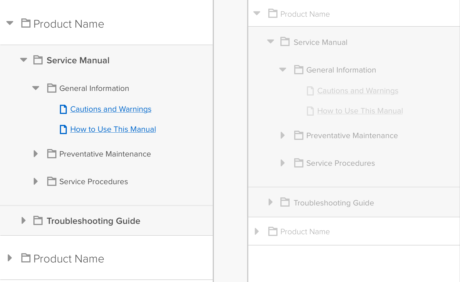
In software design, alignment is also important. Text should be left-aligned in most instances. Buttons should not be thrown willy-nilly on the screen. When items are aligned properly, you can create a logical flow for people’s eyes to travel through the screen in the desired manner. As in traditional design, there’s a sense of balance, but more importantly, there’s also a clear path forward for the user.
Proximity in Software Design

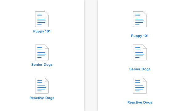
In print design, proximity is often used to indicate relationships between items. For example, text placed close to an image will imply that the text is about said image. Grouping images together will imply that those images are related in some way. Adding distance between items can indicate that these items are not meant to be viewed as a set.
Proximity works the same way in software design. Of course, it should be used to clearly communicate groupings of content, just as it is in print design. However, unlike print, software expects users to complete actions. By using proximity wisely, you can make it clear what users should do to complete the actions they desire.
For example, placing an “edit” button 600px away from an editable item would be confusing. Not including enough space between rows of content could make it unclear what caption goes with what photo. Instead, be thoughtful about the ways proximity can guide users.
Traditional Design Needs to Come First
The reality is, to be a good software designer, you need to understand “traditional” design principles. Art school might not teach you how to prototype in InVision, but it will teach you about color theory and why white space is important. You need to understand those theories before you can design an effective app.
So if you have a traditional design background and feel like you’re eons away from breaking into the world of software, you’re not. We’re not that different, you and I.

