We at Atomic Object recently launched our brand-new website with completely rewritten content and a clean, beautiful look that accurately represents our company’s progress in the field of design. This new website was a long time coming, and we’re proud of what we’ve achieved with the redesign. It represents a great step forward for our company–the result of many years of progress and hard work.
As one of the designers who led the project, I’d like to share a bit about how the design came together, from initial concepts to implementation.
Content First
Content is important to Atomic. With our roots in academia, our values of transparency and teaching and learning, it’s important to us to have a website that shares an in-depth look at who we are, what we do, and what we’ve accomplished in the field of software.
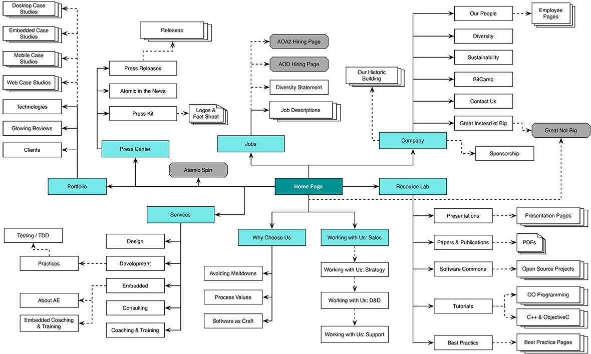
Our old website was extensive, with many pages. Previous attempts at redesigning our website were scuttled largely because they didn’t account for the depth of Atomic’s content and its importance to our company. Here’s our old site map:

Before I officially joined the project, I observed as over the course of about a year, our marketing staff—with the help of some trusted consultants—systematically deconstructed and quantified our brand message and did in-depth research about our website’s audience and what they were looking for when they came to our website. They carefully rewrote the entire website with a laser-like focus on the specific needs our audience had, and the specific questions that these potential customers and hires were asking.
The end result of this effort was more or less a designer’s dream: a tight, well-thought-out information architecture and an utterly impressive (and vast!) body of pages, grounded in well-researched user needs. Here’s the new site map:

Understanding the Requirements
As Lisa and her team continued to put the final touches on the content, it was time to officially come together as a design team and get to work. While the new content was much better and greatly slimmed down from the old site, it was still a huge effort to tackle—this was no one-page scroller.
We knew that the content would continue to grow and evolve, and we were also working with a limited timetable. We also knew that this site, like our old one, would likely grow with and represent the company for several years. In terms of design requirements, this meant that we needed more than just a few page mockups: we needed an extensible system of visual design, backed by a powerful content management system, so that our marketing team could make edits and updates to the website with little hassle. Easy, right? :)
Getting Started
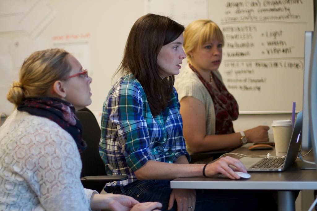
We kicked off the project by getting together four designers and going off site for a week. This turned out to be a great way to kickstart the process because we were outside of our usual habits and environment, and totally focused on the task in front of us, shielded from the everyday concerns that come along with working at a busy consultancy.
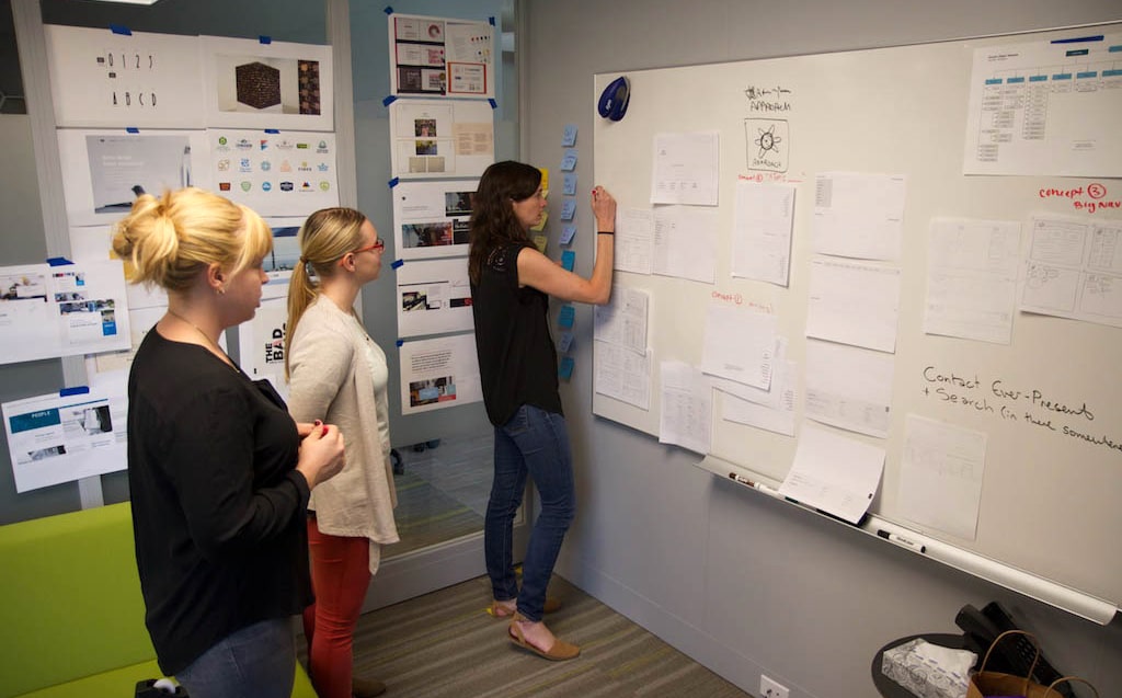
We set up a little war room at Custer Worklab and did a lot of rapid, iterative sketching before moving into wireframes and again, rapidly iterating on those. We used a divide-and-conquer approach, each person working on specific sections or components of the website, with frequent check-ins to share and critique work, and frequent handoffs and collab sessions where we built on each other’s work.
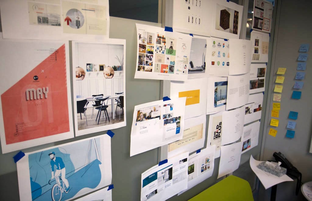
This process continued into visual design, where we all worked on variations of the design, drawing on a single moodboard that represented our shared vision. Throughout the day, we frequently checked in as a team to critique and synthesize the work.

By the end of that week, we were exhausted, but I was excited because I could already see a structure of reusable elements was beginning to evolve, in terms of both layout and stylistic attributes. As we continued to develop the design in the weeks following, a system of reusable blocks emerged. These reusable blocks, employed in various combinations with a few variations, make up most of the website. They provided a backbone which, when combined with some custom, page-specific elements, and a couple of custom layouts for special-purpose pages (such as our employee bios and the content in our resource lab) helped us rapidly create a very cohesive yet not repetitive design which I think truly showcases the great content that our team developed and accurately tells the story of our company.
From the beginning, the attributes of our mood board that we as a team were most aligned on and inspired by were collage-style pieces with clean Bauhaus influences, and also very photo-forward pieces. I think these concepts were great assets both for the success of creating a modular design framework and for reflecting the personality of our company. Collages, by nature, are made up of variation and repetition. It was a natural fit.

Implementation
Once we had a solid design direction, it was time for me to peel off of the design effort and begin implementing. Lisa and I, working together with our DevOps team, had identified Craft CMS as a good platform for our new website, and I was excited to dive in and see what it could do. I knew from our research that Craft was one of the most flexible and designer-friendly systems out there.
Implementing our modular design was all about identifying the common block-level elements in the design, and parameterizing their variations so that they could be controlled through the CMS. Craft’s powerful matrix fields were perfect for this purpose. I used the approach outlined in this helpful post from Minds On Design Lab.
Here is the complete library of blocks that make up our website, with major variations of each shown:

Getting the elements to flow
Using a grid system was crucial for developing a system of block elements that could be rearranged and reordered and still look cohesive together. As we implemented the design and began using the blocks in different configurations with one another, we found ourselves making minor adjustments—and in a couple of cases, compromises—to widths and positioning of elements so that the blocks could appear in many different configurations and look good in all cases.
Thru experimentation, we eventually arrived at a system of rules for widths and positioning of elements across blocks which afforded the most flexibility. In some cases we made slight compromises, sacrificing variety in the design for flexibility of the system. In the end, I don’t regret those compromises. I feel the end product is interesting and cohesive without being repetitive.
Each block has several available design parameters which are controlled by the CMS:
- Whether there’s extra margin top (depending on which block appears above it, we may need margin or not)
- Whether the photo appears on the left or right
- Whether or not button appears
- Width of the paragraph (normal or extra wide)
So each major block is a single field type in the CMS, accompanied by a single HTML file, which can be reused in many different ways, in many instances. In a future post I hope to take you a bit deeper into how this all came together from a technical/CMS implementation perspective, but for now this video has a great overview of the approach I used.
The end result is a complex and interesting visual design with flexibility such that entire sections can be added or removed without touching the HTML or CSS markup of pages. Our marketing staff can add or maintain the site with little intervention from our heavily-bottlenecked design staff, and that’s a really good thing. We might provide assistance in the form of advice of what type of block might work best, or how much margin is appropriate, but these things can be controlled entirely through the CMS. This also means we don’t have to redeploy the site and invalidate the cache in the CDN every time we want to make a change–also a good thing.
The Result of Great Teamwork
I’m incredibly proud of what we accomplished as a design and marketing team. This design is the product of hours and hours of collaboration. It wouldn’t have been possible without a group of teammates who trusted one another enough to be constantly providing honest and thoughtful feedback, and who were humble enough to listen to that critique, iterate on the work, and even kill some ideas they thought were pretty good.
I’m honored to be a part of the design team at Atomic, and to have had the opportunity to build something this cool for our company—together.
This is the fourth post in a series about how we created our new site.
- What We Learned from our Hardest Project Ever
- Planning & Writing a User-Focused Website
- A Fresh Outlook: Updating Atomic’s Visual Brand
- Using Team-Driven Design to Create a Flexible Content Design System
- Design Pairing at Atomic
- Where Atomic and Photography Meet

