Article summary
[Your website is] the hardest project you’ll ever do, and when you’re done, you won’t like it.
– Aaron Schaap, Elevator Up
It’s not every day, or even year, we redesign our website. Thank heavens. In fact, our last major redesign was in 2006. Eight years is a long life for a website. And while the cruft had definitely accumulated and the visual design was quite dated, it was still garnering compliments from potential clients until its very last day online.
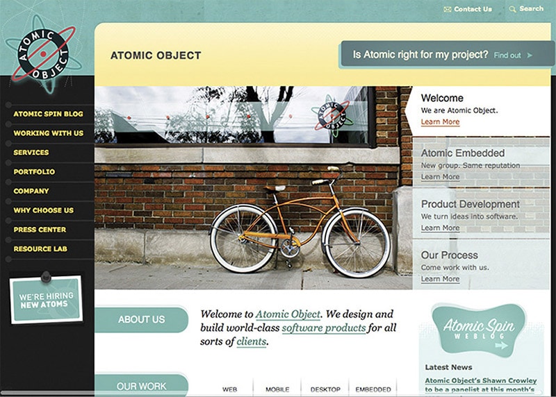
Here’s the site from 2012:

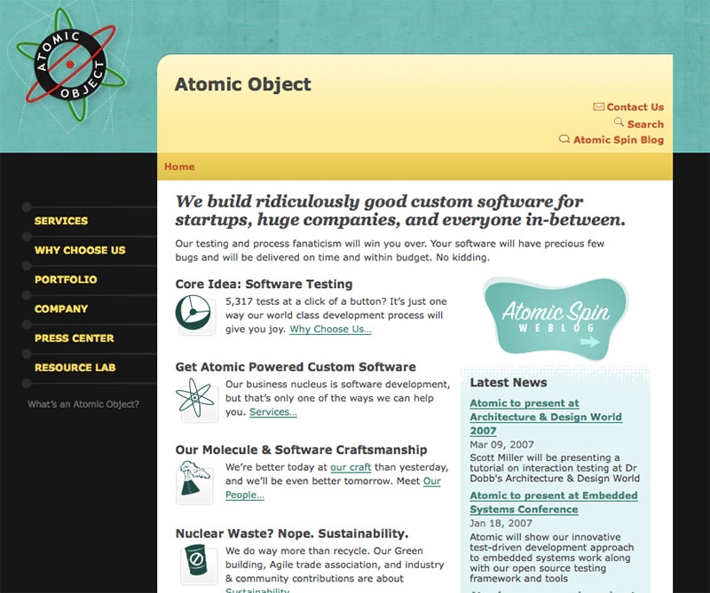
It’s original incarnation in 2006:

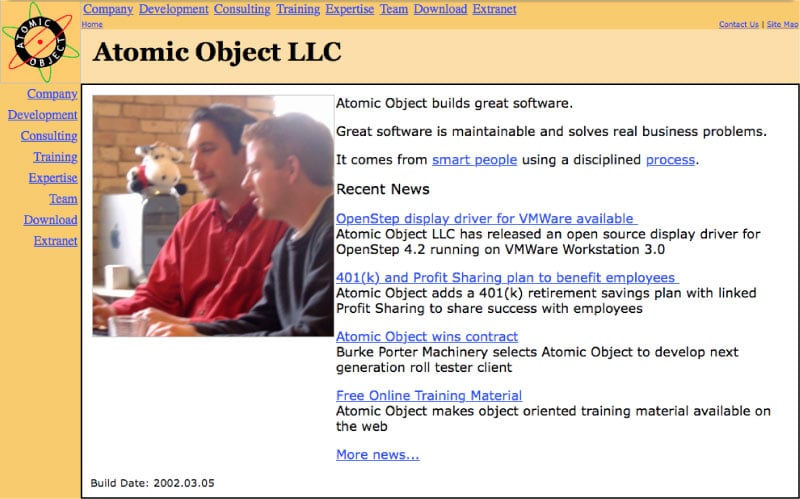
And here’s our first site, created in 2001:

Goodbye, Old Site
The most serious strike against that site was that it no longer represented our capabilities very well. Atomic Object has changed a great deal since 2006. While we’ve maintained and even grown our technical expertise, we’ve complemented that with design skills—15% of our makers are software designers, and we’re actively looking to hire more. The website project is a perfect example of our growth in design. Last time around, in 2006, we relied on our friends at Fusionary Media for a visual design as we didn’t have those skills in-house.
Since 2006 we’ve adapted our technical practices to work in embedded systems, creating tools and changing the way embedded systems are built and tested. Atomic Object is now one of very few firms in the country that can field a team to design and build a product that combines firmware, web or mobile software, and a compelling user experience. But you wouldn’t have known that from our old website.
So while I wish it a pleasant retirement in website heaven, and I do appreciate the years of service (380k unique visitors, $39.5M of business), I’m extremely excited to have a fresh new site that better represents our capabilities.
h2. Strike One… Strike Two…
I’ve heard a lot of stories recently of failed attempts at website redesigns, abandoned efforts, and poor outcomes. I’m glad to learn it’s not just us.
Our first failed attempt was in the summer of 2010. A simple idea about adding a “working with Atomic” section morphed into the (laughable) idea that the entire site could be redone in a week’s time, and finally thumped to the ground (late) with a clichéd front page slide show rotator and a redundant, tacked-on call-to-action for potential clients. It was painful, and the results were disappointing.
The second failed attempt came in the summer of 2011. While there were no bad actors in this particular drama, we made lots of mistakes, and a lot of time and effort ended up being thrown away. Our mistakes included:
- Not identifying a customer for the project
- Not budgeting enough time
- Relying on a loose group to self-organize
- Letting people start and work where their passions steered them
- Not doing strategic marketing work first
- Speaking to our peers
- Not using an off-the-shelf CMS
While we carved out significant time for our staff to work on this project, we didn’t carve enough, and some people contributed in an extra effort fashion. At least now I have a good, personal story to tell potential customers about the dangers of undercapitalized projects.

h2. Third Time’s the Charm
I’m happy to say that, while it took us three attempts, on this last one, I believe we’ve proven Aaron’s observation only partially correct. While it was definitely a hard project, I love the result this time.
One of the reasons that websites are hard is that they force you to consider and answer some really interesting questions that touch on your business strategy and even your very purpose on earth—What do you do? Why do you do it? Who do you serve? What do they care about? What message will reach them? And how might you want these answers to change in the future?
After two wasteful, painful attempts, we took some time to lick our wounds before starting again. This was made easier by the fact that we were incredibly busy launching two new offices and kept hearing potential clients tell us how much they liked our website.
A focused approach
We, (ok, mostly “I”), made many fewer mistakes this time around. We created boundaries around the team so they could explore different visual design ideas. We dedicated a serious budget of time to the project. We clearly delineated decision rights from improvement rights, and those varied by subject. We identified a single customer. Each person on the project had clear roles and responsibilities.
A recent article in Harvard Business Review, published when we were nearly done with the project, explains a lot of our past failures. I’ve written about that article and how it related to our web project at Great Not Big: How to Avoid the Downsides of Transparency.
A client-oriented message
We started our third attempt with a huge advantage over the first two—her name is Lisa. Having a full-time, experienced marketing person not only created more capacity for this large job, but it got us asking the right questions and doing the important thinking that should necessarily come before any HTML is ever written.
The conventional approach to websites for development and design firms seems to be all about the “what” and “how” of our types of business—the services we provide, the details of our particular sausage making. I actually think this is a very easy and natural approach to take, as most of us in this business are genuinely passionate about what we do and how we do it. It’s an easy mistake to assume our clients share those same interests. I’d personally love to sell Atomic’s services based on our awesome process and amazing practices. Sad to say, that’s mostly us talking to our peers.
We’ve tried really hard with our new website to use language clients understand, and to address concerns and questions they have when making a critical selection of a software product development partner. Lots of great detail and fascinating, valuable content got dust-binned in the process. Did we succeed? I’ll only be able to answer that question in a year or so.
A broader team
Atomic’s organizational unit is the project team. We compose teams to create compelling software products for our clients. For our successful third attempt at our website project, the team consisted of 12 Atoms working through nine distinct phases or activities:
- Strategic marketing: Carl, Shawn, Mike, Lisa, and Jody Burgess (friend and consultant)
- User research: Lisa, Lane Halley (friend and consultant)
- Messaging, structure, content: Lisa, Tabitha, Carl
- Visual design: Brittany, Julia, Abbi, Bryan
- Photography and videography: Tabitha, Bryan, Julia
- Design and CMS implementation: Brittany, Abbi
- Content migration: Lisa, Tabitha
- Hosting, automation, dev: Justin & MikeE
- Testing: Phil, and team
As with any Atomic project, no one drew hard, brittle boundaries around their responsibilities or abilities to contribute. Our poly-skilled, cross-functional team created a product that none of use alone could have come close to. Designers collaborated on copy. Business and marketing people refined visual design. Everyone tested.
h2. 5 Suggestions for Any In-House Website Project
Having screwed the pooch twice before getting it right, we have some advice to share.
1. The place to start is not your website.
Do the hard work of thinking through your company strategy, understanding your clients, deciding on what your brand is all about, and what messaging will appeal to your potential clients. If you don’t know what you’re shooting for, you’re unlikely to hit the target. Dig deeper, or be prepared to be unhappy.
2. Don’t underestimate how much time is required.
Even if you don’t have all the skills to create your own website, you’ll still be putting plenty of time into this project. Carve out enough time for this important work.
3. Draw clear lines of responsibility.
Clarity around who owns the final decision versus who can suggest improvements smooths out many potential rough spots. It doesn’t have to be one person for everything, but it does need to be clear.
4. Don’t be fooled by analytics.
If you’re inclined to use data to contribute to decisions, as we are, watch out for website analytics. If your site is like ours, the potential clients who visit your site are a tiny fraction of total visitors, making visitor and page load stats difficult to interpret.
5. Beware the “what” and “how.”
Challenge yourself to learn what your clients really care about, what language they understand, what issues are top-most in their minds. Then make a site for them, not yourself or your peers.
h2. Teach and Learn
One of Atomic’s value mantras is “teach and learn”. We live this value when we share what we’ve learned, whether that’s about development, design, operations, or marketing.
Over the course of the next two weeks, we’ll be writing here on Atomic Spin about how we went about tackling one of the hardest projects we’ve ever done. I hope it’s helpful to some of you.
Over the next two weeks, we’ll be walking through how we got from idea to execution on this project. I hope you come back and read all about it.
