Designing your own stuff is hard. I might even go so far as to say that it’s painful.
Why? Because it requires you to take a hard look at yourself and admit what sucks. What’s even harder is that you have to put a stake in the ground and make decisions. For whatever reason, this is much easier to do with our clients than it is for ourselves.
Designing our Own Website… Again
In November, Atomic pushed a new website for the first time in over 8 years. Officially, the website project started in mid-September and wrapped mid-November. However, this was after at least one failed re-design attempted in 2014 and at least one other a couple years of before that. (You can read more in Carl’s post What We Learned from our Hardest Project Ever.)
The project started back in in May and June of 2014, when we took a hard look at what Atomic was putting out into the world. Everyone, including us, knew the Atomic website was outdated. I can’t tell you how many times peers in the design community said, “We know Atomic does great work, but your website just doesn’t really show it.”
We also had too much inconsistency with our brand collateral. We felt that the work we do was not being represented properly. We noticed that our peers were thus viewing us as a really great place for development & software engineering, but they did not recognize us as a design consultancy.
To start to change this misconception, we wanted to address the outward facing elements of our brand.
Evaluating our Visual Brand
Though we could have hired a firm that specializes in branding and identity, we decided to complete the work in house. Maybe down the road, but not for this redesign. One of the reasons we stayed in house was the constraints we put on ourselves.
Our constraints
- the integrity of the logo was off limits
- the name of the company was off limits
Our goals
- to unify & organize our presence online and in print
- to mature our logo and brand, rather than redesign or reinvent it
Step 1: Benchmarking
We started the process of visually redesigning our materials by:
- doing a wall walk of all the existing materials we could find
- completing a hopes and fears exercise
- completing a SWOT analysis
- benchmarking ourselves against peers in the software design & development industry
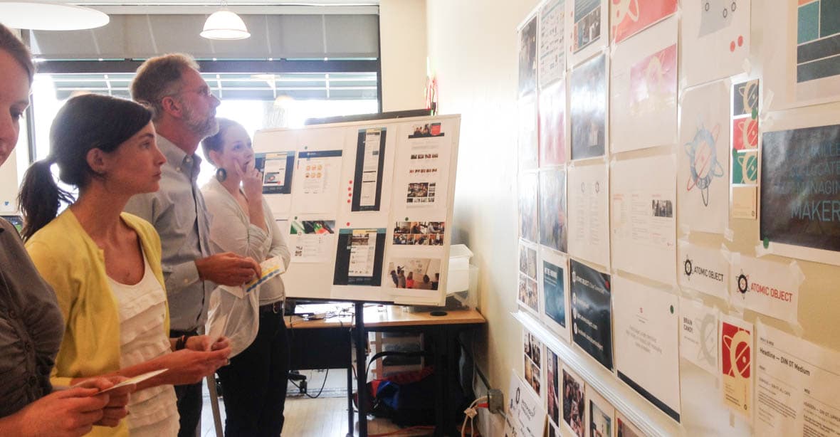
Step 2: Ideation & Refinement
From there, we:
- identified attributes that we wanted to maintain
- agreed on attributes we wanted to discard
- identified how we want to be perceived
- agreed on how we don’t want to be perceived
- created mood boards and gathered inspiration
- refined the visual direction
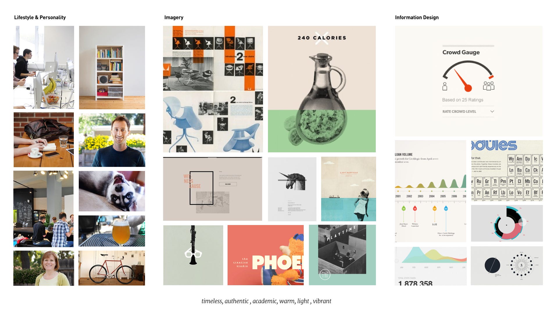
The Final Product
Updating Atomic’s Logo
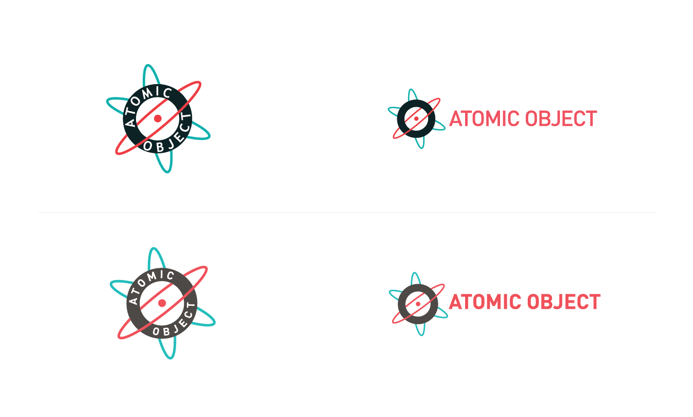
As I mentioned above, the logo was off limits. Well, mostly off limits. The integrity of the logo needed to stay the same, but small adjustments were considering okay. So we did the following:
- Changed the font weight: In the word mark we changed the weight to bold from regular, to increase legibility at smaller sizes
- Consolidated the type: Previously we had one font in our emblem and another in our word mark. This had to go.
- Updated our color palette.
- Changed the angle on the rotating orbs: we rotated them clockwise a couple of degrees so that the words “Atomic Object” would be more snug in between the orbs, instead of nearly clashing with the lower left orb.
Our new visual style
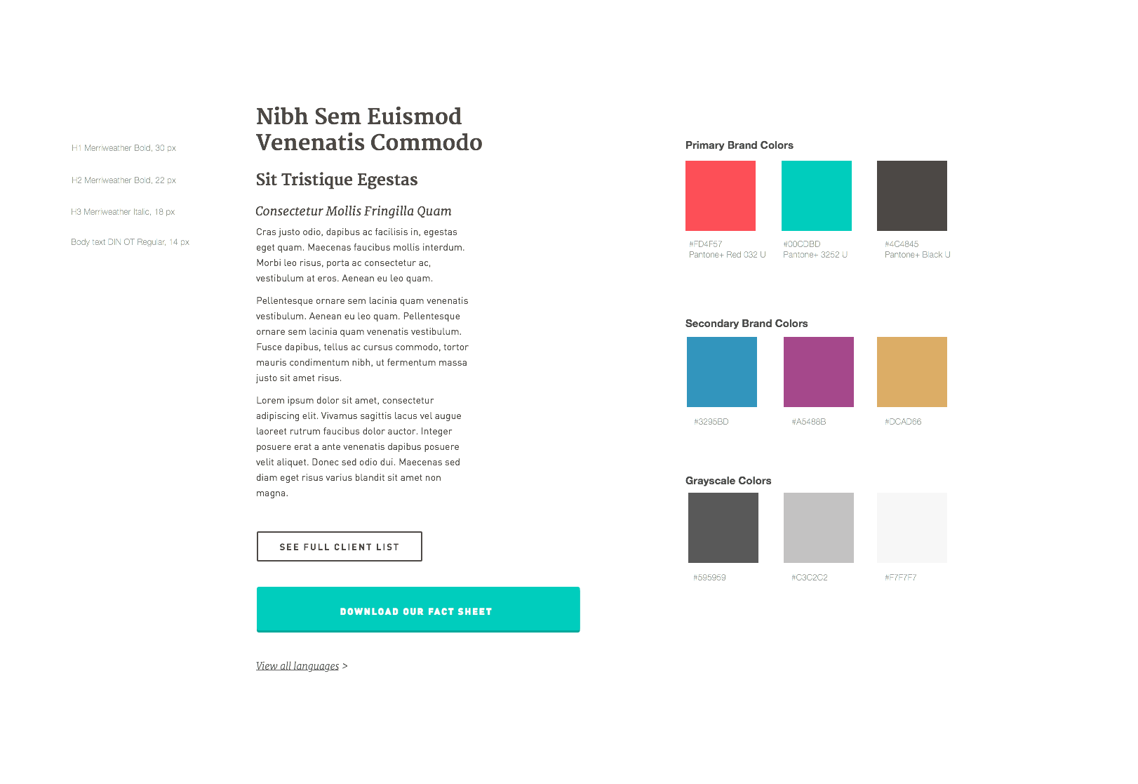
Throughout the process of wire framing and designing the new website, which was the main catalyst for this work, we selected updated fonts and colors to represent Atomic both online and in print.
Beyond the Website
Moving forward, we have big plans for continuing to consolidate our brand collateral online, in print, and in physical spaces. For the time being, we’ve divided all the touch points that needed a redesign into four phases, with estimates, just like we would on any other project.
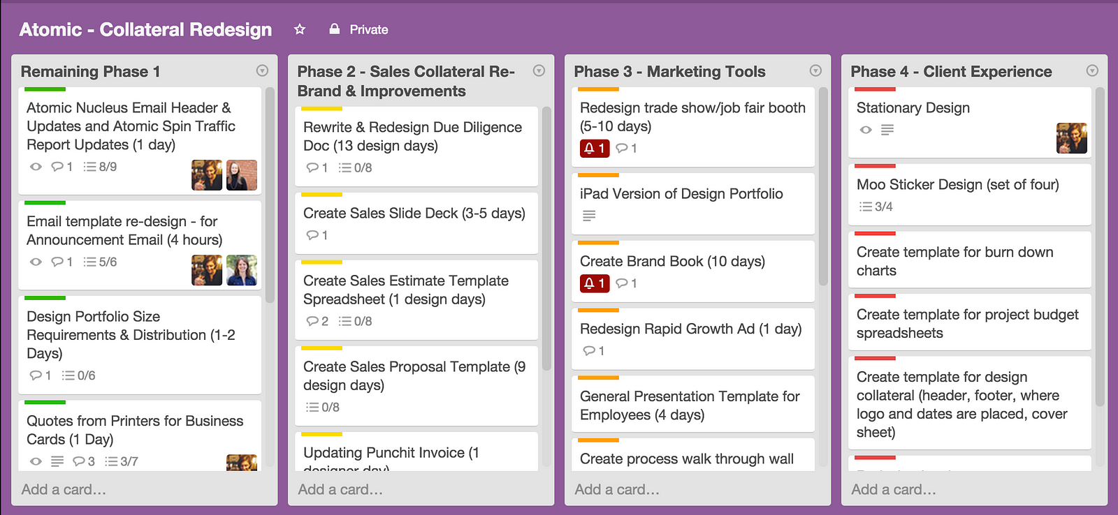
We have a long way to go to achieve our initial goals. But by taking an agile approach to the work, we’ve been able to process the large amount of work ahead while also being nimble to change.
This is the third post in a series about how we created our new site.
