Apple puts a strong emphasis on the Watch user experience outside of what you might traditionally consider “the application.” Their guidelines state that:
People frequently use a watchOS app’s related experiences — such as complications, notifications, and Siri interactions — more than they use the app itself.
So they encourage developers to optimize the entire experience (inside and outside the app) for “quick, information-rich” interactions.
I have several years’ experience with iOS, and in 2020, I tackled my first watchOS project. While watchOS 2 added support for third-party app complications back in 2015, I still struggled to find satisfactory documentation or tutorials for complications on watchOS 6.
Complications are the small widgets that Apple Watch users can add on their watch face. They display real-time information directly from the watch face without having to open the app.
In this series of posts, I want to create the complications tutorial that I couldn’t find last year:
- In this post, I’ll explain why complications are important and give an overview of complication families and templates.
- Next, I’ll create previews for the customization screen, discuss designing complication functionality, and implement the basic background refresh cycle.
- Finally, I’ll dive into some more advanced features for making rich complication experiences.
Caveat
Most of the details in this post are specific to watchOS 6. It’s possible that future versions of watchOS will follow the same API, but I’m skeptical because, at the moment, I would consider the API to be clunky at best. I hope Apple will improve the complication development API, but if they do, it will likely invalidate some of the following.
Why Include Complications?
Complications — when implemented well — provide a sleek and efficient way for users to interact with your app. Watch faces have limited space for complications, anywhere from one to five slots (depending on the watch face). By providing a compelling complication, your app can claim valuable watch face real estate and become one of the most visible applications on a user’s watch.
This is bolstered by the fact that a complication’s secondary duty is as an app launcher. The Apple Watch app selector is notoriously messy, so providing an easy front door to your application is a great way to ensure consistent usage.
In addition, apps with an active complication on the user’s watch face get preferred background treatment by the operating system. Apps will likely need to do some background processing to keep their complication fresh, so watchOS gives apps with active complications more background processing time. If your app does any other background processing, then you have alleviated a constraint on your app by getting a user to use your complication.
Complication Families
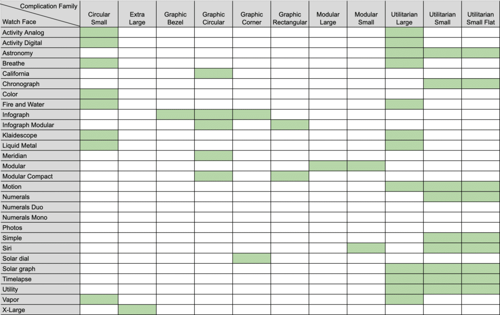
The first step in planning your complications is to decide which complication families to support. A family determines which watch face slots a complication can fit into. You can find all of the possible families by checking out the Supported Families checkboxes under the Complication Configuration section of the WatchKit Extension Target’s general settings.
Unfortunately, discovering watch face availability or previews for a family is tricky. Luckily for you, I’ve mapped out family availability for each watch face in the table below (click to enlarge).
I’d recommend supporting as many families as you can meaningfully display info for. I’d also recommend enabling the other families, even if you just display your app logo. By doing this, you will still reap the benefits discussed above for users that just want a quick way into your app.
Complication Templates
To choose complication families, you’ll need to investigate the templates available for each one. A template specifies the structure of the data within a complication family; it’s what decides whether your complication will include images, gauges, text, or other components.
Again, discovering which templates are available for each family is a bit tricky. The best way I’ve found to do this is to explore ClockKit’s CLKComplicationTemplate module with Xcode’s type-ahead assist. If you type “CLKComplication” and the complication family name, Xcode will recommend all of the possible templates to you.
Most of the templates are self-describing, but for those that aren’t, you’ll either have to try each out (as we’ll discuss in the next post) or check for each one in Apple’s documentation following this URL format: https://developer.apple.com/documentation/clockkit/[Template Class Name]
You can only display one template per complication family at a time, but which template you display can change at runtime. The information density of different templates varies widely; some templates may force you to be creative with your verbosity.
Handling No Content
Before you start working on a complication, you have to handle the case where the complication has nothing to display. If you created your project with the “Include Complication” setting enabled, you should already have a “Complication” folder within the WatchKit Extension’s assets directory. Within this folder, you’ll find placeholders for eight classes of complication families.
You need to replace the placeholders for your supported families with some sort of image, which will be displayed when your complication has nothing else to display. The most likely option is to use your app icon. The trick here is to get the necessary size for each family.
Next Steps
At this point, you should be able to launch your app, go back to the watch face, force press for customization, and select your application’s complication for a supported slot. It will preview as blank, but when you return to your home screen, you should see the image that you set in the last step.


