Article summary
I’m currently working on a project that uses Xamarin.Forms, and the other day I started a story to implement some design on a multi-selection list in our mobile application. The design added checkboxes to each cell in the list, and each checkbox has a subtle inner shadow.
This is a common design convention–so common that CSS has an attribute specifically to configure the design on a component.
But as I dove into this story, I realized that, not only is there no easy attribute for me to configure on my BoxView to give it an inner shadow, but very few people in the Xamarin.Forms community had any advice on how to achieve this effect.
I finally settled on using SkiaSharp to manually draw the inner shadow for my checkbox. Here’s how I did it.
Two Parts to a Checkbox
The drawing of our checkbox is done entirely on an SKCanvas element. This allows us to avoid the struggle of attempting to overlay two view elements on top of one another, and it also lets us take advantage of the SkiaSharp Blur filter to mimic the appearance of an internal shadow.
In my attempts to solve this problem, I first searched for a way to blur the interior of a square while keeping the edges sharply defined. This seemed like the most obvious solution.
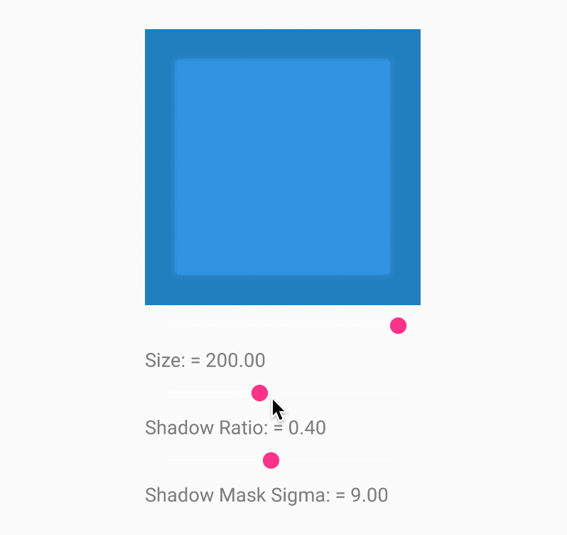
When no such method so presented itself, I approached the problem from a different angle. My solution consists of drawing a solid square in the desired shadow color, then laying a smaller square with blurred edges on top of that square. This gives the illusion of an internal shadow.
The Code
To achieve this effect, I created an SKCanvasView inside a ContentView. Then I added this OnCanvasViewPaintSurface to the code behind for the ContentView.
Here is the code I used to achieve this effect:
 void OnCanvasViewPaintSurface(object sender, SKPaintSurfaceEventArgs args)
        {
            SKImageInfo info = args.Info;
            SKSurface surface = args.Surface;
            SKCanvas canvas = surface.Canvas;
            float height = (float)info.Height;
            float width = (float)info.Width;

            canvas.Clear();

            if (IsChecked)
            {
                SKPaint paint = new SKPaint
                {
                    Style = SKPaintStyle.Stroke,
                    Color = checkedColor,
                    StrokeWidth = height
                };
                canvas.DrawRect(0, 0, width, height, paint);
            }
            else
            {
                SKPaint paint = new SKPaint
                {
                    Style = SKPaintStyle.Stroke,
                    Color = shadowColor,
                    StrokeWidth = height
                };
                canvas.DrawRect(0, 0, width, height, paint);

                float ShadowCoordinateRatio = (1 - ShadowRatio) / 2;

                float innerWidth = (float)(width * ShadowRatio);
                float innerHeight = (float)(height * ShadowRatio);

                float innerX = (float)(width * ShadowCoordinateRatio);
                float innerY = (float)(height * ShadowCoordinateRatio);
                SKPaint innerPaint = new SKPaint
                {
                    Style = SKPaintStyle.Stroke,
                    Color = boxColor,
                    StrokeWidth = innerHeight,
                    MaskFilter = SKMaskFilter.CreateBlur(SKBlurStyle.Normal, ShadowMaskSigma)
                };
                canvas.DrawRect(innerY, innerX, innerWidth, innerHeight, innerPaint);
            }
        }
What Does This Do?
In this method, we first check if the IsChecked Boolean is true. If it is, we draw a filled square in the color that indicates a checked state.
The logic becomes more complicated if the box is not checked. First, we draw a basic square that is the size of the entire checkbox, using the shadow color that we want. Then we perform some calculations to derive the center coordinates of the square.
We do this because in SkiaSharp, the origin is in the top left. We want to draw the lighter square in the center of the darker square, so we need to determine the center coordinates, along with the inner square’s width and height.
When we draw this second square with the unchecked color, we add a Blur effect to the SKPaint object.
These two important parameters determine the overall appearance of the shadow:
ShadowRatio: This value is used to calculate the height and width of the inner shadow box. The smaller the value (on a scale from 0 to 1), the smaller the internal square is, and therefore the wider the shadow appears to be. In my posted example, I found that0.45flooked good.ShadowMaskSigma: The documentation for SkiaSharp states that “The sigma parameter specifies the extent of the blur.” In this case, the sigma determines the width of the fade between the lighter and darker squares. Therefore, changes to the sigma adjust how aggressive the gradient between the two colors will look. In my example, I have this set to20.0f, but you may want to vary this value based on the size of your checkbox.
Using these two values, you can achieve a wide range of inner shadow effects. I’ve put together a quick project on my GitHub to show off the effect.
Final Thoughts
I am extremely happy with the outcome of this endeavor. In the end, I created a Checkbox component with a very believable internal shadow that matched the original designs.
I do realize that this implementation requires much more effort on the part of the developer than adding a few extra lines of CSS to an HTML element. It certainly took me a lot of thought to arrive at this end result. Hopefully, these steps will help you create a reusable Checkbox component that looks great in your application.


Hellow, nice article.
May I sugges you to add screenshots newt time you write a post like this one :)
Thanks !