Bootstrap has become a great tool for quickly bringing a web-based product to reality — even more so with the need for websites to be responsive. I’ve enjoyed using Bootstrap, and I feel version 3.0 has been another big step in the correct direction.
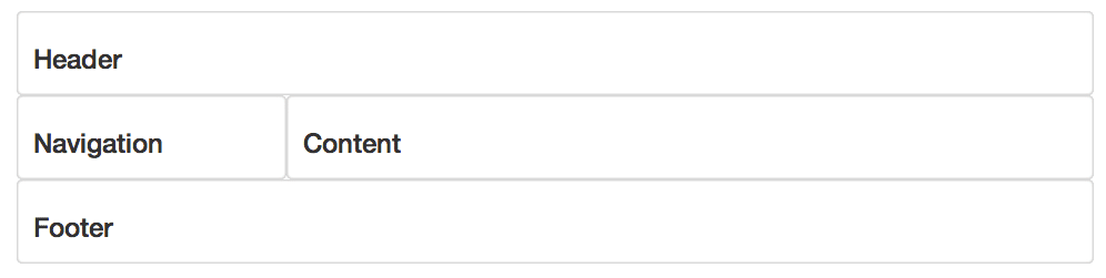
However I still cringe every time I have to add the class col-md-12 col-sm-6 etc etc etc into my dom. If we look at a simple layout and its markup, we can start to see the DOM clutter:
Layout
Markup
...
...
This example illustrates a common pain point of Bootstrap. The col-md-X classes mixing into the DOM goes against the teachings of Semantic Markup. Col-md- clutter the DOM and are, overall, an eyesore.
Bootstrap it not alone in this method of markup for CSS frameworks — Grid 960 and BluePrint CSS use the same approach. Fortunately, some are becoming more semantic like Foundation 4.
There is another approach to using Bootstrap. Because it’s built on LESS, we can take advantage of LESS Mixins. Mixins allow you to embed all the properties of a class into another class by simply including the class name as one of its properties. It’s just like variables, but for whole classes. Mixins can also behave like functions, and take arguments.
Bootstrap documents their mixins, allowing us to remove the layout classes from our html.
...
...
And turns our css, or LESS, into this.
header {
  make-md-col(12);
}

nav {
  make-sm-col(12);
  make-md-col(3);
}

main {
  make-sm-col(12);
  make-md-col(9);
}

footer {
  make-md-col(12);
}
This solution isn’t perfect. With your LESS using Mixins instead of classes in your HTML, your CSS can become large and also repetitive. The code to create an element spanning 12 columns would be repeated in the header and footer CSS. Depending on your CSS size, this could be a better way to go for your site.