Earlier this summer, it was announced that in response to customer feedback, Ford is bringing back buttons to its MyTouch in-car infotainment system.
My response: Well, Duh.
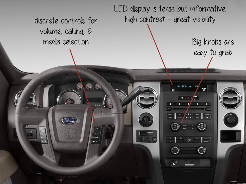
I’ve written previously about about my appreciation for Ford’s UI design, featuring my ’01 F150 pickup. Since then, I have traded in my old truck for its younger, sexier sibling, a SYNC-equipped 2010 model. I love the user experience in my new truck just as much as my old one. The voice recognition, while quirky sometimes, is perfectly adequate for everyday calling and bluetooth audio playback. The buttons and knobs are well-placed, the cluster is satisfyingly designed, and the LED display, while not as fancy as an LCD, is bright and absolutely useful in its simplicity.
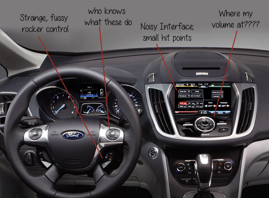
On the other hand, when I brought my truck to the dealership for routine service and was given a 2013 Ford Focus as a loaner vehicle to drive in the meantime, I was quickly reduced to a fit of frustrated rage. I could not figure out how to use the thing. I kept misfiring with the weird rocker control on the steering wheel, and I couldn’t figure out what the screen was trying to tell me… while driving down a four-lane road. And all I wanted to do was listen to some music!
As Consumer Reports put it in their aptly-titled article ‘Why the MyFord Touch control system stinks’:
“The flush, touch-sensitive buttons on the dashboard below the screen are maddeningly fussy and can be hard to distinguish. You can’t just feel for them; you need to look directly at them to tap the right spot. Once we finally found and pressed the one we wanted, it frequently didn’t register or actuated multiple times. Sometimes you have to press hard. And this is supposed to be the simplest way to make control inputs.”
It doesn’t take a UX genius to tell you why this is an inconvenient (and potentially dangerous) design direction, so I’m glad Ford is listening to the market and reintroducing old-school “buttons and knobs” for the 2014 model year. And I think there are plenty of lessons for the rest of us to learn from the way Ford introduced and then evolved the MyTouch system.
1. The best solution is hardly ever the sexiest solution.
Ford’s implementation of MyFord Touch came in 2010, just as touchscreen mobile phones were becoming mainstream in the US — three short years after the introduction of the iPhone changed the technology landscape forever. Undoubtedly, Ford’s decision was influenced by the historic company’s desire to stay hip and appear cutting-edge.
But in its haste to get myTouch to market, it seems that Ford failed to completely think through the business implications of changing out the old, intuitive, ever-present physical controls with a new interaction method, the standards of which were very much still emerging. And the backlash was not trivial.
The line between innovation and poor design is a fine one. UX designers can feel pressure from themselves, clients, and peers to innovate and come up with clever, revolutionary new paradigms for interaction. However, it’s important to consider and validate whether your innovation is truly right for the product and especially the context in which it will be used.
2. Don’t bury important UI elements in favor of aesthetics.
When we’re designing software, auxiliary functions can drown out primary functions, especially as we iterate on and augment our products. Make sure central functionality remains the focus, and as features are added to a product in iterative development, make sure they are truly right and useful. As the Consumer Reports reviewer pointed out about the MyTouch system, “Some screens seem like overkill: Do you need to see your fuel economy displayed with multiple bar graphs, selectable for every five, 10, or 30 minutes?”
3. Flat screens are inadequate.
In a vehicle with a well-designed console, I know where to reach. I can find the volume dial just by its contour, texture, and positioning, without ever taking my eyes off the road. Proprioception and mechanoreception give me valuable information about the world around me, allowing me to accomplish tasks. Touchscreens neuter those senses, in favor of hand-eye coordination.
Touchscreens are not the future; they are a step towards it. As science and technology progress, I feel certain we’ll be moving back towards (non-mechanical) 3D interfaces, as well as augmented reality. I hope I get to see the day when, as a software designer, I won’t have to make a button look like it has contours and shadows to increase its affordability — I’ll be able to give it a contour that casts shadows. The lines between graphic design, interface design, and industrial design will continue to blur, making cross-disciplinary teams and multi-talented designers even more crucial to future success.
4. Thoroughly test your bold choices, and pay attention to the results.
Ford’s bold moves into the infotainment space, as well as its collaboration with Microsoft to develop the technology, positioned it as a revolutionary in its industry. This also opened them up to huge amounts of backlash and brought their quality ratings way down. Being a large company with a longstanding reputation, Ford could take this hit, survive, and grow stronger from it. Smaller companies don’t have that luxury — a botched design could very well mean a failed product. If you’re introducing a revolutionary product or mode of interaction, you can’t afford not to extensively test it and make sure you’re bringing the right thing to the market, even if it means taking a step back and rethinking things.
With computing so embedded in our daily lives, I’m glad Ford and other companies like it are experimenting with new, revolutionary modes of interaction. It’s great to see an established company pushing for innovation and moving technology forward.
Which reminds me of Alan Cooper’s “The inmates are running the asylum”. There’s a chapter called “What Do You Get When You Cross a Computer with a Car?”.
The answer is – a computer. The he goes on explaining how a well meaning solution humiliated owners of the earlier Boxter models.
Great insight, but the interface you’re complaining about in your image is almost 2 years old, some of the items such as ‘small hit points” have been addressed in multiple updates, I’d love to see you compare the old OS referenced above with this summers revamped interface with significant usability improvements.
All too often I’m seeing this complaint online and it’s giving the system a bad rap to compare it before all the changes when it was far worse to the current version.
Hi Diane,
Thanks for your comment.
The interface in the photo is the one I experienced when driving a 2012 model year loaner vehicle from a dealership earlier this year. If even dealers can’t/don’t/won’t take time and effort to upgrade the software in the vehicles they send out, I wonder how many consumers are installing updates and enjoying the enhanced functionality afforded by the new software (my guess: very, very few.) This, to me, demonstrates the importance of considering update mechanisms when making UX decisions. In software that is easily or automatically updated, (for example, Chrome browser) UX fails can be quickly fixed and so may have a lesser impact on a product or brand’s reputation. But in an automobile or other embedded applications where updates are manual, broken software can stay out in the wild and continue to damage a brand’s reputation for a long, long time.
I would be very interested to take the latest version of MyFord Touch out for a spin. The problem space that Ford is working in is complex and fascinating, and I’d love to see the improvements they have made to the product.
It’s embarrassing to see that a dealer is letting the old interface be out there since it really was horrible, they have done a huge amount of work trying to salvage the fiasco of the initial deployment.
Ford is actually very aggressive at telling owners to update because of the huge hit that they’re taking in usability scores.