Article summary
During a recent project I came upon an interesting CSS problem. I needed to create a square element that would maintain its square shape as it responsively resized to a changing window size.
The Problem
It is easy to create a square in CSS when we can explicitly declare its 'width' and 'height':
.square {
  width: 100px;
  height: 100px;
}
However, when we try to make our square element responsive by changing our units to percentages, we run into a problem:
.square {
  width: 50%;
  height: 50%;
}
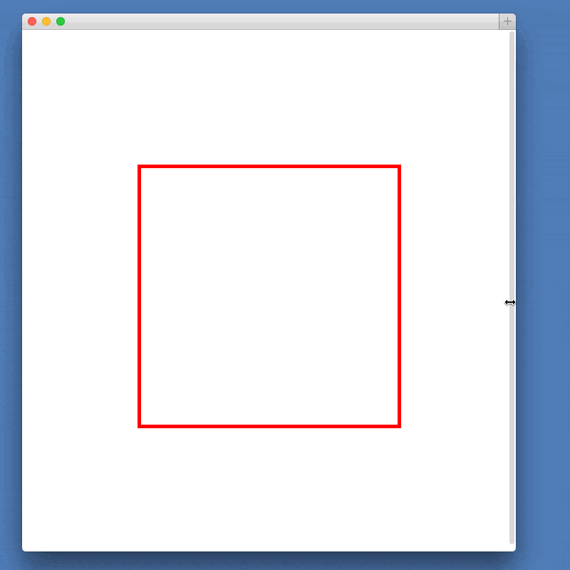
The element’s width is calculated as a percentage of its parent’s width, while its height is calculated as a percentage of its parent’s height. Because our width and height are calculated from different measurements, the square will no longer hold its shape.
The Solution
After quite a bit of searching, I came upon a surprising solution to the problem. By making use of the :after pseudo-element and 'padding-bottom', we can create our responsive square using only CSS.
The solution relies on the somewhat counterintuitive fact that padding is calculated as a percentage of its parent element’s width, not height. This rule applies, even for 'padding-top' and 'padding-bottom', despite being vertical measurements.
To capitalize on this fact, we must first remove the 'height' property from our .square element. In its place, we add an empty :after element to .square and set 'padding-bottom: 100%':
.square {
  width: 50%;
}

.square:after {
  content: "";
  display: block;
  padding-bottom: 100%;
}
Because the pseudo element’s padding is calculated as a percentage of its parent’s width, and its parent is our .square element, we are effectively fixing the height of the pseudo-element to the width of .square. Whenever .square’s width changes, so will the pseudo-element’s height.
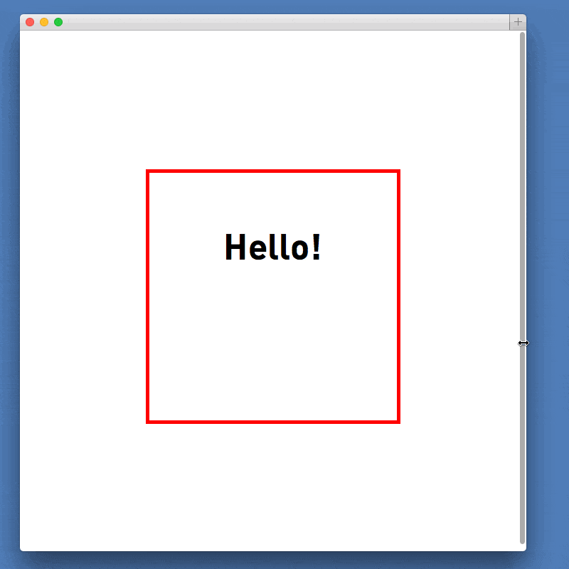
Adding Content
Finally, we might like to add some content to our .square element. The above solution relies on both .square and .square:after having a height of 0, so adding content to either of them would break our solution.
Fortunately, this problem is easily solved by creating an absolutely positioned element and placing it within .square. The new element can be sized to match the square, but since it is absolutely positioned, its content will not affect the dimensions of our square:
.square {
  position: relative;
  width: 50%;
}

.square:after {
  content: "";
  display: block;
  padding-bottom: 100%;
}

.content {
  position: absolute;
  width: 100%;
  height: 100%;
}
An alternate way would be using viewport units. While they are a bit newer, using them means not having to mess around with absolute positioning and ::after. The CSS would be:
.square {

    border: 5px solid red;

    text-align: center;

    width: 50vw;

    height: 50vw;

  }
.content {
font-size: 2em;
padding-top: 20%;
}
Codepen fork here
It is a bit limited just because viewport units are taken from the width of the window, not the width of the parent element. But if that fits with your desired layout, its cleaner code and less of a “hack”.
Thanks for sharing and explained so well with examples and all.
Thank you for this! Very helpful and clear, it saved me a lot of headache. Another one of those “it shouldn’t be this difficult/hacky” kind of CSS problems :)
This is cool, but what is the browser compatibility with it?
This is amazing. Thanks.
Thanks for sharing.
Exactly what I need. Thanks!
Just awesome! Until height can be defined as a percentage this will be my go to. And for the record, it works for other shapes too. I’ve made a scaling circle and scaling rectangle with slight variations. The circle, adding border-radius:50%, a 2-to-1 ratio’d rectangle, setting the padding-bottom to 50% instead of 100%. Thank you for this elegant “hack”
Very Nice!
Thanks for sharing this!
so helpful thanks!!
Thank you!!!
ı need the to do responsive this div pls help thanx
Untitled
.edgeLoad-D0111 { visibility:hidden; }
AdobeEdge.loadComposition(‘/lms/static/images/D0111’, ‘D0111’, {
scaleToFit: “none”,
centerStage: “none”,
minW: “0”,
maxW: “undefined”,
width: “0px”,
height: “810px”
}, {dom: [ ]}, {dom: [ ]});
Dinleme MetniÜnite 1: MERHABA – Konu 1: Tanışma
ı cant upload all code
can you anybody help me about a dive make a responsive
ı can send
send your code to [email protected]
Thank you!!!
Bobby this is an awesome solution. But I think there’s a problem with it in Firefox. It just doesn’t work (collapses the element height to 0). Has anyone else got the same problem?
Isn’t it a rectangle? a square has on all sides the same length. Can be wrong though.