If you have found this article, chances are you are working on some Enterprise-level UI mock-ups. Chances are, you find yourself recreating the same navigation elements, buttons, filter lists, table headers, and cells…Chances are, you’ve noticed that there are many elements that are quite similar, but have minor differences. And chances are, using customizable symbols is going to drastically speed up your process!
Sketch’s Nested Symbols
The power of Sketch lies in its use of symbols to speed up mock-ups, limiting the burden on the application and your computer. There are already a lot of really good tutorials on basic symbol creation out there using the standard ‘contact list on a mobile app’ screen, but I’ve noticed a lack of information on using symbols for hardcore Enterprise UI design.
For a great introduction to nested symbol creation, check out this article, which is, without a doubt, the coolest Sketch technique you’ll see all day. My tutorial will use a lot of similar techniques, but with an Enterprise UI focus.
In this three-part series, I’ll walk through the organization and best practices for creating symbol libraries. I’ll discuss how to build nested symbols with masks to quickly change the colors of elements like icons, backgrounds, and borders. Finally, I’ll show you how to put all of the pieces together into a data-dense Enterprise UI that is quickly editable to make UI mock-ups a breeze.
Creating a Symbol Library for an Enterprise UI
Have a gameplan
First and foremost, gather a list of all of your UI elements and their different states (actives, hovers, disabled, etc.). This can be quite difficult if you are just getting started with a brand new project, so I recommend building your first few iterations of your UI the old-fashioned way, without forcing yourself to use symbols.
Once you have a pretty good idea of what your colors, fonts, sizes, margins, icons, etc. look like, you are ready to start building your symbol library. Just a warning–this can be a significant time investment, but it will save you a ton of time in the end.
Build the basics first
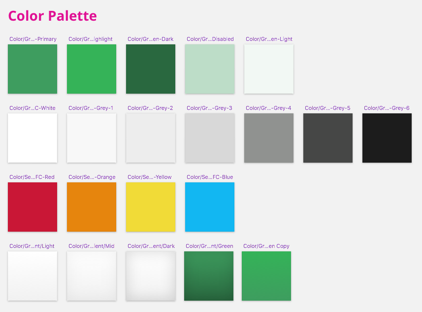
The first symbols I create are my color swatches. Every color, shade, or gradient becomes its very own symbol in the library. These will form the foundation for all other symbols, and doing this makes adjusting your palette down the road a breeze!
To do this, create a new document by drawing a 100 x 100px square. Select it, and create a symbol. (If you are unfamiliar with creating symbols, check out the creating symbols tutorial from the creators of Sketch.)
You can make this symbol any size, as long as all of your color symbols are the exact same size. This rule applies to all symbol groups; i.e. icons, buttons, font styles, etc.
The next step is to give this symbol a proper name. Nested symbols rely heavily on naming conventions to organize your elements.
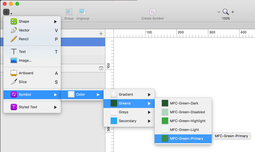
For colors, I name them like so: Color/Green/Green-1, Color/Green/Green-2, Color/Grey/Grey-1, Color/Gradient/Gradient-1, and so on…
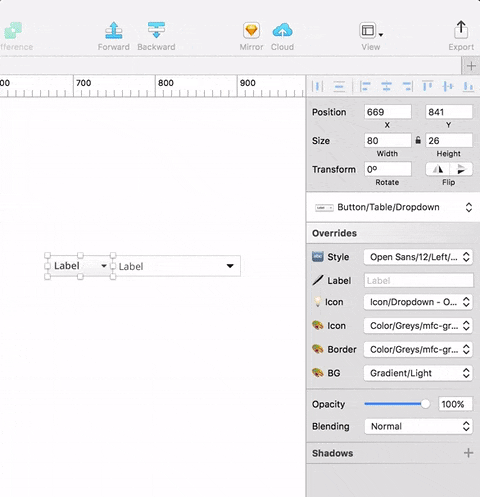
The forward slash breaks up the elements into sub-menus under your “Insert Symbol” menu, and the symbol override controls in the right panel.
Once you are in your symbols library, you can duplicate the symbol, change the color, and rename it. Do this as many times as you need.
Nesting color symbols in icons
I’m going to assume that because we are building an Enterprise UI, we are going to be using a lot of icons. I’m also going to assume that the icons in the UI aren’t always the same color. We could build each icon as a symbol, and then recreate it in all of the different colors within our UI. We could even use nice organizational naming conventions like Icon/Warning/Grey/Grey-1, Icon/Warning/Grey/Grey-2, etc.
Instead, there is a better way! We can nest a color symbol within our icon symbol and have the ability to override it with any other color as we need.
If you are drawing your own symbols, you are one step ahead. If you are using a symbol font, you’ll need to convert the icon to outlines to make this work.
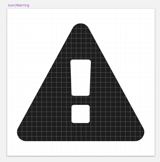
To begin, create a new 30 x 30px artboard. (Again, this can be any size, as long as all of your icon symbols are the same size.)
Place your icon in the middle of the artboard, and size it to fit. Save it as a new symbol. Remember, a good naming convention still applies: Icon/Warning, for example.
Find your new icon in your symbols library, and insert an instance of a color symbol directly within the artboard. Size the symbol to 30 x 30, and make sure its X and Y are both set at zero. This ensures that your entire symbol will be colored correctly if you resize the icon later in your UI creation.
With your icon layer under your color layer, set it as a mask.
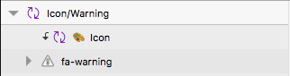
There you have it! A fully re-colorable icon symbol.
This post is part one in a series on using Sketch’s nested symbols to build enterprise UI mockups:
- Part 1 – Getting Starting with Nested Symbols
- Part 2 – Buttons & Table Elements
- Part 3 – Putting it All Together