On a recent project, we needed to support multi-level tab bar navigation within our application. With multiple variations of tab bars, each page needed to know which tabs to show. We found that TypeScript offered a good solution.
For this particular application, we are using Material-UI’s Tab Bar component for navigation. However, the presented approach works with other APIs as well.
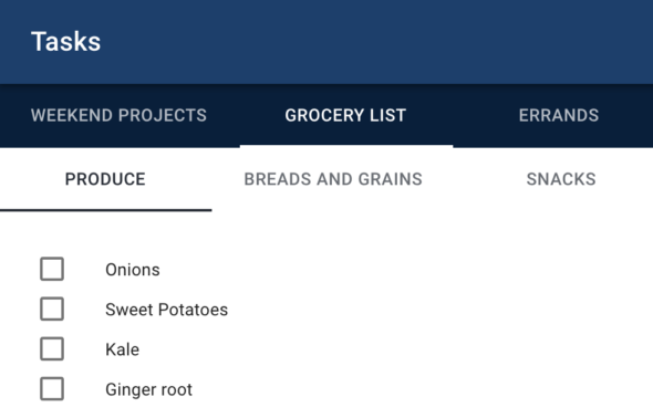
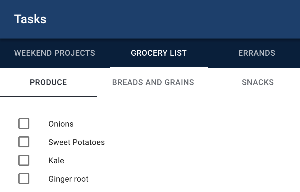
Here is an example of nested navigation that has similar logic:

Produce is a subset of Grocery List, as are Breads and Grains and Snacks. So, if the user clicks on Errands, they should no longer be able to access the subsections belonging to Grocery List.
It turns out that TypeScript is well suited to handle the problem of describing the unique combinations of sections and subsections. Using typed objects to collect the valid combinations of sections and subsections will enforce that invalid states are impossible.
Here’s how we put it all together.
1. Custom Provider
First, we create a context to keep track of the selected Section. The definition of Section will likely be strongly tied to the business logic of the application.
Section can also be used to represent the differentiation between user-group specific views or modes of the application. This definition will work for the example above:
export type Section = WeekendProjectsSection | GroceryListSection | ErrandSection | null;Null represents the state where nothing is selected; there are other ways to handle this case.
Take a look at the definition of the SectionProvider.
import * as React from "react";
import { Section } from "client/core";

export const SectionContext = React.createContext({
  selected: null as Section,
  setSelected: (url: Section) => {},
});

export const SectionProvider = SectionContext.Provider;

export interface Props {
  selected: Section;
}

export function ActivatedSection(props: Props) {
  const context = React.useContext(SectionContext);
  React.useEffect(() => {
    context.setSelected(props.selected);
    return () => {};
  }, []);
  return null;
}
The ActivatedSection component can then be dropped on a page and linked to the Section where it belongs, and the state will update.
The React.useEffect() hook in ActivatedSection provides a way to tell React which side effects to run at any point in its lifecycle. Think about it like the combination of the React class lifecycle method: componentDidMount, componentDidUpdate, and componentWillUnmount. Here, we are telling the tab bar to render with the correct selected state.
The second argument to useEffect() tells React to skip the effect if its value has not changed. Here, we pass in an [] to make it run the effect only once, on mounting.
If you want to learn more about React.useContext() or React.useEffect() hooks, check out the docs.
2. Type-Aware Tab Bar
Now we’ll define a type to describe a set of tabs that belong to a tab bar. The tab bar component will receive TabBarInfo as props to build itself.
import { Prism } from "@atomic-object/lenses";
import { Section } from "client/core";
import * as React from "react";

export type TabBarInfo = {
  prism: Prism<Section, string | undefined>;
  tabInfo: {
    value: string | undefined;
    label: string | React.ReactElement;
    route: string;
  }[];
};

type PrismType = (props?: any) => string | undefined;

export interface TabBarInfoGivenT extends TabBarInfo {
  prism: Prism<Section, string | undefined>;
  tabInfo: TabInfo<ReturnType>[];
}

export interface TabInfo {
  value: T;
  label: string | React.ReactElement;
  route: string;
}
The goal here is to define the TabBarInfo in terms of T, the type of the prism that retrieves the selected tabs for the section. This eliminates invalid combinations of Sections. We use TabBarInfoGivenT<T> to compose our specific sets of Tabs with its matching prism.
The TabBarInfo for the GroceryList subsections will look like this:
export const groceryTabBarInfo = (): TabBarInfoGivenT<typeof grocerySubSection> => ({
  prism: grocerySubSection,
  tabInfo: [
    {
      route: ProduceRoute.generate(),
      label: "Produce",
      value: "produce",
    },
    {
      route: BreadsAndGrainsRoute.generate(),
      label: "Breads and Grains",
      value: "breadsAndGrains",
    },
    {
      route: SnacksRoute.generate(),
      label: "Snacks",
      value: "snacks",
    },
  ],
});
Prisms are fail-safe getter/setter pairs that represent the location within a data structure. They are used here to return the possible values of subsections, then check the values within tabInfo against them. As a result, any mismatch or typo will be caught.
3. Define Valid States
We will need types that define the valid selectable sections. Starting at the top level, there are types linking every section that is logically related another. For this example, only the path to the ProduceSection will be fully defined.
export type TaskSection = {
  main: "tasks";
  subSection: TaskSubSection;
};

export type TaskSubSection =
  | WeekendProjectsSections
  | GroceryListSection
  | ErrandsSection;

export type GroceryListSection = {
  taskMain: "groceryList";
  subSection: GroceryListSubSection;
};
export type GroceryListSubSection =
  | ProduceSection
  | BreadsAndGrainsSection
  | SnacksSection;

export type ProduceSection = {
  groceryMain: "produce";
};
4. Inside the Component
Now we are ready to put it all together. Inside the subcomponent, in this case, the ProduceList drops right in with the matching selected Section.
export const ProduceList: React.SFC<{}> = props => {
  return (
    <ActivatedSection
      selected={{
        main: "tasks",
        subSection: {
          substituteMain: "groceryList",
          subSection: "produce",
        },
      }}
    />
   {...} // build the rest of the component here
  );
};
The beauty of this approach is that nesting can be as deep or shallow as your designs require. Furthermore, there is just one provider that is aware of the entire Section context. Lastly, once the infrastructure is in place, actions such as adding, removing, or changing sections become simple.

