Has this ever happened to you? You just worked hours on end getting your React Native app to look perfect on your current device. In excitement, you call your friend over and tell them to download your app on their phone. Once downloaded, you notice an unimpressed look on their face. Turns out your friend’s phone has a different font size and screen resolution. This resulted in your app looking very poor on their device. You forgot to account for different device sizes. Well, how do you fix this? Let me tell you three ways to scale your React Native app!
Let’s take a look at this example code.
const Pictures: = () => {
  const styles = makeStyles();
  return (
    <SafeAreaView style={styles.safeAreaViewContainer}>
      <View style={styles.screenContainer}>
        <View style={styles.boxContainer}>
          <Text style={styles.sectionTitle}>Some nice pictures</Text>
          <Image
            style={styles.imageTop}
            source={require('./images/rose.jpeg')}
          />
          <Image
            style={styles.imageBot}
            source={require('./images/palm_tree.jpeg')}
          />
        </View>
      </View>
    </SafeAreaView>
  );
};

const makeStyles = StyleSheet.create({
  safeAreaViewContainer: {
    minWidth: '100%',
    minHeight: '100%',
    backgroundColor: 'red',
    justifyContent: 'center',
    alignItems: 'center',
  },
  screenContainer: {
    height: '100%',
    width: '100%',
    justifyContent: 'center',
    alignItems: 'center',
  },
  boxContainer: {
    paddingHorizontal: 36,
    paddingVertical: 36,
    alignItems: 'center',
    backgroundColor: 'white',
    width: 350,
    height: 700,
  },
  sectionTitle: {
    fontSize: 30,
    fontWeight: '600',
  },
  imageTop: {
    height: 200,
    width: 300,
  },
  imageBot: {
    height: 200,
    width: 300,
    marginTop: 20,
  },
});
Run on an iPhone 13, it looks like this:
Let’s take a look at what happens when I run the same code on an iPhone 8.
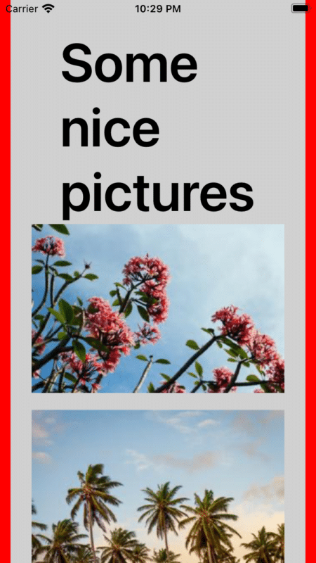
As we can see, it doesn’t look great anymore. Let’s go over three different responsiveness (font scaling) techniques we can use to solve this issue on React Native.
1. Use percentages and padding over pixels.
One of the biggest mistakes some new programmers make is to set a fixed value for the styling of an element. This fixed size might look great on your device but may not on others with different screen sizes. If we take a look at our example code, we notice that we have made this first mistake.
  boxContainer: {
    paddingHorizontal: 36,
    paddingVertical: 36,
    alignItems: 'center',
    backgroundColor: 'white',
    width: 350,
    height: 700,
  },
The width and height of this boxContainer are both set to a fixed value. This looks great on the iPhone 13, but on the iPhone 8, that value becomes too large. To fix this issue, instead of setting the width and height to a fixed value, we can set them to a percentage. The percentage will determine the size of the element based on the size of the parent element it’s nested in. Let’s make that change here.
  boxContainer: {
    paddingHorizontal: 36,
    paddingVertical: 36,
    alignItems: 'center',
    backgroundColor: 'white',
    width: '100%', // Change width to '100%'
    height: '100%', // Change height to '100%'
  },
In this case, we change the percentage to 100% so the box container fits 100% of its parent element. Changing the fixed values to percentages produces the following results on the iPhone 8.
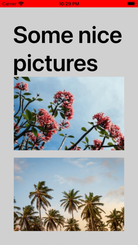
Now wait a minute! It still doesn’t look like the original image, right? That’s where padding comes in! We can add padding to the parent container in order to set a uniform size across all devices for our box container.
  screenContainer: {
    height: '100%',
    width: '100%',
    justifyContent: 'center',
    alignItems: 'center',
    paddingHorizontal: 20,
    paddingVertical: 20,
  },
Putting this altogether, the styling makes the box container fit 100% of the entire screen width and height and also applies padding of 20 on every side. This ensures that no matter what device is running, the container will always look the same. This is because the box container will always fit the space 20 pixels away from the edges of the screen. Let’s see what this looks like now.
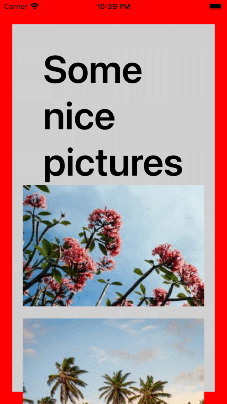
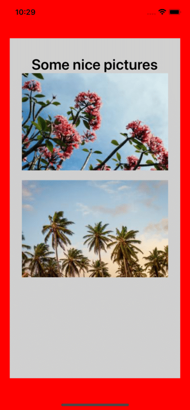
The box container now fits inside the screen and looks like it originally did! Next, we will address the issue with the font being too large and pushing the images off the screen.
2. Use the useWindowDimensions() fontScale variable
The fontScale variable provided by the useWindowDimensions() hook provides a convenient way to find the font scale of the current device. This is especially helpful for devices where the display is scaled up or down to different font sizes. Taking a look at the iPhone 13 and the iPhone 8, we see that the font on the iPhone 8 is a lot larger because the display was scaled up.
In this case, we can use this fontScale variable as a multiplier that we apply to the current font size. This multiplier will adjust the font size based on the scaling of the device. The fontScale can range from anywhere between 0.5 to 4. A lower number corresponds to a smaller scale, and a higher number corresponds to a higher scale. Hence, by dividing the font size by this scale, we can adjust the font based on the font scale of the device. Let’s make that change!
First let’s import the useWindowDimensions() hook and declare the fontScale variable. Then we can pass that fontScale into the StyleSheet.
const Pictures: = () => {
  const {fontScale} = useWindowDimensions(); // import useWindowDimensions()
  const styles = makeStyles(fontScale); // pass in fontScale to the StyleSheet
  return (
    <SafeAreaView style={styles.safeAreaViewContainer}>
      <View style={styles.screenContainer}>
        <View style={styles.boxContainer}>
          <Text style={styles.sectionTitle}>Some nice pictures</Text>
          <Image
            style={styles.imageTop}
            source={require('./images/rose.jpeg')}
          />
          <Image
            style={styles.imageBot}
            source={require('./images/palm_tree.jpeg')}
          />
        </View>
      </View>
    </SafeAreaView>
  );
};
Next let’s apply that value to our fontSize.
const makeStyles = fontScale => StyleSheet.create({
  safeAreaViewContainer: {
    minWidth: '100%',
    minHeight: '100%',
    backgroundColor: 'red',
    justifyContent: 'center',
    alignItems: 'center',
  },
  screenContainer: {
    height: '100%',
    width: '100%',
    justifyContent: 'center',
    alignItems: 'center',
    paddingHorizontal: 20,
    paddingVertical: 20,
  },
  boxContainer: {
    paddingHorizontal: 36,
    paddingVertical: 36,
    alignItems: 'center',
    backgroundColor: '#D0D0D0',
    width: '100%',
    height: '100%',
  },
  sectionTitle: {
    fontSize: 30 / fontScale, // divide the font size by the font scale
    fontWeight: '600',
  },
  imageTop: {
    height: 200,
    width: 300,
  },
  imageBot: {
    height: 200,
    width: 300,
    marginTop: 20,
  },
});
Let’s run this code on the iPhone 8 and see what happens.

Looks great, doesn’t it? Now the font will scale correctly regardless of the display scale of the device. This method doesn’t only apply to font sizes but can also be used to scale other elements within your app. If, instead, you want an element to become larger when the display scale is increased, simply multiply the size of that element by the fontScale, and it will scale up on your devices.
3. Restrict device font scaling
The last method to scale your React Native app allows you to apply an app-wide maximum font scale that any text element can reach. This means that whatever maximum font multiplier you set, the text in your app will never exceed that maximum size. This method is great if you don’t want to go through every text element and individually fix the scale but just want to set a maximum font scale and forget about it. Let’s take a look at how to implement this.
To make this change, we need to add some code to the highest level file of your project so that this scaling restriction can be applied to your entire app. Navigate to the index.js file in your root directory and add the following code.
import {Text, TextInput} from "react-native";

Text.defaultProps = Text.defaultProps || {};
Text.defaultProps.maxFontSizeMultiplier = 1; // the maximum amount the font size will scale.
TextInput.defaultProps = Text.defaultProps || {};
TextInput.defaultProps.maxFontSizeMultiplier = 1; // the maximum amount the font size will scale.
This code is modifying the default props of the Text and TextInput element to always have a maxFontSizeMultiplier across your entire project. Instead of individually applying scaling to each text input, this change automatically applies a maximum font scale to every single text occurrence.
For our case, the value of 1 is used. This is equivalent to disabling the scaling of the font of the app, but feel free to adjust this value for what works best with your app. A higher max font scale means that the font will scale a lot higher on your device. Let’s take a look at what this change does.
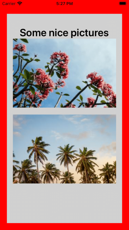
With this change, the font will always remain at a readable size regardless of the display scaling of the device.
Scale Your React Native App: Wrapping Up
There you have it! Here are three ways you can scale your react native app and ensure that it looks great across all the different devices and displays. As a further note, these methods are only a guideline for how to implement these changes. Each app is different, and it will require differing amounts of experimentation to achieve the sweet spot of values for your app.
Some of these methods may work better than others, so definitely spend some time finding which one works best. Hopefully, with the help of these methods, you’ll be able to create a great-looking app and find that the look on your friend’s face will quickly turn from disappointment to amazement. Happy coding!


I dont think #2 will work like you are explaining it will. In the description you talk about multiplying the font size by the fontScale but in the code you divide it. That reverses the scaling, giving you a smaller font as the user scales up and larger as they scale down. `30 / 0.5 = 60`!
If you simply multiply you aren’t doing anything different than the device is doing.
hi,
thats a great approch. but how about min font scale. Is there any solution ?