Over the past few years, our teams have created numerous software products designed with Figma. Figma is a design tool for creating visual artifacts that help communicate the desired user flows. Below is my current game plan to get the design implementation side of the project up and running quickly.
To start, create a new Figma file and give the file a useful and descriptive name. The client name + project tile (or code name) often gets the job done. A name like “Acme – Project Orange” can be descriptive and serves two main functions. First, it gives the user of the file confidence they are in the right place. Secondly, it helps differentiate Figma files from one another, which can be very helpful when working on multiple projects.
Setting Up the File’s Pages
You’ll create two pages to start a design file. Pages are the spaces where the designs live within a Figma file. The first page is the “Application” or “Visual Designs” page that will house the application screens and user flows. The other page is the “Components” page, which will be the home for the master components. The Application page lives above the Component page. That’s because you’ll access the Application page far more often during the first phase of the design implementation.
A small but useful tip is to add an emoji with a few spaces prepending the name to help visually identify the differences in the Application and Component pages. I tend to use the puzzle piece for the component page and the frame with picture for the Application page, but use what works for you.
Application Page Layout
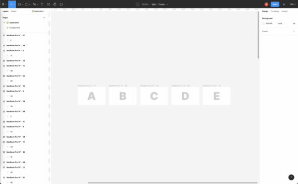
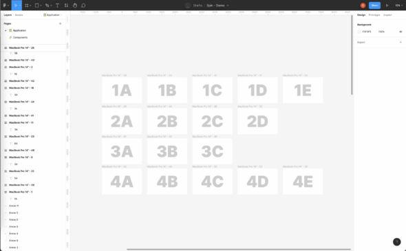
At the end of the design process, this page will detail most application pages in a site map structure. To start, however, I tend to lay out the first flow from left to right, then build up and down, keeping a logical grouping of functionality in mind. I often don’t worry about naming artboards until there is some complexity or depth to the application screens. There is often a point or many points where you need a logical grouping. That is a great time to name or rename your artboards.
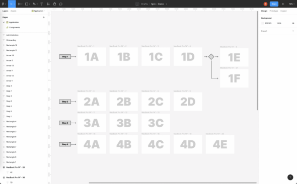
You can leverage arrows and select flow diagram elements to help document the user’s path when looking at the artboards. I’ll use the Process element to state the desired user flow. I’ll use the Decision element to describe how a user might get to a specific screen.
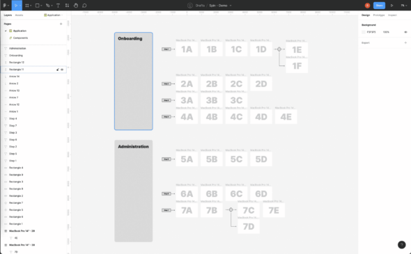
As the application page gets more complex, adding labels and visual groupings can help wayfinding when zoomed far out from the details of the dartboards. These different sections may need to be split into to different pages if the amount of content becomes unwieldy.
Component Page Layout
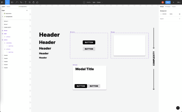
The second page is a component repository. Components are reusable elements, such that if you make a change to the master component all the instances of the component are also changed. These components can be simple or highly complex. I often have them ordered in a grid-like fashion to help keep order and aid in visual scanning when trying to find a desired master component. More complex components also live below simpler ones.
If the team is using a design system such as React Bootstrap, Angular Material, or the like, the components are recreated from the design system’s components list. These component names should match the design system component names. For example, if using Angular Material you should name the select component “mat-select.”
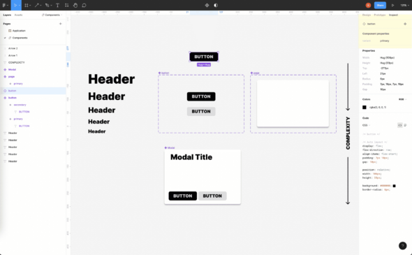
The design system’s naming convention should also be applied when adding variants of components. Variants are components that are slightly different but closely related. A good example is when using primary and secondary buttons. The variant properties in the Figma component should match the design systems. For example, React Bootstrap uses variant=“primary” variant=“secondary” for the primary and secondary button styling. I would expect “variant” as the property variable in the Figma component that would accept “primary” and “secondary” as variant options.
This aligning of components and variant names will closely couple design and development through having design and development talk in the same language. When designers are communicating with developers and referencing a variant of a component, there’s less friction if both are using the same terminology. Likewise, when developers are likely to have an easier time when inspecting designs for implementation when the component’s variants match the documentation of the design system.
Sharing with Your Team
Inviting your team is great, but consider giving read-only access to non-designers or those not familiar with Figma. Unfamiliar users can accidentally move or delete items.
Review the designs often with the team so they are comfortable finding their way around the pages. Ensure everyone knows how to inspect artboards and identify components used to ensure you’re using the right components and aren’t duplicating work.
Things will grow and get more complicated from here as your project grows, and that’s totally normal.