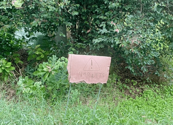
The other day, while walking my dog, I noticed a sign in a neighbor’s yard. It immediately caught my attention, not because it was flashy, but because of how clearly it communicated its message. With just a simple image, I knew right away to steer myself (and, more importantly, my dog) away from a bush full of hornets. After gratefully avoiding the hornets’ bush, I began noticing more signs around the neighborhood, many of them using icons to get their point across.
Icons are powerful tools used to communicate meaning. Designers use them because they are easily recognizable, compact ,and visually pleasing. I’ll share what these neighborhood signs can teach us about using icons effectively in user interfaces.
Icons should communicate meaning
In this hornets example, the designer paired the word ‘Hornets’ with a warning icon, and the icon make all the difference. For some background, I live in North Carolina which is home to the Charlotte Hornets. Without the icon, I might have assumed the sign was just showing support for an NBA team. But with the icon, the message was unmistakably indicating danger. When used successfully icons are more than decoration and serve a purpose: to communicate clearly and quickly.

Choose familiar icons
On the hornets sign, the designer chose a symbol almost everyone recognizes: a warning icon. Because of that choice, I instantly understood I needed to use caution. They could have gone in lots of different directions, but by leaning on something familiar, the message was clear to anyone passing by.
The same principle applies in UI design. Whenever possible, stick with icons that are commonly used. There’s no need to reinvent the wheel. Familiarity helps your users and makes your interface easier and faster to use.
Keep it simple
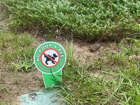
On my walk, I noticed a yard with several signs aimed at keeping pets from using the lawn as their bathroom. One of the signs used a dog icon to get the point across, but the design was a little awkward. It included an odd rendering of a dog and a red slash through it it which felt more distracting than helpful. Instead of making the message clearer, the icon actually slowed me down as I tried to figure out what it meant. Icons are best when they are simple and easily recognizable.
Context matters
How and where an icon is used plays a big role in how well the message comes across. In the hornets example, the sign was placed right next to the dangerous bush. The physical proximity allowed me to fully comprehend the danger.
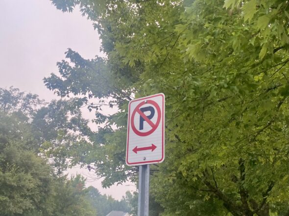
Another example I noticed on my walk was a no parking sign. Out of context, a P with a cross through it might be ambiguous. But on a busy street, styled like every other traffic sign, the user can easily understand that P stands for Parking and the sign means ‘No Parking.’ Icons don’t exist in isolation and their context shapes how we understand them.
Room for improvement
I’ve praised the hornets sign for its smart use of a warning icon, but there’s still room for improvement. With stronger color contrast and more legible text, the sign would be even easier to read.
Just like in this example, icons are powerful tools for communication. They’re most effective when paired with thoughtful design choices, selected with the end user in mind.