I’m back again for another post about Figma. Why? Because it is hands down my new favorite design and prototyping tool. Even better, it is an all-in-one solution! For this post, we are going to talk about tips for improving micro-interaction prototypes, such as hover effects or UI animations.
1. Work backward
For prototyping micro-interactions, we are less worried about how a user navigates throughout an app from beginning to end. Instead, we’re focused on what the final state looks like for the interaction. Often, our final state may look much different or incorporate more elements than the starting point.
By working backgrounds, we are building what our desired end state looks like first.
If your prototype is showing how buttons come in from off-screen, you’ll need to account for those buttons in both states. Once the desired end state is done, duplicate the frame, and then slide (with Shift+Arrows) off the artboard.
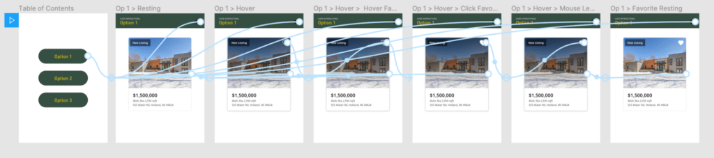
2. Build a table of contents
When prototyping micro-interactions, I am often testing variances in the design. Because prototyping in design tools typically has a single starting artboard, it becomes annoying to have to exit the prototype, switch the starting artboard, and launch it again.
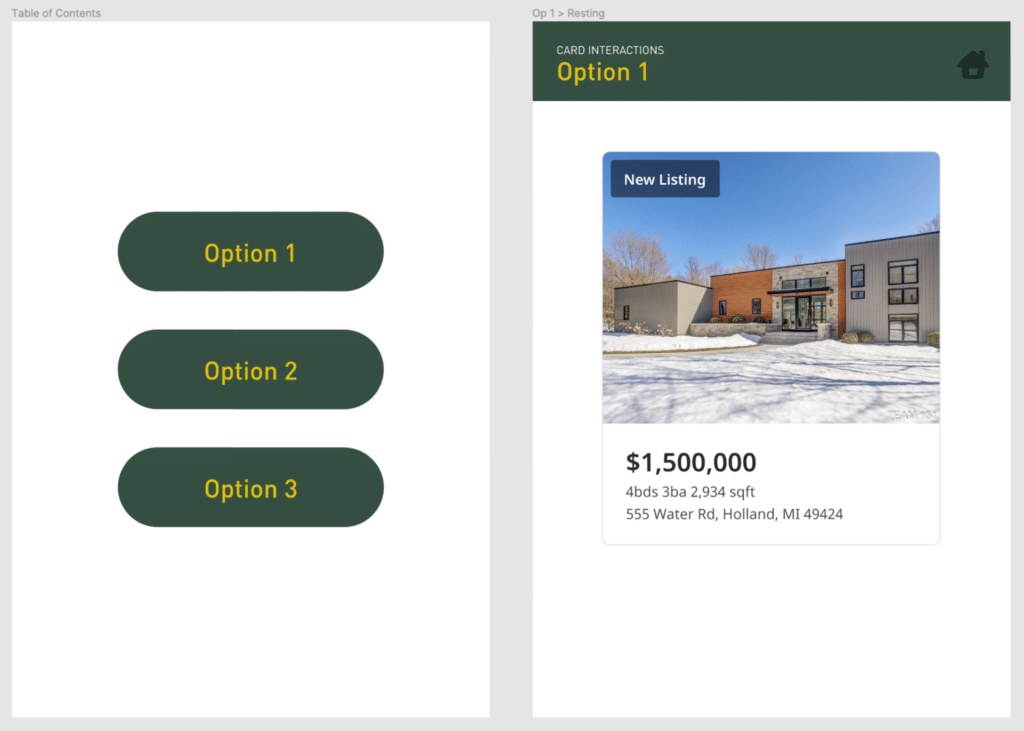
I’ve found that creating a table of contents and a consistent ‘container’ increases the speed at which I can test between options.
3. Avoid combining Micro- and Macro-interactions
Macro-interactions are concerned with app navigation, making sure users understand where they go to accomplish a specific task, and how easily they can get there. To prevent complexity, avoid building out the micro-interactions into a macro-prototype, or else your prototype is going to become far too complex to manage.
Hi Mark. I like your ToC idea. I have a similar issues – needing to show various variations but only having one starting page. I did try creating a prototype “navigation” system/menu, however that doesn’t work if there are overlays on the screen which just made things even more confusing. For example, I need to show different scenarios for validation errors or other issues within a registration and login process. I don’t always have something on the screen to trigger the next stage in a scenario. When I share the prototype in JIRA for developers or the BA to follow.. it isn’t helpful to just have that one starting screen that can only show one scenario.
So when you’re using your ToC, does this you just tell people to use the “Restart” button to get back to the ToC?
Sorry, not sure why I said Mark instead of Kyle. I’ll go have another cup of coffee now…
Hi Jessica,
Thanks for the comment! In essence, it is a quick way for the person using the prototype to “reset” it, yes. But the ToC could also be a lot more descriptive than just “Option 1, 2, 3”. From your scenario, it sounds like you are sharing with Developers or BAs to illustrate expectations during specific events (attached to stories). It could be helpful to have buttons links that say “Email address is already in use” or “Password does not meet requirements”. This gives them clear direction on where to look (and what to expect). This is obviously much different than trying to elicit raw feedback.
Also, your other comment reminded me of this:
https://www.youtube.com/watch?v=NTK6sTIsDpg
Have a good one! :)