Article summary
My work as a digital designer has focused on creating digital experiences for (mostly) desktop or laptop users. When I’m designing in Sketch, what I see is really close to what I’ll see in the finished interaction. But what about designing for mobile or tablet apps?
It can be easy to underestimate the size of text or buttons, or even what feels natural when interacting on a mobile device. There is no shortage of tools, free and paid, that attempt to simulate a developed solution. However, I like to keep it simple. Here are the five tools I use to design mobile applications.
Sketch

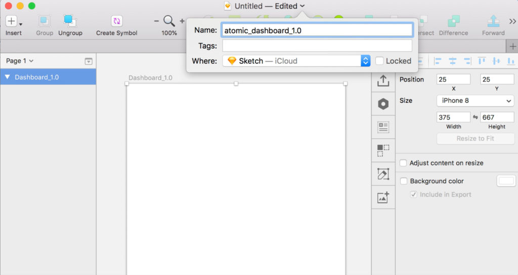
Once I have some paper and pencil sketches, I start building out my wireframes in Sketch. I can use Sketch’s mobile artboards to simulate large and small devices. When I’m ready to put together a crude prototype, I use Sketch’s Preview tool to link the wireframes.
Tip: I created a version control system that works for me to keep track of iterations. In most cases, a 1.0,1.1,1.2 etc in the file name is sufficient. For complex projects, I’ve also named my artboards with a version number.
Sketch Mirror
Mirror (recently replaced by Sketch Cloud) allows you to view your Sketch design files in real-time on a device. I use this early in the design process to ensure that my proportions and hierarchy are appropriate for the size of a mobile device. It’s a quick way to test how easy it will be to click on buttons or navigation during right-handed or left-handed use.
Tip: Use iOS and Android devices to test early. Sketch Mirror, made for iOS, is not available for Android, but there are alternatives like Crystal.
Stark

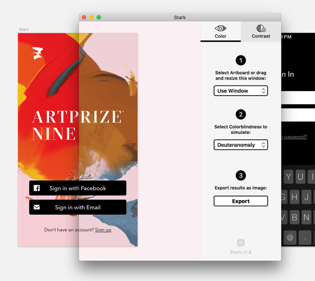
One easy-to-address accessibility factor for design is color. Stark, a Sketch plugin, is my favorite (but Colour Contrast Analyser is a close second). This overlay is the quickest and easiest tool I’ve found to preview my design for various vision types. I find I often end up tweaking the light grey to be a little darker or increasing the font size a little bit more to make my designs more accessible.
Tip: When checking contrast and size, ‘AA’ ratings are the minimum acceptance. A passing ‘AA’ would likely work for most apps. An app with a wide range of users, intended for everyone, should really pass the ‘AAA’ test.
InVision

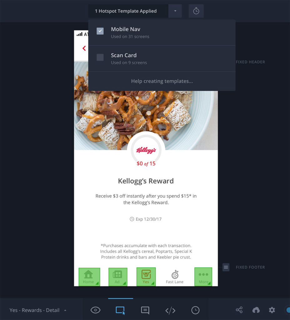
When I’m ready to start collecting feedback on wireframes or designs, that’s when I upload my designs to InVision. It’s really easy to share a private link with the project team or with a user for testing. Mobile application designs will even appear in a simplified device frame and support scrolling or fixed header/footer elements in the design.
Tip: InVision’s hotspot templates have been a time-saver for common elements like navigation. They can be applied to all or some of the designs to quickly make designs feel real.
Zeplin

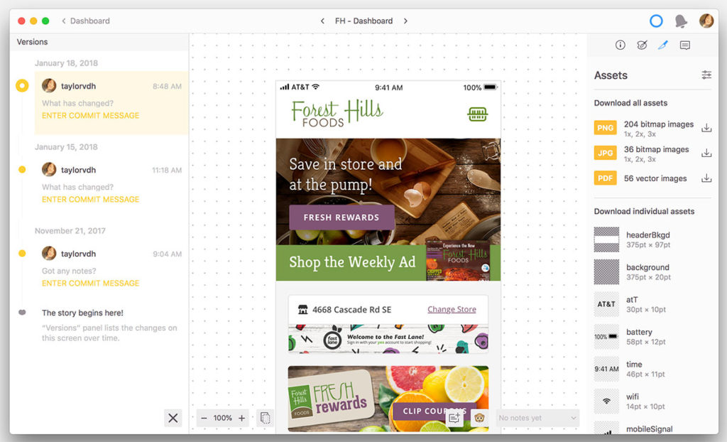
So this isn’t a design tool in the way the others help support the creation process, but Zeplin has become an integral tool for me to share complex design assets with the development team (without the need for design software). There is a plugin for Sketch that makes updating files easy. Updating notes or annotations can be captured in Zeplin for the team to see and comment on. For some projects, this has been our internal tool for design review and approval.
Tip: Layers need to be made “exportable” in Sketch (small button in the bottom right) in order to be exportable in Zeplin.
Whether building a mobile-only app or starting a project with mobile-first, I find these five tools especially helpful (and simple) for mobile user interface and user experience design.


Pro tip: You can check Sketch files into version control.
Depending on your team, project, and workflow, this can be incredibly helpful. I’m curious Doug, what’s your go-to version control tool?
They layout of this page is interesting. It is image, title, and then paragraph. But when you scan titles the image looks like it’s attached to the section above (after the paragraph). This makes deciphering the title an image confusing. Consider changing the order.