Article summary
In the previous two posts, we went through creating some basic building blocks, such as colors and icons as symbols, and combining them into nested symbols for buttons and table cell elements.
If you’ve already read those two posts, I hope you were able to think of other elements that could be “symbolized”–such as primary and secondary navigation, form elements, and other widgets.
Today, I want to talk about how we can put all of these elements together to quickly create Enterprise UI mock-ups that are flexible and customizable.
Building the Table
Because of the way we’ve built our table cell symbols, we can use the same symbol to create all of our table needs: header row, alternating background colors, selected cells, etc.
Start by inserting a table cell symbol on your artboard. Duplicate this symbol a few times, and line up the symbols across the board to make a row. Since we have icons as well as text in these symbols, we can change the two on the ends into a checkbox for multi-select and a kebab for a menu.
In the end, you should have something like this:

Next, let’s duplicate this row downwards a couple of times. We can change some of the data to differentiate between the header row and the normal rows.
In a presentation mock-up, I would be inserting realistic placeholder data at this point, as well.
Next, we can quickly change the rows to better define the table.
https://www.giphy.com/gifs/3ohryk1Zzg7e40gY8w
Quick Resizing
If were to make all of these cells individual groups, it would take forever to change the colors or the borders, backgrounds, and text styles! However, because we’ve built these symbols correctly, with the right resizing options, we can quickly adjust the table width all at once.
In our example, let’s move the kebab menu to the right edge of our width, and then select just the rows we want to get wider.
https://www.giphy.com/gifs/3o7bu30B89jRm1yTtu
More Table Sizes
With these same symbols, we can also demonstrate how different states (including selected, editable, or disabled) look for cells.

The Full Mock-up

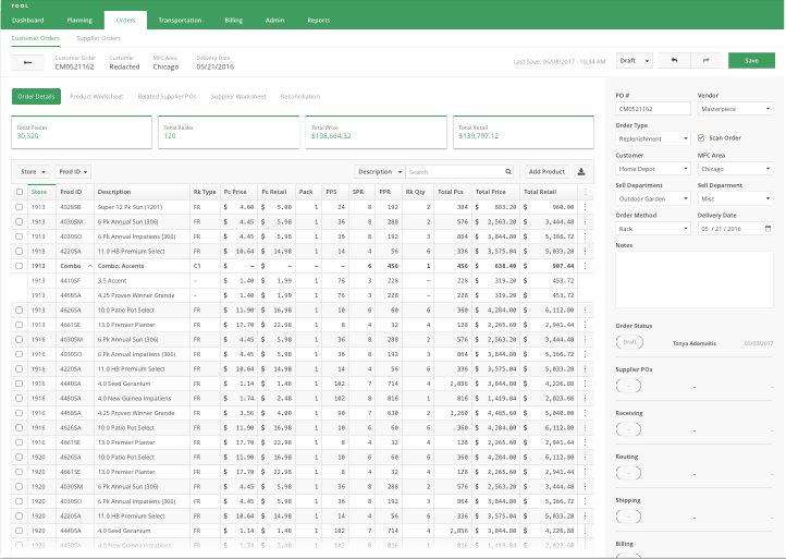
Using these techniques, I am able to create entire UI mock-ups that are completely driven by fully customizable symbols. The primary navigation elements are one symbol. The secondary are another symbol. I have a symbol for a stats widget and a symbol for a table cell. All button instances are a single symbol, as well.

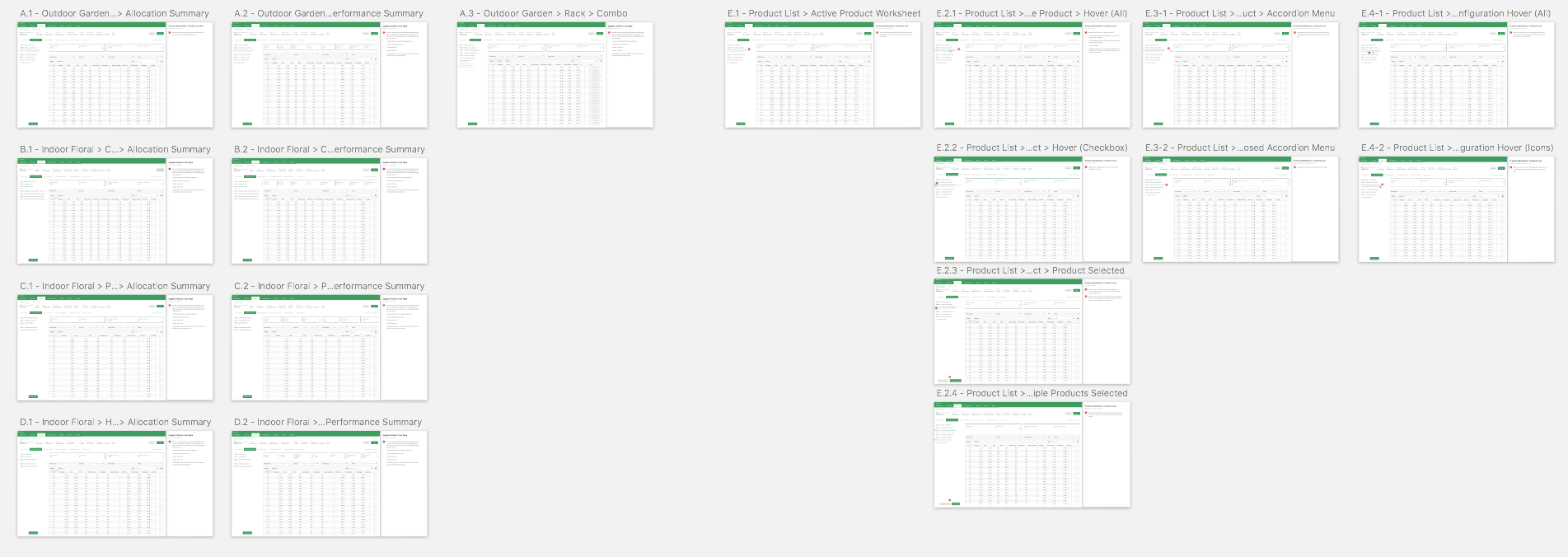
By running my documents through symbols, I am able to get much better performance out of Sketch, and it allows me to create many many artboards and pages without compromise.
For the Future
There is a lot of work to be done to make symbols perfect, but they are definitely my go-to for creating presentations and development-worthy mock-ups. They allow for quick creation of many different interfaces, and they erase a lot of the legwork for simple tweaks and changes.
I hope these techniques were helpful. Let me know if you have any more tips for speeding up workflow through symbols in Sketch!
This post is part three of a series on using Sketch’s nested symbols to build enterprise UI mockups:
- Part 1 – Getting Starting with Nested Symbols
- Part 2 – Buttons & Table Elements
- Part 3 – Putting it All Together

