
Article summary
Recharts is a nifty little charting library for React that’s packed with powerful, beautiful presets. There are lots of excellent examples for using Recharts both in the doc and online, but composing multiple different features can be a little tricky.
Example
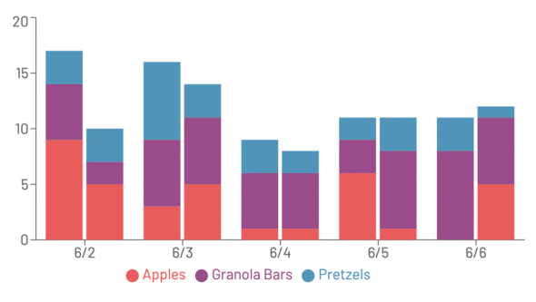
Let’s say you’re managing a preschool classroom and you want stats on the kids’ snack consumption. How many of each type of snack are they typically eating per day? This sounds like a job for a stacked bar chart. But, you also suspect that there are differences in the snacky behaviors of your morning class and afternoon class. So, you’d like to look at them separately.
To chart this out we’ll need two stacked bars for each day: one bar for the AM class, and one for the PM, each broken into sections.
To achieve this, we could just add padding between every two bars, but we’d lose Recharts’ nice section-highlighting and tool tipping behavior:
So we want to keep each group of bars together for each day to keep those nice affordances. Fortunately, Recharts exposes a “stackId” prop that we can take advantage of to show a day’s data in different stacks. Using just one stackId gives us one stack per item in Recharts’ “data” array.
Using stackId
For this example, we’ll coin two different stackIds: one for AM class, and one for PM class. For the above-described dataset, here’s how I laid out my data:
const data = [
  {
    date: "6/2",
    amClass: {
      apples: 9,
      granolaBars: 5,
      pretzels: 3,
    },
    pmClass: {
      apples: 5,
      granolaBars: 2,
      pretzels: 3,
    },
  },
  {
    date: "6/3",
    amClass: {
      apples: 3,
      granolaBars: 6,
      pretzels: 7,
    },
    pmClass: {
      apples: 5,
      granolaBars: 6,
      pretzels: 3,
    },
  },
  ...
];
Then, for each day, I add two different stackIds and create my bars:
<BarChart data={data} width={600} height={300}>
    <XAxis dataKey="date" />
    <YAxis />
    <Tooltip />
    <Bar
        dataKey="amClass.apples"
        stackId="amClass" // All the Bars with this stackId will be in one stack
        fill={red}
    />
    <Bar
        dataKey="amClass.granolaBars"
        stackId="amClass"
        fill={purple}
    />
    <Bar
        dataKey="amClass.pretzels"
        stackId="amClass"
        fill={blue}
    />
    <Bar
        dataKey="pmClass.apples"
        stackId="pmClass" // Then three more bars to make the PM stack
        fill={red}
    />
    <Bar
        dataKey="pmClass.granolaBars"
        stackId="pmClass"
        fill={purple}
    />
    <Bar
        dataKey="pmClass.pretzels"
        stackId="pmClass"
        fill={blue}
    />
    <Legend/>
</BarChart>
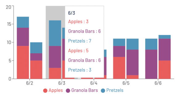
Unfortunately, when you do this, you get a goofy-looking tooltip with an entry for every stack section:
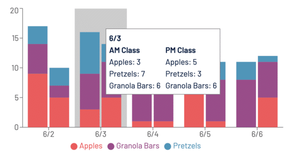
To get around the duplicated entries, we can create a custom tooltip that shows each day’s stats with custom formatting. We’ll create a CustomTooltip component that we can pass into the Recharts tooltip component:
<BarChart data={data} width={600} height={300}>
    <XAxis dataKey="date" />
    <YAxis />
    <Tooltip content={CustomTooltip} />
    [...]
</BarChart>
When Recharts renders the CustomTooltip, it’ll receive a payload in its props that will be one day’s worth of data. That way, we can do whatever we like with that payload to make it display nicely:
const CustomTooltip = ({
  active,
  payload
}: TooltipProps<ValueType, NameType>) => {
  if (active && payload) {
    const day = payload[0].payload;
    return (
      <div
        key={day.date}
        style={{
          padding: "6px",
          backgroundColor: "white",
          border: "1px solid grey"
        }}
      >
        <b>{day.date}</b>
        <div style={{ display: "flex" }}>
          <div style={{ marginRight: "10px" }}>
            <b>AM Class</b>
            <p>Apples: {day.amClass.apples}</p>
            <p>Pretzels: {day.amClass.pretzels}</p>
            <p>Granola Bars: {day.amClass.granolaBars}</p>
          </div>
          <div>
            <b>PM Class</b>
            <p>Apples: {day.pmClass.apples}</p>
            <p>Pretzels: {day.pmClass.pretzels}</p>
            <p>Granola Bars: {day.pmClass.granolaBars}</p>
          </div>
        </div>
      </div>
    );
  }
  return null;
};
And now we have pretty, readable tooltips!
But at this point, if we use a Legend, it still looks broken, with duplicated entries:
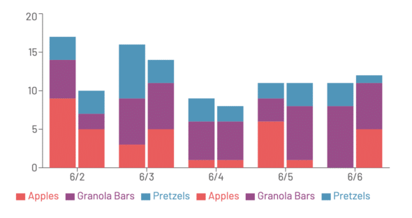
We can override that by giving our Legend a custom list of items to show:
<Legend
    payload={[
      { value: "Apples", id: "apples", color: red },
      { value: "Granola Bars", id: "granolaBars", color: purple },
      { value: "Pretzels", id: "pretzels", color: blue }
    ]}
/>
And now we’ve got a grouped, stacked bar chart!