Let’s talk about the unsung hero of video games: the user interface (UI). It’s the thing that quietly guides you as you build, explore, or—in the case of some games—leaves you utterly confused. Today, we’re diving into two games that couldn’t be more different: Tiny Glades, a serene sandbox that invites you to let your creativity run wild, and College Football 25, a sports simulation that aims to put you in the coach’s seat. Both games use information (or a lack thereof) in very different ways. And, that makes all the difference in how they feel to play.
Tiny Glades: A World Without Labels
In Tiny Glades, you’re the architect, the artist, and, well, sometimes the clueless player. But that’s kind of the point. This game’s UI is so minimal, it’s like a whisper instead of a shout. Want to know how to build a structure or place tiles just right? The game says, “Why not figure it out yourself?” It’s an invitation to explore, and as the GIFs show, it’s all about discovering what you can create as you go. No pressure, no tutorials shouting in your ear—just you, your imagination, and a very calming lack of urgency.

In a world full of status bars and pop-ups, Tiny Glades is refreshingly hands-off. Instead of detailed instructions, it nudges you to experiment, to place that roof tile a little off-kilter, or to see what happens if you connect a few walls this way or that. And somehow, that freedom makes each little discovery feel like a triumph. It’s a sandbox that knows the best toys are the ones without a manual.

College Football 25: Where’s the Playbook?
Now let’s switch gears to College Football 25. This game has a lot going on—stats, strategies, player abilities, and enough tactical depth to make your head spin. You’d think a game with so much information would make sure you know what’s what, right? Well, not quite. While College Football 25 delivers in complexity, it stumbles when it comes to helping players understand what they’re looking at.

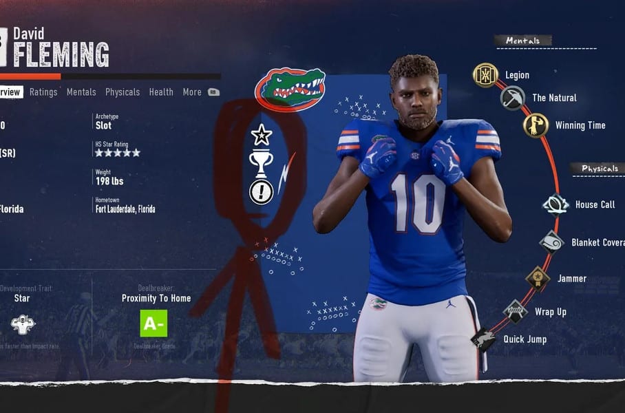
Take a look at the images of the player cards, where mysterious icons sit next to abilities, each one seemingly daring you to guess what it means. Reddit users have chimed in, too, with threads like, “What do these symbols mean?”—a plea for some clarity in a sea of stats. Unlike Tiny Glades, where figuring things out is part of the fun, here it feels more like you’ve been handed a playbook in a language you don’t speak.
And sure, there’s a certain thrill to stumbling upon a hidden feature or figuring out the perfect play. But when you’re managing a whole team and trying to make strategic decisions on the fly, ambiguity isn’t your friend. It’s like a coach shouting plays without telling you what they mean—you can guess, but the results are often less than stellar.
How These Games Handle (or Don’t Handle) Information
So why is the lack of information charming in Tiny Glades but frustrating in College Football 25? It all comes down to what the players are there for. Sandbox games attract those who want to tinker and create without a time crunch. For them, minimal guidance is a feature, not a bug. On the flip side, sports games like College Football 25 are for players who want to feel like they’re mastering the field, and that means understanding every play, every stat, and every tiny icon that pops up on the screen.
The images of Tiny Glades gameplay show a world where players are free to let their curiosity drive them. It’s a game that doesn’t mind if you make mistakes—it’s all part of the experience. But in College Football 25, where strategy is king, not knowing what a player’s ability icon means can feel like a serious handicap. The GIFs of the game’s menus and HUD tell the story of a user interface that’s packed with info but stingy with explanations.
What Game Designers Can Learn
These two games offer a valuable lesson for designers: know your audience. If your game is about open-ended creativity, like Tiny Glades, you can afford to keep things simple. But if you’re making a simulation where stats and strategy matter, players will appreciate a little more hand-holding. It’s all about giving players the right amount of guidance so they can focus on what makes the game fun.
The trick is finding that sweet spot between letting players discover things for themselves and making sure they don’t feel lost. And it’s not just about games—think of any software or app you’ve used. Sometimes you just want to be left alone to explore, and sometimes you really need a helpful hint or two. Knowing when to do which is the real art.
Embracing the Unknown vs. Making it Accessible
In the end, both Tiny Glades and College Football 25 show that the way you present information can make or break a player’s experience. One game embraces the unknown, turning it into a playground of possibilities, while the other struggles to balance depth with accessibility. It’s a reminder that while every game is different, players always appreciate feeling like they’re in control—even if that control comes with a side of mystery or a bit more clarity.
So next time you pick up a game, think about what it’s asking you to learn—or not learn—and how that shapes your journey. Who knows, maybe there’s something to be said for the times when the manual is left unwritten, or when a little more clarity could save a lot of frustration.

