Article summary
In the middle of a responsive page using Susy, I encountered a layout which required vertical alignment across different kinds of elements, ideally without hard-coding a dimension anywhere. I wondered, could Susy and Flexbox play nicely together to create this complex layout? Indeed, they could and they did!
The rest of this post will walk you through how it works, but you can also interact with the code this post is talking about here on Sassmeister*.
The Challenge
What I found tricky here is that the grid on the left has to be vertically aligned with its sibling ‘large-item’ element. The width of the large-item is set by Susy. Since the large-item contains a responsive css square, its height will vary with screen size. Any dynamic calculation of the height of the large-item would be difficult to maintain because its height also depends on text contents outside the square. So vertical alignment of the items in the grid has to be done relative to the large-item without knowing its height.
The Tools
Susy makes it really easy to make widths across the page responsive. It wraps up all the horizontal math so we just have to think about columns, spans, and, if we want, gutters. While Susy offers a grid system that’s completely flexible horizontally, it doesn’t attempt to do the same vertically. Its gallery mixin unfortunately doesn’t necessarily fill the parent container or care about the grid’s sibling’s height.
Flexbox helps a lot with making vertical alignment responsive. Karen Menezes has a great sequence of examples using Flexbox for vertical alignment. Unfortunately, what I found there didn’t plug-and-play with Susy. It took some experiments to figure out a clean way to mix Susy and Flexbox to get the grid I was aiming for.
How it Works
Under the hood, Susy’s span mixin sets widths, right and left padding, and right and left margins. That’s it. Let Susy do what it’s good at: horizontal work. Use Flexbox only for the vertical work if you’re using Susy at the same time.
How I Got There
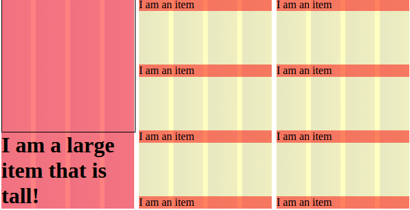
Step 1: Get the widths with Susy.
Here’s our starting markup with styles to show background colors and set widths using Susy:
I am a large item that is tall!
$susy: (
  container: 600px, //to keep things small. This line can be deleted and everything else still works.
  columns: 12,
  gutters: 1/6,
  output: isolate,
  debug: (. . .)
);

.container {
  @include container;
  .list-of-items{
    @include span(8 of 12 first);
    background-color: rgba(yellow, .25);
    .item{
      @include span(4 of 8);
      background-color: rgba(red, .5);
    }
  }
  .large-item {
    @include span(4 of 12);
    background-color:rgba(red, .5);
    .h1 {...}
    .square {...}
    }
  }
}
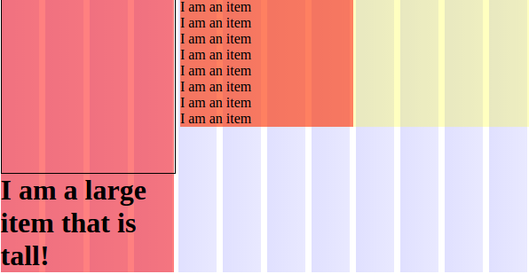
Step 2: Add an outer Flexbox.
Now, all of the elements have the desired widths. The next step is to get the list-of-items to have the same height as its sibling large-item. Let’s put in some Flexbox for that. By adding display: flex to the container class, we get the list-of-items height to match the height of the large-item: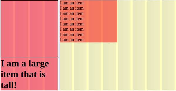
Step 3: Add a nested Flexbox.
Onward! I used Joni Trythall’s wonderful Flexbox decision-making flowchart to quickly figure out how to do columns the way I wanted with Flexbox. Let’s add a nested level of Flexbox into the list-of-items to get the item elements spaced out properly.
If we add flex-box styles to list-of-items as follows…
.list-of-items {
...
display:flex;
flex-direction: column;
justify-content: space-between;
...
}
we get…
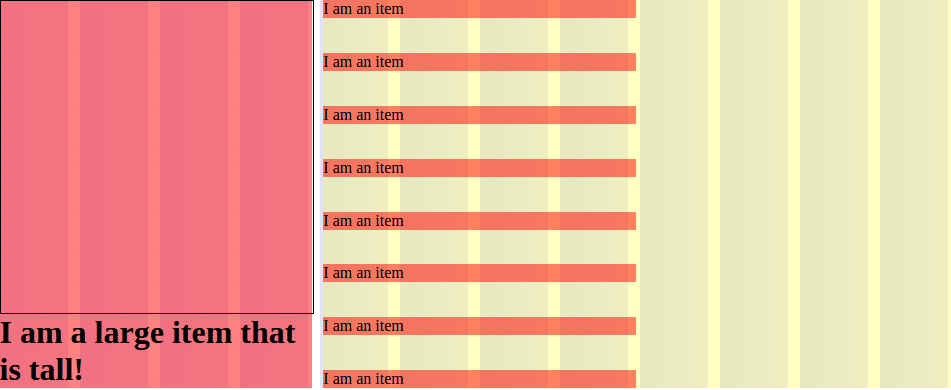
Step 4: Get Susy to play nice with Flexbox.
Almost there! Now the list-of-items has the same height as its sibling large-item, and item elements are evenly vertically spaced in list-of-items. The problem is, they will remain in one column no matter how many I add. How to get the two columns in our goal layout?
The key lies in Flexbox. The outer Flexbox style on container will let container‘s children have the same height. The inner Flexbox style on list-of-items will space list-of-items‘s children evenly within it. If we break the item elements across two list-of-items elements, these two rules work for us instead of against us.
Here’s my revised markup:
Revised styles:
.list-of-items {
@include span(4 of 12);
. . .
.item {
@include span(4 of 4);
. . .
}
}
Splitting item elements across two list-of-item elements that are each children of container and revising the Susy span widths accordingly gets us to our goal, without relying on any hard-coded dimensions:
Creating this layout in a way that is responsive helped me learn more about the fundamentals of both Susy and Flexbox. I’m sure there are many other ways to approach this problem. Do you see a better solution?
*Using Sassmeister to communicate about Susy with debug columns and background colors was inspired by James Steinbach’s Sitepoint post on Susy (an excellent Susy reference!).