
Article summary
Victory Native XL can be a very powerful charting tool, the configurability of the charts can be a huge plus especially when developing in React Native. However, it’s difficult to find a direct answer on how to do certain things when just getting started with Victory Native XL without having to dig into the examples folder on the GitHub repository for this powerful library. One of the biggest things I had to work through was how to do two y-axes on a chart. However, understanding and configuring that enabled me to do even more complex things later on.
Set Up & Configure
Here, I’ll walk you through how to set up and configure a Victory Native XL chart with two y-axes in React Native Typescript. For my project, I used Expo’s template project created by running create-expo-app. I used bun as my packet manager, but NPM or Yarn would work as well.
To begin using Victory Native XL, you’ll need to follow the setup guide on their website. This installs the actual library and the two dependencies the library needs to run. Once those are installed, you’re ready to begin making charts.
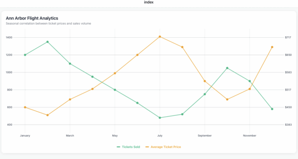
For this example, we’ll make a chart that compares some fake data on the number of flights to Ann Arbor and the cost of the ticket from month to month.
Let’s get started. Now I’ve found the best success for Victory Native XL charts when I leave room for modularity and configurability. It leaves room for growth on the chart and makes it easier to make a change later on.
To have two y-axes, we want to describe each of the y-axes for our chart. The library needs to know which data belongs to which y-axis. It does that with YKey’s the CartesianChart prop, I set mine up as a constant because I prefer to reference it like Y_KEY.SALES to keep the code more modular and clear. It also makes the input for the YKEY prop easier.
type YKey = "sales" | "costs";

const Y_KEY = {
  SALES: "sales" as YKey,
  COSTS: "costs" as YKey,
};
Two Configuration Objects
Okay, we have two more configuration objects to set up. Then we’ll be able to dive into our actual component with the chart. I have found that if you want axes labels and different colors for lines and whatnot, it’s best to have it in a way to reference it instead of doing it manually every time.
For Victory Native, all colors need to be in hex format. Otherwise, it won’t show up. So when I’m doing my AXES_LABEL_CONFIG, I do three variables for each axes option. So for sales, costs and the x-axis, month, I declare a string label, color, and a function called formatLabel that will take the value and add any context to it for me. I will also include a separate object with the axis, tick, label and grid color for the actual chart.
const AXES_LABEL_CONFIG = {
  sales: {
    label: "Tickets Sold",
    color: "#10B981",
    formatLabel: (value: number) => `${value.toFixed(0)}`,
  },
  costs: {
    label: "Average Ticket Price",
    color: "#F59E0B",
    formatLabel: (value: number) => `$${value.toFixed(0)}`,
  },
  month: {
    label: "Month",
    color: "#8B5CF6",
    formatLabel: (value: string) => `${value}`,
  },
};

const AXIS_STYLE = {
  axisColor: "#D1D5DB",
  tickColor: "#9CA3AF",
  labelColor: "#374151",
  gridColor: "#F3F4F6",
};
Getting into our actual component. You’ll need to have a variable with the font you’d like to use or none of the AXIS_STYLE , or AXES_LABEL_CONFIG configuration will show up on our chart. Now, because I am not using this chart with any outside variable data, I declare the values we are using with the chart. However, you can easily pass in data from other components or from the database as long as you have it structured.
I usually gather all the data I want and then format it into an array called chartData. In chartData we map the intended xValue to the specific y-axis. Victory Native expects the following format when taking in data:
{ xValue: string, yKey1: number, yKey2: number }
After doing that, you’re going to want to make sure you have the metric config set up for each of the y-axis declared and referenced for when we set up the chart. The code for this section might look like this:
  const data = (() => {
    return Array.from({ length: 12 }, (_, i) => {
      const costs = [450, 420, 480, 520, 580, 650, 720, 680, 550, 480, 520, 680][i];

      const sales = [1200, 1350, 1100, 950, 800, 650, 480, 520, 750, 1050, 900, 580][i];

      const month = ["January", "February", "March", "April", "May", "June", "July", "August", "September", "October", "November", "December"][i];

      return {
        sales,
        costs,
        month,
      };
    });
  }, []);

  const chartData = (() => {
    return data.map((d) => ({
      xValue: d.month,
      sales: d.sales,
      costs: d.costs,
    }));
  }, [data]);

  const { salesInfo, costsInfo } = (() => {
    const sales = AXES_LABEL_CONFIG.sales;
    const costs = AXES_LABEL_CONFIG.costs;
    return { salesInfo: sales, costsInfo: costs };
  }, []);
Ykeys
Now the last thing we need to configure before rendering the chart is setting up the Ykeys. Ykeys is how Victory Native knows what your y-axis is, inside CartesianChart it can only take 1 value for Ykey so by creating an array with all the possible information for both of our Ykeys we are able to let Victory native know we have two axes. This is where we reference a lot of our setup from the previous steps, declare what side we want it on each key on and the style.
  const chartConfig = (() => {
    const yKeys: YKey[] = [Y_KEY.SALES, Y_KEY.COSTS];
    const yAxisConfig = [
      {
        yKeys: [Y_KEY.SALES],
        formatYLabel: salesInfo.formatLabel,
        axisSide: "left" as const,
        font,
        ...AXIS_STYLE,
      },
      {
        yKeys: [Y_KEY.COSTS],
        formatYLabel: costsInfo.formatLabel,
        axisSide: "right" as const,
        font,
        ...AXIS_STYLE,
      },
    ];

    return { yKeys, yAxisConfig };
  }, [salesInfo, costsInfo, font]);
Displaying the Chart
Finally, we can get into displaying our chart. You can add other views, etc., for style, but that’s not our focus. To create a Victory Native chart, you need a view with at least the desired height or the chart will not appear. I usually go with a standard 500 to start and adjust as needed. Inside that view declare the CartesianChart, this is where the magic happens. It can take in a lot more than what I will show you, but with our setup, we don’t have to declare much to the CartesianChart. Without the setup we did, you can declare the values directly, but I find it clutters the props and makes it hard to understand.
Start by declaring the data we are using for the chart, the formatted chartData we did in the previous step, then declare what our xKey (x-axis variable name in our array) is which we set in chartData to be xValue. Then we do the same for the yKeys where we use the chartConfig.yKeys to declare.
Then, declare the styling that we didn’t set up for our x-axis month in a variable. You have to declare the font, the style in AXIS_STYLE, what the label should say on the axis ticks, and how many ticks you want on the chart. So, for example, if we had four, it would show every four months, but if we have it at 12, it will show all 12-month data points.
Now we do the same for yAxis which is much simpler: we just map the chartConfig and AXIS_STYLE to each Ykey. Finally, we declare the domainPadding which is just how much padding on each side of the chart we allow for.
Then inside the CartesianChart you map each point on the chart. I usually call the variable points, and then for each point type you declare with the type of line or point you want that Victory Native XL provides. For this example, we’ll use Line and Scatter. Line takes in the point, strokeWidth and color, while Scatter takes in the point, radius and color.
<View style={{ height: 500, marginBottom: 16 }}>
  <CartesianChart
    data={chartData}
    xKey="xValue"
    yKeys={chartConfig.yKeys}
    xAxis={{
     font,
     formatXLabel: (label: string) => label,
     tickCount: 12,
     ...AXIS_STYLE,
    }}
    yAxis={chartConfig.yAxisConfig.map((config) => ({
    ...config,
    ...AXIS_STYLE,
    }))}
    domainPadding={{ left: 60, right: 60, top: 30, bottom: 60 }}
  >
    {({ points }) => (
      <>
        <Line points={points.sales} strokeWidth={2} color={salesInfo.color} />
        <Scatter points={points.sales} radius={5} color={salesInfo.color} />
        <Scatter points={points.costs} radius={5} color={costsInfo.color} />
        <Line points={points.costs} strokeWidth={2} color={costsInfo.color} />
     </>
    )}
  </CartesianChart>
</View>
You should now be able to see a fully functioning Victory Native Chart with two y-axis when you run the app.
Warning
One last note if when you run the app and you get the following warning:
The following packages should be updated for best compatibility with the installed expo version:
@expo/[email protected] - expected version: ^15.0.3
@shopify/[email protected] - expected version: 2.2.12
[email protected] - expected version: 54.0.19
[email protected] - expected version: ~18.0.10
[email protected] - expected version: ~14.0.9
[email protected] - expected version: ~3.0.10
[email protected] - expected version: ~6.0.13
[email protected] - expected version: ~6.0.8
[email protected] - expected version: 0.81.5
Your project may not work correctly until you install the expected versions of the packages.
This is simply because as of October, 2025, these libraries haven’t been updated to be compatible with Expo 53. They won’t cause anything to break in the app. And, you can disable seeing these warnings by using the following code snippet at the top of your file. To learn more about that, here is a GitHub issue describing the situation.
configureReanimatedLogger({
  level: ReanimatedLogLevel.warn,
  strict: false,
});
Wrap Up
Overall, Victory Native XL is a highly customizable React Native Charting library. While it may take a bit of setup, it gives you, as a developer, more choices and control over how the chart looks and what data you want to display. If you want to learn more about Victory Native XL I recommend looking at their docs and the official GitHub page as they maintain working examples of a lot of the different features you can accomplish with the charting libraries.
The complete code example can be found at this GitHub repository. It includes the code snippets in this article and more styling with a chart title and legend.