Today, an increasing number of entrepreneurs and professionals understand the value of good UX in their software. It’s not enough for your product to just get the job done. It needs provide a good user experience so that people will actually want to use it. Sold on the value of UX, business owners agree to invest in a UX designer.
For UX designers, this should be great news! But most often, after hiring, UX designers find that the time, budget, and overall expectations for their role are unrealistic, and their hands feel tied. They’re expected to improve the user experience, but there is push back against many of the tools and processes needed to get the job done.
Meanwhile, others on the team may feel that UX designers are the unrealistic ones. You give a straightforward request, and they need too much time to research, plan, and think, when what is really needed is some mockups!
Like with most conflict, there can be truth on both sides. But often, what I see at the root of the issue is a common and fundamental misunderstanding of UX design, and confusion between UX and UI design. Misconceptions about UX prevent good UX from happening, and this is a lose-lose for everyone.
Basic Definitions of UI and UX
I’m not the first to try to define UI and UX or to observe the confusion between the two. When I research these terms, there are loads of articles. I’d sum up the definitions I’ve found like this:
UI Design is the practice of visually designing a user interface. It involves things like color, typography, spacing. UI Designers handle the graphic design and interaction of the various components of a page.
UX Design is concerned with the full user experience before and after the user reaches a particular page or flow, so it is much broader than UI Design. UI designers focus mostly on mockups, whereas UX designers focus more on research, flows, information architecture, and wireframes.
These definitions make sense on the surface, but the lines quickly become blurred. Both UI and UX designers’ work might include research, flows, wireframes, and mockups. And both UI and UX designers care about the user experience as they make countless decisions to craft user-friendly interfaces.
My Definition of UX Design
It took years (as in nearly a decade) before I finally felt like I understood my role as a UX Designer. Rather than focusing on what a UI or UX designer does, the distinction became clearer when I understood it in terms of their purpose and goals.
A UI Designer’s primary goal is to create a modern, user-friendly digital interface. There is a lot of focus on visual design, and ensuring that the design looks good and feels good to use.
A UX Designer’s primary goal is to create a positive user experience that solves specific problems for specific users. The primary focus is on understanding the users and ensuring the design successfully solves their problems.
Ok great… so UI Designers create interfaces, and UX designers solve problems for users, but in the end they both create mockups so…. still feeling confused?
I’ll help make these abstract ideas more concrete with an example.
Problem: Organize My Stuff
Joanna is a busy mom overwhelmed with stuff. Specifically, she is struggling with her kitchen.

As a very busy person with little spare time, she has decided to hire professional help to get her home in order.
Solution #1: UI Design
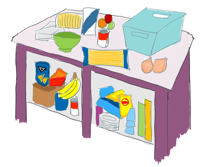
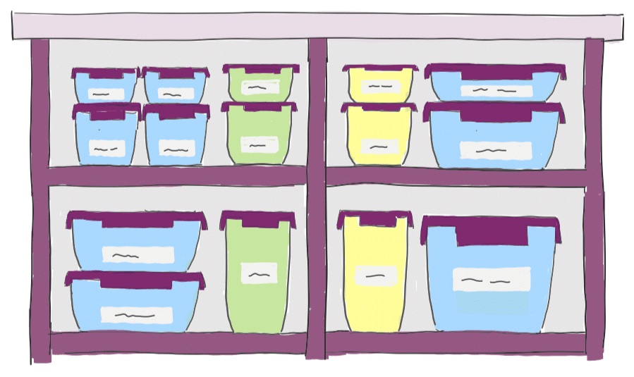
Ira is an experienced designer who has worked on some of the most popular organizational systems around. When Joanna met Ira, she thought he would be the perfect person to design custom containers for her home.
Ira took into consideration Joanna’s stuff, her space, and her style, and created beautiful, functional containers.

Joanna was thrilled. The containers were perfect, and so thoughtfully designed. They were the perfect size, made of quality material with ergonomic handles, and could be stacked in many different ways. They could be used with or without the lids attached to the bottom of the containers so they wouldn’t get lost. The labels were removable and washable. They were the best containers she had ever used. She was a very happy customer and told all of her friends about them.
But after a short time, Joanna realized that she and her family didn’t use the containers as intended. Labels started to be ignored, and it felt more and more like the containers were just getting in the way. Eventually, she set the containers aside and ended up with the same disorganized mess as before.
The containers were perfect, so Joanna concluded that she was simply not an organized person, and gave up. The beautifully designed solution didn’t solve the root problem, even though it was exactly what the client thought she wanted.
Solution #2: UX Design
Xander is an expert user experience designer. He has never designed tools to organize a home, but he is good at understanding people and their problems and creating order from chaos for his clients.
When he heard about Joanna’s mess and decided to help her out, the first thing he did was ask questions to better understand Joanna and the factors leading to the organizational problems in her home.
He asked Joanna about her goals. Was she trying to save time? More easily find things? Make her kitchen more clean and attractive?
He asked Joanna about herself, her family, and her home. How much space did she have in her cabinets, fridge, and pantry? Who else was involved: Just her, or other adults, or kids?
He asked about their habits, lifestyle, and needs. How many things were there to fit? Did her family do a lot of meal planning, cooking, and grocery shopping? Did they like to stock up on prepared meals or need space for leftovers?
After this questioning, Xander learned the following about Joanna’s situation:
- Joanna cooks most days of the week but relies on prepared mixes and frozen ingredients to help keep it quick.
- Joanna usually grocery shops and plans meals for the week on Sunday, which is also the day that the family eats out.
- Snacks are always available for the kids to grab freely, but they don’t always know where to find them or put them back where they belong.
- There is limited space in the fridge, freezer, and small pantry.
- She spends a lot of time finding ingredients and putting them back away.
- Joanna hates the cluttered mess that happens when things are constantly shuffled around.
Xander’s Solution:
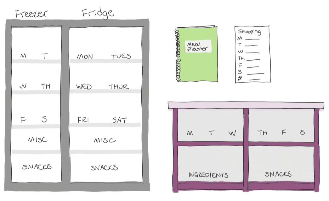
Based on what he learned, Xander proposed an organizational system based on the days of the week.

There was space in the fridge, freezer, and pantry for meals for each day of the week. The bottom of each was reserved for the kids’ snacks. This ensured they could reach them and would find them and put them back without interfering with the rest of the system. As a final touch, Ira also created a meal planner and shopping list to help with weekly planning.
Joanna and her family immediately started following the new system. She was even able to incorporate her custom containers into the new system. This new way of organizing fit right in with their lifestyle, and she couldn’t believe how natural it felt to stay organized!
Good UX vs. Good UI
See what happened there?
Ira (the UI designer) was an expert in his field. He used his skill to create something top-notch, but what he created just didn’t solve the real problem for Joanna and her family.
Xander (the UX designer) wasn’t an expert in organization, and Xander didn’t even really design anything for Joanna. What Xander did was use his skills to understand her situation and create a system to help her stay organized using the tools she already had.
Many people expect good UX to happen by hiring someone to do good UI. But it is possible to have world-class UI without solving the right problem, and if you don’t solve the right problem, the user experience is still bad. UX designers ensure the right solution is being addressed, and often, and the solution they come up with can be much different than what their client or boss originally thought they needed.
So What Now?
To those who have hired or worked with UX designers, I hope this helps you understand why, when you ask a designer to “design a container,” you might be told you need research and exploration before a design can be complete. Or, the UX designer might tell you that what the users need is not a “container” at all.
And to UX designers, I hope this helps you address some of the pushback you receive when you try to do your job. You know it’s your job to look beneath the surface, but others may not understand that. They think your job is to “make it pretty.” They don’t understand that your job is not just UI design, so they don’t understand why you won’t just create the damn container!
Part of our job as UX designers is to educate others about what we do and why it’s important. For better or worse, it is on us to clear up misconceptions about our job. In the end, there will still be friction surrounding the time and budget available for UX. Sometimes there will only be room for quick UI design. However, having a conversation to clarify the goals of UX is critical for teams to make informed decisions and move forward together.
What I’ve shared is the understanding of UX that I have developed in my personal career journey. Others are likely to have different views. If you have developed a different understanding than mine, please share your thoughts! Having an open dialogue about what we do and why is what this is all about.

wow! what a great insight to a problem tha many managers and engineers tend to ignore. The distinction between UI and UX is often ignored I honestly think it’s because of the naming, especially UX. Something clearer like Application Usage Design or something 😅😅 But until then hopefully as many people see this as possible and it helps the communication between the parties!
Well done daughter of mine! Objectively, this is well written as you have taken a complex subject and through simple words and and relatable examples, you have explained something that can be understood by the business community in general, who may not be a part of the “Nerd Squad”. I hope for this, you get a Neutron or Proton Pack or whatever it is they hand out there……..
Umm…. Thanks dad….
As a fellow father, I love everything about this
Cutest comment thread on Spin this week. <3