Article summary
This is the second in a series on using Angular CDK Overlay to build a custom, accessible select dropdown component. In part one, we laid out the basic parts of our custom select component. We created the main bar that users will interact with to make the list of options appear, created the list of options, and wired them together with CDK Overlay. Next, we will implement the ability for users to select an option from the list, have that option appear in the main bar, and emit that value to the parent component.
Clicking On An Option
Let’s start with the simplest case: the user clicks on an option in the list. We’ll need to add some code to our CustomSelectOptionComponent to handle it being clicked:
  @HostListener('click', ['$event'])
  public onClick(event: UIEvent): void {
    event.preventDefault();
    event.stopPropagation();
    if (!this.disabled) {
      // Tell the parent select this was clicked on
      this.select.selectOption(this);
    }
  }
The @HostListener captures the user clicking on an option and, if that option is not disabled, tells the parent select that it was clicked on. However, we have a problem: how do we get that parent select component? This is where the custom-select.service.ts we mentioned briefly in part one comes in. We’ll make a service that the parent registers with and the child options can use to get a reference to that parent.
Using a Service to Allow Communication to the Select from Options
Here’s the complete custom-select.service.ts file:
import { Injectable } from '@angular/core';
import { CustomSelectComponent } from './custom-select.component';

@Injectable()
export class CustomSelectService {
  private select!: CustomSelectComponent;

  public register(select: CustomSelectComponent): void {
    this.select = select;
  }

  public getSelect(): CustomSelectComponent {
    return this.select;
  }
}
It only has two functions: register(select), which the parent select component calls and passes a reference to itself to and getSelect(), which the child options use to get that reference to the parent.
To have the parent register with the service, we need to add the service to the component’s list of providers. Then we can call it in the constructor.
@Component({
  selector: 'custom-select',
  templateUrl: './custom-select.component.html',
  styleUrls: ['./custom-select.component.scss'],
  providers: [
    {
      provide: NG_VALUE_ACCESSOR,
      useExisting: forwardRef(() => CustomSelectComponent),
      multi: true,
    },
    {
      provide: NG_VALIDATORS,
      multi: true,
      useExisting: CustomSelectComponent,
    },
    CustomSelectService, // <--- Note this line was added
  ],
})
export class CustomSelectComponent
  implements OnInit, ControlValueAccessor, Validator
{

...
  constructor(
    private cd: ChangeDetectorRef,
    private domSanitizer: DomSanitizer,
    private overlay: Overlay,
    private selectService: CustomSelectService
  ) {
    this.selectService.register(this);
  }
Now that the parent has registered, we can use that same service in the child CustomSelectOptionComponent to get the parent:
  private select: CustomSelectComponent;

  constructor(private dropdownService: CustomSelectService) {
      this.select = this.dropdownService.getSelect();
  }
With these three lines of code, now our onClick() function should be able to talk to the parent select component. We just need to handle everything that should happen when a user selects an option.
Selecting an Option
Angular is complaining that our CustomSelectComponent doesn't have a selectOption() function so let's implement that:
  private selectedOption: CustomSelectOptionComponent;
  ...
  public selectOption(option: CustomSelectOptionComponent) {
    this.hide();
    if (this.selectedOption !== option) {
      this.selectedOption = option;
      this.onChange();
      this.updateDisplayText();
    }
  }
We pass the child custom select option into this function so we can access everything we might need from it. Then in this function, we hide the dropdown menu using the hide() function we built in part one. If the clicked option was not already selected, we update the internal selectedOption value, and call the onChange() and updateDisplayText() functions. These are separate functions because we'll add other ways to trigger changes or display text updates later. Next we'll define the onChange() function:
// Outside the component class
export interface CustomSelectEvent {
  source: CustomSelectComponent;
  selected: any;
}

...
  // Inside the component class
  @Output() readonly change = new EventEmitter();

  // Reactive forms uses these functions to write component changes back to the form
  public onChangeFn: any = (_: any) => noop();

  public registerOnChange(fn: any): void {
    this.onChangeFn = fn;
  }
  ...
  private onChange(): void {
    this.onChangeFn(this.selectedOption.value);

    this.change.emit({
      source: this,
      selected: this.selectedOption,
    });
  }
At the top of the file, we define a custom event that will return a reference to this custom select component and the value of the selected item. The self reference is emitted so that if you have more than one custom select on a page you will know which one is emitting events. We call both the onChangeFn and change.emit to support both reactive and template-driven forms.
Changing the main select display to the ng-content supplied by an option is a little trickier. Here's the updateDisplayText() function in the select component:
  public displayText!: SafeHtml;
  ...
  private updateDisplayText(): void {
    if (this.selectedOption !== undefined) {
      this.displayText = this.domSanitizer.bypassSecurityTrustHtml(
        this.selectedOption.getOptionElement().innerHTML
      );
      this.showPlaceholder = false;
    } else {
      this.displayText = this.domSanitizer.bypassSecurityTrustHtml(
        this.placeholder
      );
      this.showPlaceholder = true;
    }
  }
We check to see if we should be displaying the placeholder when either no option has been selected yet or the component has been written back to its initial state. Then we update the displayText to the innerHTML of the option element. All of the domSanitizer business tells Angular not to throw warnings that we're showing the user arbitrary code by using [innerHTML]="displayText" in our HTML. If no option has been selected yet or the component has been reset, then we set the display text to the placeholder. In both cases, we update the showPlaceholder value appropriately. This enables us to style the placeholder to be gray while the selected option display remains black by default.
Now Angular is complaining that the options don't have a getOptionElement() function, so let's implement that in the CustomSelectOptionComponent:
@Component({
selector: 'custom-select-option',
// Note the change to the template:
// we've added a span around the ng-content tag from last time
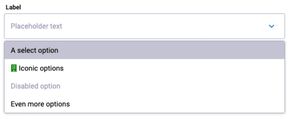
template: `To get access to the ng-content, we've added a span around that element in our HTML template. The span has a template variable #option that allows us to use @ViewChild to refer to that element in our code. In this case, we are simply passing that element back to the select, which is calling getOptionElement() on this option. This gets us the same HTML used by the person creating options when using our custom select component and displays that. In the demo, you can see the exact icon displayed in an option and in the select bar when you select it.
With these functions in place, you should now have a working custom select menu. The user can click on it to display the menu of options and then click on an option to close the menu, update the display, and emit the new value of the component. "But what if I love speeding through forms using the keyboard, tabbing to a menu, and hitting a letter to scroll to that option?" you might say. Don't worry! We'll handle keyboard input, writing a value back to the select component, and more in part three!
There's a demo of all of the code we've written so far on stackblitz.