I’ve recently started working in iOS again. Making wireframes and context scenarios for an iPad app had me thinking about the opportunities and challenges in tablet interface design, and how they compare to traditional interfaces. I was asking, “what principles still apply?”
There’s some great stuff in the iOS Human Interface Guidelines. One Apple recommendation is to “flatten your information hierarchy.” This leads to more interactions on the same plane, making them accessible without pesky drill-downs. Unfortunately, it can also mean fighting for space for widgets and gestures.
Well there is a principle that addresses cramped spaces, and it’s one of my favorites: Fitts’s Law. Here, I’ll talk about the history of the law, find some clues to its continued relevancy, and finally, find some ways to apply it in the new world of touch interaction.
Given its origins in the 1950s, Fitts’s Law is a surprisingly robust tool for interface and interaction design. It models the time it takes to interact with interface elements and relates that logarithmically to the size of a target element. Big things are easier to reach, and enlarging a small target improves time better than enlarging an already large one. If you’ve heard of it but want more detail, Wikipedia has a nice in-depth article about it, but first-timers might prefer Tog’s A Quiz Designed to Give You Fitts, which is where I originally learned of the law.

One thing I like about Fitts’s Law is that it’s extremely intuitive. (Raskin would have me say “intuitable”.) Telling someone who is working on an iPad app that enlarging a button will make it easier to tap isn’t very insightful. But it’s great exercise for merging design and development skills. It’s one of the few principles of human-computer interaction (HCI) that is pragmatic, robust, and empirical enough for a computer scientist to really dig. Where the field of IxD can look pretty foggy from the coder’s chair, Fitts’s Law draws a crisp horizon.
There are some caveats to the historic form of Fitts’s Law:
- Fitts’s research modeled a stylus being used in a single dimension only, but…
- More recent research (up to the 1990s) demonstrated its application in two dimensions, contributing to the early popularity of the mouse.
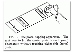
- Fitts set up his first experiment with a stylus—direct manipulation and feedback—more similar to the modern “tablet PC” than an iPad, but farther still from the older meaning of “tablet”: a non-display device that accepted stylus input. The subjects were looking at their hands and targets, not a display.

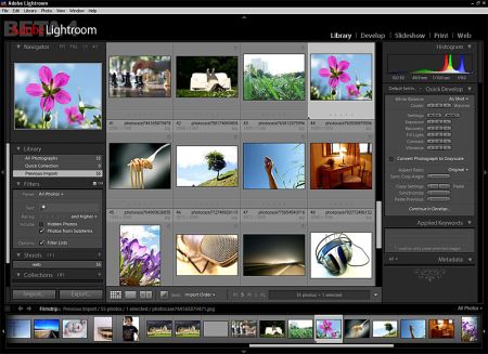
The law has provided a couple of IxD innovations since its inception. As Tog’s quiz points out, the “biggest” target is your mouse pointer’s current position. He calls this a “magic pixel.” This is a beautiful insight, despite being put to evil purpose in context-menu-crazy window environments. The other “magic pixels” are probably more useful but less used: the corners and edges of a screen are also “infinitely” large in one or more dimensions. Adobe’s Lightroom is my favorite example of taking advantage of screen edges. It makes it easy to expand or collapse overlay panels on all four sides, allowing large numbers of UI elements to be available quickly without cramming things into context menus or modal dialogs.

Magic pixels essentially disappear on an iPad. Sure, you have to consider “where their hand is,” but it’s a less precise model than with a mouse pointer, which is always somewhere, even when you aren’t interacting with it. The context menu legacy lives on however, in the form of the “pop-over”, which is intended to open near the invoking element to minimize finger travel.

Trading target reachability for screen real estate is a common IxD problem. Tiny buttons seem inevitable in a densely-packed interface, and designers are often faced with the choice of obeying Fitts’s Law vs. cutting or hiding features. Menus, “ribbons”, and hotkeys traditionally aid in feature packing, at the expense of flatness, discoverability, and desirability. Touch gestures are a new solution to the old problem. A good example is the pull-down-to-refresh meme, originating in the Tweetie app for iPhone.
They could have used a very small navbar button, or a large one that takes a chunk out of the interesting content. Neither is a great choice. Instead, a sustained downward-flick gesture allows the whole active area of the app to become a single target for the refresh operation. This is possible even though downward-flick is already used for scrolling through tweets. By allowing more complicated spatial and temporal inputs than a “click,” layers of real estate have opened up for use by targets that are frequently needed. I don’t think it’s a fluke that this mechanism spread so quickly: it gains maximum advantage from observing Fitts’s Law.

Flicks and pinches can be difficult to discover, but here it’s already used for scrolling the main view. With the user already understanding that they can flick to scroll, it’s a much smaller mental jump to figure out that pulling at the top opens a new view which describes the refresh operation. The inventor of pull-down-to-refresh, Loren Brichter, discusses this in depth in an interview about the feature:
“Necessity is the mother of all invention. Looking back to Tweetie 1, I was in this position where my navigation bar was already filled up.”
“[…] So I put the reload button at the top of the list. As you scrolled up, reading newer tweets, eventually you’d get to the top of the list and bam… there’s a reload button, it just slid into view exactly when you needed it. You tap it and it’s replaced by the newer tweets. It’s intuitive and doesn’t waste prime screen real estate (corners of the screen) until you actually need it.”
Brichter doesn’t mention Fitts’s Law, but describes the problems it helps solve. This is the intuitive nature of the law: when you can pull it off, big targets are obviously easier to reach, giving a sense of empowerment when using a feature. On touch devices, gestures allow you to do this without actually sacrificing space.
While I like that touch interfaces have opened up some new possibilities, I also see a lot of repetition among apps. A good idea like pull-down-to-refresh becomes popular, and some might assume that it’s now expected by users. But looking deeper at pull-down-to-refresh allowed me to consider how else I could exploit Fitts’s Law on a touch device. Pinching, flicking, and swiping offer a whole new set of interactions, each with their own screen real estate to make targets big and easy to use. It’s been a great motivator for me to seek out new, innovative user experiences in the tablet space, and to find other IxD tools to craft tablet apps that delight users.
(Read more:)

I’ve used Fitt’s law in a bot as part of human mouse movement simulation.
A highly relevant post. When you read Apple Human Interface Guidelines, it’s easy to see why Macs are so darn intuitive.
[…] recently wrote about how Fitts’s Law can help direct design decisions in tablet interfaces. Fitts’s Law says to put the things users need […]
[…] The last time I wrote about user interfaces for tablets, I was talking specifically about how Fitts’s Law informs usability in tablet contexts. […]