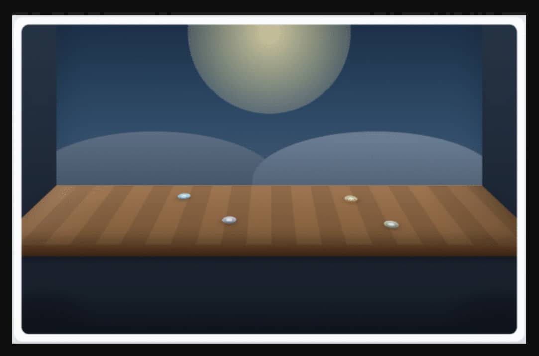
My software development team had a client who wanted to represent activity on a stage, not in the usual top-down layout that shows up all over the internet. A 3D stage? Reasonable request, slightly unreasonable visual problem.
My wacky idea: what if this was mostly CSS? Maybe a little JavaScript. But mostly CSS. It turns out you can get surprisingly far with a tilted floor plane. I recently pulled that technique out of a larger implementation and reduced it to a small demo. This post walks through the cleaned-up version.
The complete demo lives in this gist:
The snippets below are trimmed from the full demo so the relevant pieces stay together.
Build the Scene with Three Layers
The basic structure is intentionally small. There are three main visual layers:
- a fixed
background - a tilted
stage - a
foregroundlayer that sits closer to the viewer
Here is the core HTML:
<section class="panel demo-panel">
  <div class="scene" id="scene">
    <div class="background">
      <div class="sky-glow"></div>
      <div class="backdrop-ridge ridge-left"></div>
      <div class="backdrop-ridge ridge-right"></div>
    </div>

    <div class="stage-shell">
      <div class="stage">
        <div class="marker marker-back-left"></div>
        <div class="marker marker-back-right"></div>
        <div class="marker marker-front-left"></div>
        <div class="marker marker-front-right"></div>
      </div>
    </div>

    <div class="foreground">
      <div class="foreground-strip"></div>
      <div class="foreground-shadow shadow-left"></div>
      <div class="foreground-shadow shadow-right"></div>
    </div>
  </div>
</section>
The DOM stays simple. The effect comes from how the layers are styled and positioned, not from a complicated rendering pipeline.
Use a Perspective Container to Create Depth
The .scene element establishes the perspective context for everything inside it:
.scene {
  position: relative;
  min-height: 28rem;
  aspect-ratio: 16 / 10;
  overflow: hidden;
  border-radius: 1rem;
  perspective: 1000px;
  perspective-origin: 50% 36%;
  transform-style: preserve-3d;
  --stage-base-width: 86%;
  --stage-back-width: 86%;
  --stage-front-width: 102%;
  --stage-tilt: 72deg;
  --fg-depth: 90px;
  --fg-offset: 0px;
}
There are a few important pieces here:
perspectivecontrols how strongly depth is perceived.perspective-origincontrols the viewer’s apparent position.transform-style: preserve-3dkeeps child transforms in the same 3D space.- the CSS custom properties give JavaScript a clean way to adjust the scene.
From there, the stage itself is just a rotated plane:
.stage-shell {
  position: absolute;
  left: 50%;
  width: var(--stage-base-width);
  bottom: 12%;
  height: 36%;
  transform: translateX(-50%);
  transform-style: preserve-3d;
}

.stage {
  position: absolute;
  inset: 0;
  transform-origin: top center;
  transform: rotateX(var(--stage-tilt));
  border-top: 1px solid rgb(255 244 214 / 0.65);
  background:
    linear-gradient(180deg, rgb(255 255 255 / 0.08), rgb(0 0 0 / 0.14)),
    repeating-linear-gradient(
      90deg,
      #9f6a3d 0 42px,
      #8e5e36 42px 84px
    );
  box-shadow:
    inset 0 -24px 36px rgb(0 0 0 / 0.24),
    0 24px 40px rgb(7 10 18 / 0.2);
}
That rotateX() call is doing most of the heavy lifting. The stage is still just a rectangle. It just no longer reads like one.
Keep the Background Fixed and Let the Foreground Move
For this demo, I wanted the back of the scene to stay put as the tilt changes. If the whole world starts sliding around, the illusion gets weird fast.
The foreground is different. A little movement there helps sell the depth cue:
.background {
  position: absolute;
  top: 0;
  bottom: 38%;
  width: var(--stage-back-width);
  left: 50%;
  transform: translateX(-50%);
  background:
    linear-gradient(180deg, #15324b 0%, #274d6b 52%, #43627d 100%);
  box-shadow: inset 0 -48px 72px rgb(0 0 0 / 0.2);
}

.foreground {
  position: absolute;
  bottom: 0;
  height: 28%;
  width: var(--stage-front-width);
  left: 50%;
  transform: translate3d(-50%, var(--fg-offset), var(--fg-depth));
  pointer-events: none;
}
This keeps the scene readable. The background behaves like a backdrop. The foreground gives the viewer a sense of looking into the scene rather than at it.
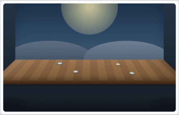
Match the Background and Foreground Widths to the Stage
This is the part that made the demo stop feeling like a neat trick and start feeling intentional.
If the background and foreground both span the full width of the scene, they do not look connected to the stage. The background should visually line up with the back edge of the stage. The foreground should visually line up with the front edge.
That means the layer widths need to come from the stage geometry, not from the page container.
At a high level:
- the background width should match the stage’s back edge
- the foreground width should match the stage’s projected front edge
In CSS, that means centering those layers on the same axis as the stage and giving them their own width variables:
.background {
  left: 50%;
  width: var(--stage-back-width);
  transform: translateX(-50%);
}

.foreground {
  left: 50%;
  width: var(--stage-front-width);
  transform: translate3d(-50%, var(--fg-offset), var(--fg-depth));
}
The background now reads as if it actually belongs to the back of the stage. The foreground can widen enough to align with the front.
Use JavaScript to Keep the Widths Aligned
The JavaScript in this demo is intentionally small. Its whole job is to do three things:
- update the stage tilt
- move the foreground slightly up or down
- recompute the visible back and front widths based on the current stage geometry
Here is the core logic:
const DEFAULT_TILT = 72;

const scene = document.querySelector("#scene");
const stageShell = document.querySelector(".stage-shell");
const tiltInput = document.querySelector("#tilt");
const tiltValue = document.querySelector("#tiltValue");

function syncStageEdgeWidths(nextTilt, fgDepth) {
  const perspective =
    Number.parseFloat(getComputedStyle(scene).perspective) || 1000;
  const { width, height } = stageShell.getBoundingClientRect();
  const radians = nextTilt * Math.PI / 180;
  const frontZ = height * Math.sin(radians);
  const frontScale = perspective / Math.max(1, perspective - frontZ);
  const foregroundScale = perspective / Math.max(1, perspective - fgDepth);

  scene.style.setProperty("--stage-back-width", `${width}px`);
  scene.style.setProperty(
    "--stage-front-width",
    `${(width * frontScale) / foregroundScale}px`
  );
}

function applyTilt(nextTilt) {
  scene.style.setProperty("--stage-tilt", `${nextTilt}deg`);

  const fgDepth = 90;
  const fgOffset = (nextTilt - DEFAULT_TILT) * 2.2;

  syncStageEdgeWidths(nextTilt, fgDepth);
  scene.style.setProperty("--fg-depth", `${fgDepth}px`);
  scene.style.setProperty("--fg-offset", `${fgOffset}px`);
  tiltValue.textContent = `${nextTilt}deg`;
}
There are two details worth calling out here.
First, the front of the stage appears wider because the tilted plane moves closer to the viewer as it drops. That is where frontScale comes from.
Second, the foreground itself is also translated toward the viewer with translate3d(). If I used the projected front width directly, the foreground would overshoot the stage. Dividing by the foreground’s own perspective scale compensates for that.
This is the part that kept the demo from being approximate.
The math is the hard part. The rest is just file organization inside the gist:
demo.htmlcontains the structuredemo.csscontains the layout, perspective, and visual stylingdemo.jscontains the tilt and width-sync behavior
Open the gist, grab demo.html, and move the tilt slider in a browser. You can inspect the scene container, the stage shell, and the foreground to see how the widths change.
A Few Practical Notes
1. Perspective origin matters
If the perspective origin is too high, the stage can look like it is falling away a bit too dramatically. If it is too low, the floor starts reading more like a wall.
2. Width alignment makes a big difference
This was the biggest improvement in the current demo. Once the background and foreground widths were tied to the stage, the layers stopped feeling like they were floating near it and started feeling attached to it.
3. A simple scene is easier to tune
By keeping the visual language to background, stage, and foreground, it becomes much easier to reason about what each layer is doing.
Wrapping Up
This effect does not require a large rendering stack. A perspective container, a rotated stage plane, a fixed background, and a foreground layer with a small amount of motion are enough to create a convincing result.
The complete implementation is in the demo files here:
It turns out you can get a lot of stage-like depth out of CSS, as long as you are willing to be a little opinionated about geometry and let a small amount of JavaScript clean up the edges.