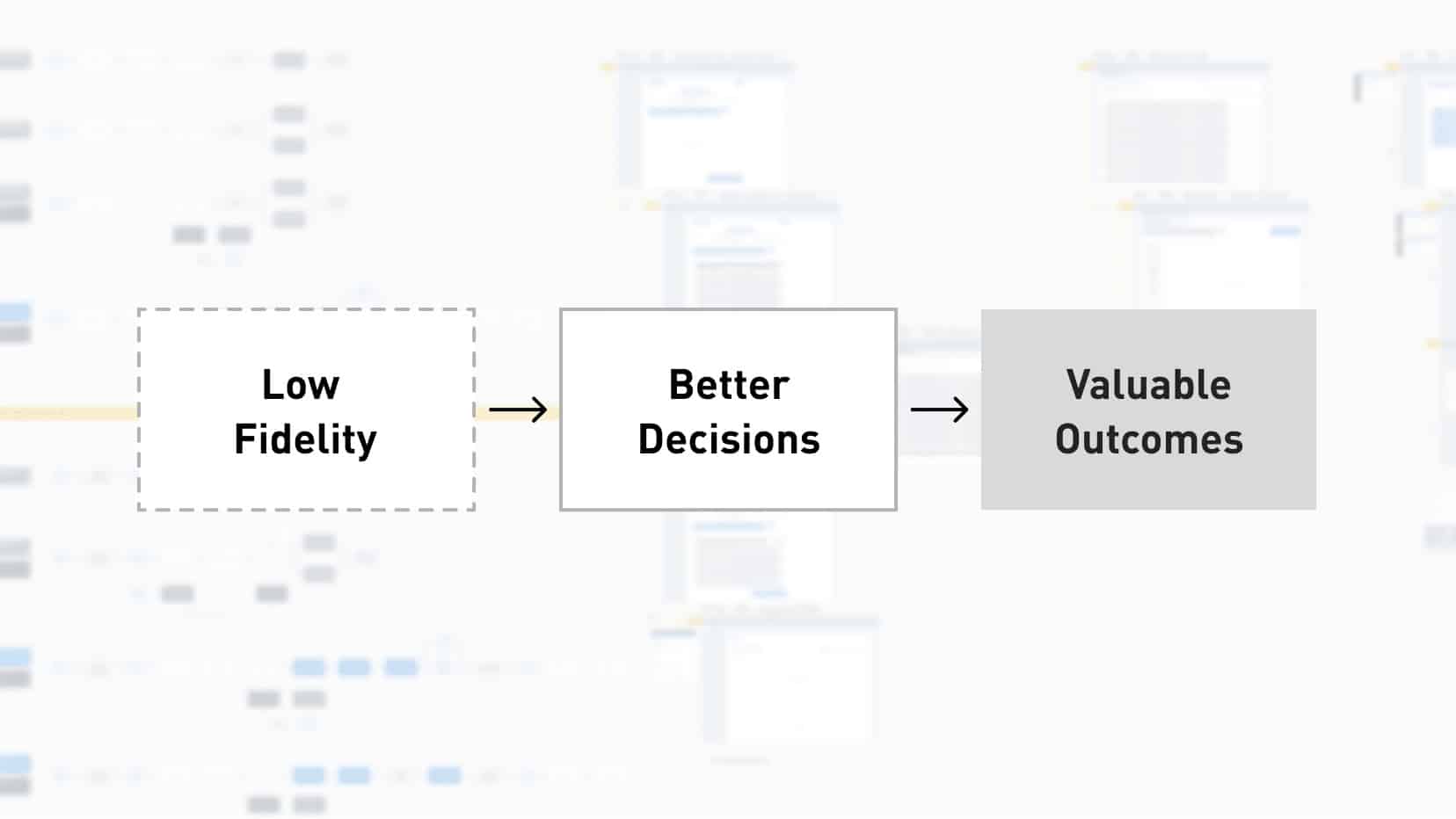
The humble “shape + text” label combo is one of the most powerful tools we have during a software design project project. With this simple element, we improve communication, ask better questions, and clarify what we don’t know (often more important than what we do know). And, ultimately, we make more intelligent decisions everyone understands. The power of low-fidelity efforts can be difficult to prove until you’ve demonstrated it, with whatever makeup of stakeholders and team members you’re working with. This is why it can be so easy to give in and create the higher-fidelity artifact.
We’ve all been there, I know I have, when someone says, “But we need to wow them,” or, “But they need to be able to picture what it will look like.” Then, the agony of fighting for doing it the right way wins out, and you end up telling yourself you’ll just use something higher-fidelity and get the same answers. Godspeed my friend.
Going lower-fidelity is worth the fight, I promise. Below are ways I’ve experienced the benefits of fighting for low-fidelity work.
Controlling the message to make better decisions.
When developing your product strategy or approach, you must tailor any argument or decision based on the context. This means being very intentional about the “why” and about what evidence, signals, metrics — or lack thereof — inform that why. You must communicate the “why” and solicit feedback, create alignment, or gain approval, specifically about that information. It’s nearly impossible to do this if you’re using high-fidelity artifacts. There’s simply too much for someone to take in. This also makes it harder to recognize that the feedback is bad, because you’re getting too much to adequately parse and interpret.
Karen VanHouten is a friend and someone who’s had a healthy impact on my career. I trust her implicitly on these topics, and she summarized this concept a bit more clearly recently on LinkedIn. Karen calls it “layering decision-making,” and it’s so well stated I’m quoting her here:
“One thing that often doesn’t come up in these discussions is the need to layer decision-making. If you start the process with high fidelity mockups, you are essentially making all different types of decisions at once: decisions about creative vision, information architecture, flows, and content. It is almost impossible to get clear feedback in that type of situation.”
Clearly define and understand your constraints.
The value of low-fidelity work is in the experimentation. Those experiments lead to decisions and trade-offs, discarded ideas that lead to better solutions, and navigating within the constraints the business has chosen. Your project is informed by the people using it, but the reality is it’s defined by the constraints but on it by the business. Every time we make a decision it acknowledges a constraint or potentially adds a new one for the next experiment. Balancing these is what really drives innovation and delivers value. I explain a bit more about how this works in this post: The Three-Legged Stool of Innovation is Sort of a Lie.
Jumping into high fidelity doesn’t save time.
This is one I’m sure we’ve all heard before: there’s just no time or budget to spend time on low-fidelity efforts. The truth, in my experience, has been the opposite. Jumping into high-fidelity work early has never saved time. It only shifts the effort (and problems) further down the line when it’s harder and more effort to change things. If you want the buzzword, starting with high fidelity is accepting UX and tech debt.
If you go low first, you clear up miscommunications and align on the big, important decisions early. At this point, the high-fidelity mockups are a formality and deliver buildable work faster.
Sometimes, high fidelity is a smokescreen clouding value.
It’s easy to mistake polish for quality. Misunderstandings, poor interaction, and badly structured information can all be hidden inside of a great-looking interface. This hinders collaboration because the attention is drawn to wrong things and the feedback is ‘bad’ because it’s not what you were looking for.
Truth be told it’s bad because it’s feedback on the visuals and, unless you’re soliciting feedback from design leaders responsible for a products visual cohesion, their opinion on the visuals doesn’t matter (within reason). Stakeholder
feedback is more valuable to understanding the domain your working in and the business goals to develop the strategic fidelity of the product. The point of design artifacts is not to create an interface. It’s to create and communicate the mental model so the team can define where it needs to be corrected.

