Article summary
Before I developed for iOS, I did a lot of Microsoft WPF programming. One of the layouts available on that platform was a WrapPanel.
Microsoft’s WrapPanel is similar to Apple’s UIStackView in that it arranges child elements into a single line that can be oriented horizontally or vertically. There are many differences, but the one I want to focus on is that a WrapPanel will space the content as close together as possible, and the size of the content is determined by its intrinsic content size.

UIStackView is missing a distribution type that will stack its children close to each other and size them based on their intrinsic content size. The only distribution type on UIStackView that comes close is Equal Spacing. For a review of UIStackView’s distribution types, you can read my blog post Exploring UIStackViews Distribution Types.
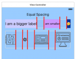
The equal spacing distribution type determines the content size by its intrinsic content size, just like WrapPanel. However, the controls are spaced out equally–not close together.
The Problem to Solve
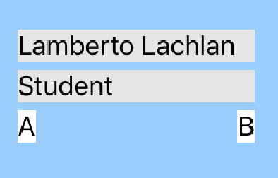
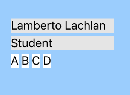
Imagine I need to display an online student report card that lists the grades for each assignment. The control might look something like the following:

The student name, the student label, and the letter grades are contained in a vertical UIStackView. The letter grades are contained in a horizontal UIStackView.
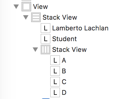
If I play around with some of the distribution types on UIStackView, you will see that I can’t get what I want.
Fill
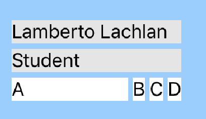
Fill Equally does not look good when you only have a couple of grades.
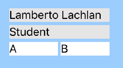
Neither does Equal Spacing.
The Solution (Hack)
Take a look at the Fill distribution above. The UIStackView will give the remaining space to the control that has the lowest content hugging priority (CHP)–or the first control in the stack view if the CHPs are the same. If I give the last grade in the stack a lower CHP, then we are getting closer to what I want.
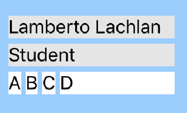
I could stop there, but my letter grades have a different background than the main view, so it is noticeable that the last letter grade is stretched to fill in the gap. The solution is to add a transparent view to the end of the stack. This will act as a spacer that has a lower CHP than the letter grades.
It is a little tricky to get the transparent view in there with the grades. When I drag a UIView into the horizontal UIStackView, it blows out the size.
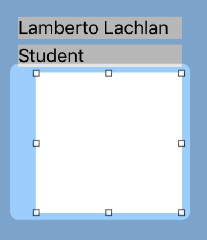
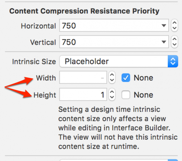
After you drag the view into your UIStackView, change the intrinsic content size of the UIView to fix the problem. Switch the intrinsic size from the default to “Placeholder,” remove the width, and give it a really small height. The UIStackView will stretch the view to fill the remaining space.
The final two steps are removing the background of the view to make it transparent and giving the view a lower horizontal content hugging priority than the grade labels.

Now I have the layout I was looking for. You can’t even tell that there is a transparent view taking up the remaining space.


Actually having to hack UIStackView’s distribution by adding an empty UIView is really sad. Did you fill a bug with Apple over this, or should I?
Actually having to hack UIStackView’s distribution by adding an empty UIView is really sad. Did you fill a bug with Apple over this, or should I?
The stack view should not have a constraint that determines its width. I.e. no width or trailing constraint. That fixes the problem as far as I can see.