Article summary
I’m pairing with a Developer, Jordan Nelson, in a side by side think-aloud-style pairing session to redesign an app. You can read more about the why behind this experiment, how we started with some research and an audit, and come back here to read how we created a sketchy prototype.
We are ideating! Now is the time to throw in all those ideas and solutions we’ve been noodling on. Some call this the time of divergence where the collection of what-ifs and wacky ideas grows. We chose to do rapid sketching so we could visualize our ideas quickly.
Rapid Sketching Goals
The point of rapid sketching is to get a lot of ideas on paper really fast and explore a multitude of options so that you can:
- Quickly find out what works and what doesn’t work.
- Build off of each other’s ideas and multiply greatness.
- Get feedback as soon as possible.
It doesn’t have to be pretty. In fact, if it doesn’t have color or great composition or witty content… great! Maybe that’s a sign that the focus is more on how the puzzle pieces fit together to serve the purpose.
Rapid Sketching Tools
We used FigJam, Figma’s web-based collaborative sketching tool so that we could both sketch and see each other’s work when pairing remotely. The app is free and pretty easy to pick up, even if you haven’t used a drawing application before.
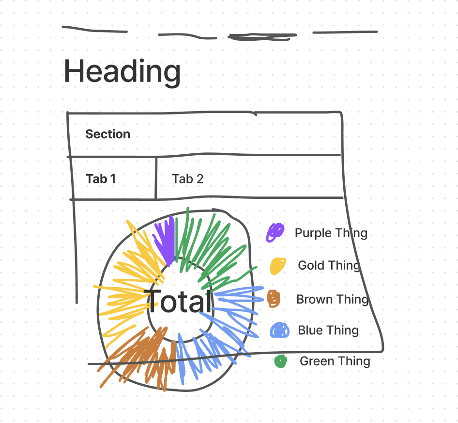
Our sketches looked like this:
Yeesh! I know, but hear me out. In this example, we were exploring ideas around how we could visualize data (charts) in combination with navigation and content hierarchy, as well as how color might play into the design system.
While sketching, we found some ideas got more oohs and aahs than others, so we leaned into them. We tried simplifying as much as possible, taking away more and more text, links, and labels until we got down to the bare minimum information we needed to convey the right idea. This isn’t a content checklist just yet, but it’s a good indicator of what’s important.
Rapid Sketching Outcomes
“The main takeaway from our FigJam sessions was a clear picture of how we want to present information. We ended up with time on the horizontal axis (now, near-term, long term) with detail cards on the vertical axis.” – Jordan Nelson
These sketches, and even more so the conversation we had while sketching, unearthed some exciting guideposts of the app.
- Content could be organized by time, such as short term to long term. We don’t have to mention it or name it in the app for this type of organization to be intuitive.
- Since we’re going to have a lot of data visualizations, the rest of the app should be pretty minimal and clean.
- We now have an idea of how we’ll use certain gestures for navigating between sections or diving deeper down the trail.
Now that we’ve got our legs under us, we can start refining these design concepts with higher fidelity designs.

